Studio Updates: Floor Progress, Bathroom Decisions, Cabinet Paint Colors, and Back Entry Options From Reader Suggestions

Actual progress on the studio has been a bit slow lately. I’ve had a lot of non-house-related things taking up my time since last Friday, but I’m coming up on three whole, uninterrupted work days, and I hope to get quite a bit done. But there are a whole lot of things rumbling around in my mind regarding the studio! And I think I’m edging closer and closer to narrowing down some decisions that I’ve had a hard time with.
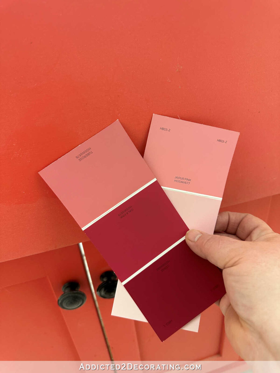
First, let’s talk about the paint color for the studio cabinets. I told y’all a few days ago that I went to Home Depot to find paint colors, and they didn’t have anything even close to what I was looking for. Their colors jumped from too purple to too pink, but what I needed was somewhere in between.
But a couple of days ago, I went to Lowe’s (I don’t think I’ve ever bought paint at Lowe’s), and they had two colors that might be just perfect! They’re both HGTV Sherwin Williams colors. The darker one is called Tuberose, and the lighter one on the right is called Jaipur Pink.
Here’s a close up of them. It’s hard to tell when they’re standing alone, but they have a touch of purple in them. And it seems to be just the right amount of purple without actually reading as purple.

Here are the colors from the HGTV Home by Sherwin Williams website, with Jaipur Pink on the left, and Tuberose on the right…

I’m hoping that one of those will actually end up working, because I really don’t want to have to do a custom color for my cabinets.
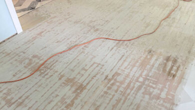
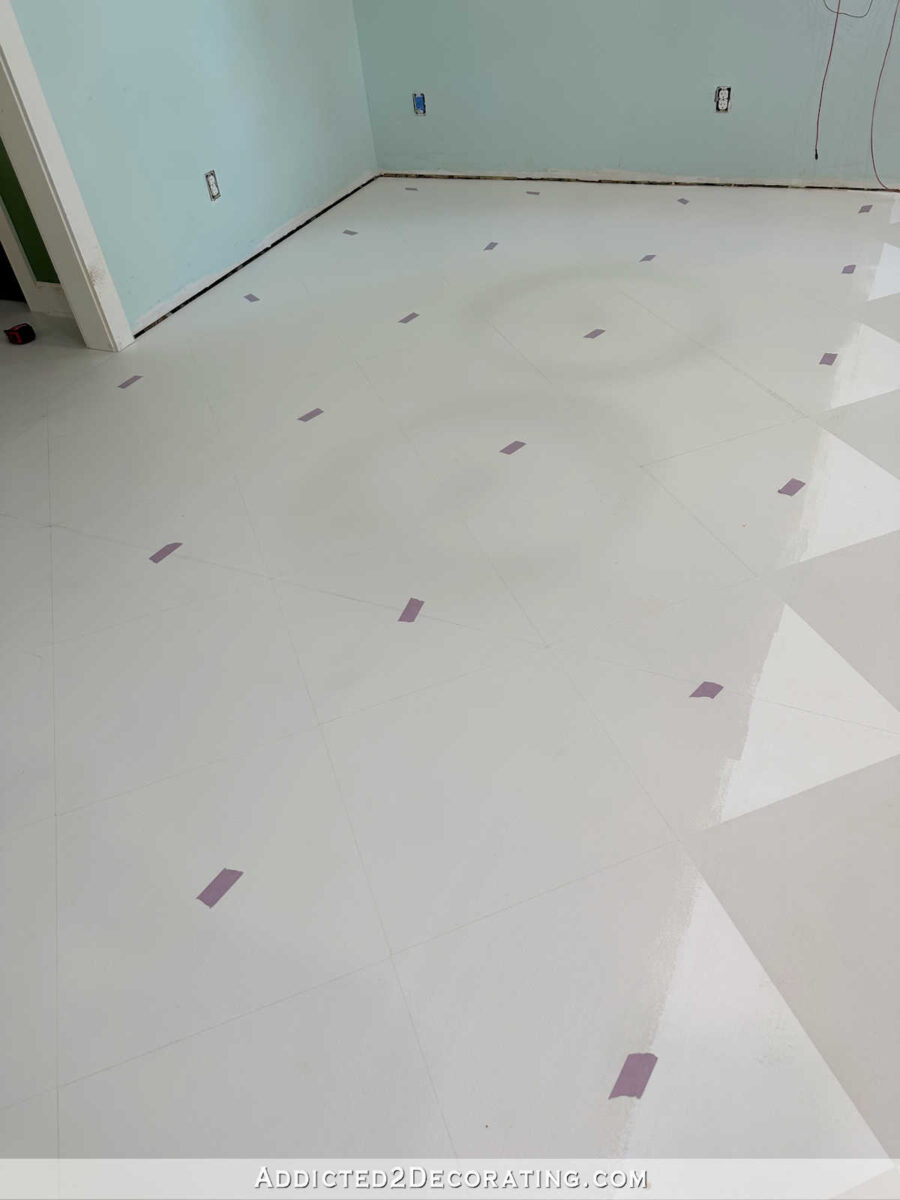
Moving on to the floor, I finally got all of the design for the painted checkerboard floor marked off, and I’m ready to tape off the white squares and get those painted. If everything goes as planned, I should have the floor finished by the end of the day tomorrow.
And regarding yesterday’s post about perfectionism and how it affects me, I wanted to show y’all exactly what it was that had me paralyzed for at least 30 minutes (probably more like 45 minutes) while I sat on the floor and tuned out of “real life” while I avoided the floor and scrolled Instagram. It was this 3/8-inch discrepancy. The distance from the wall to the first point on the floor design on this side of the cased opening is 9 inches…
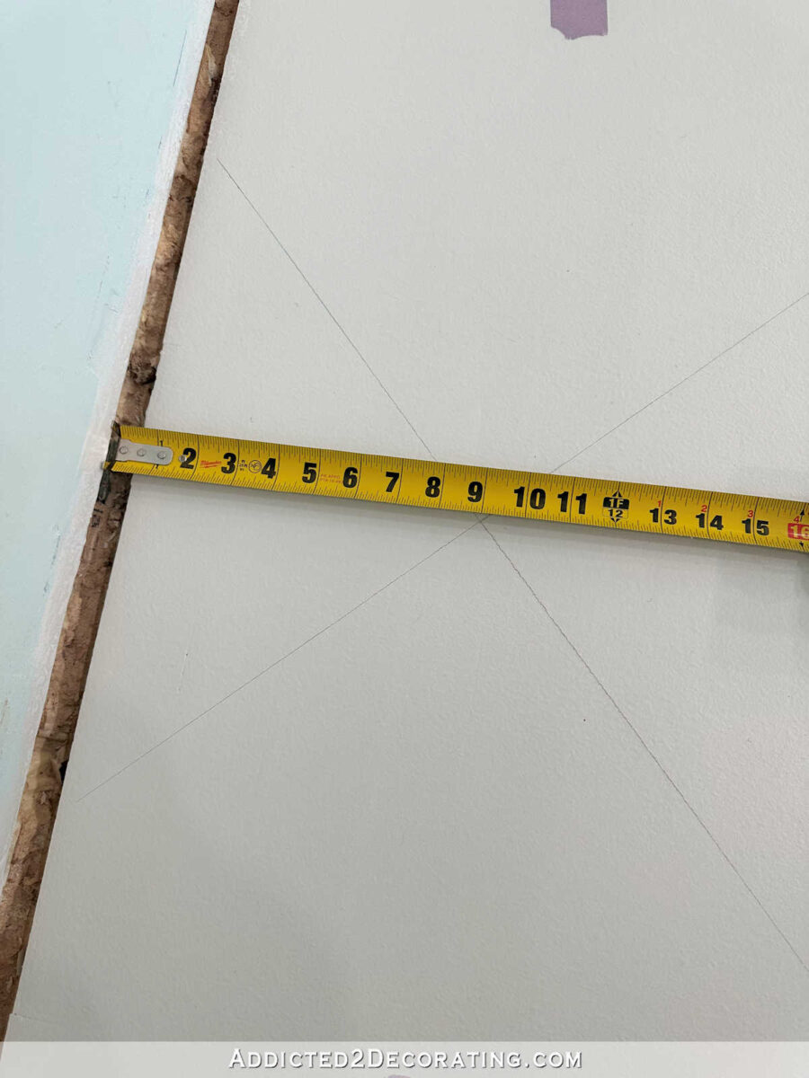
While to the right of the cased opening, the distance is 8-5/8 inches…
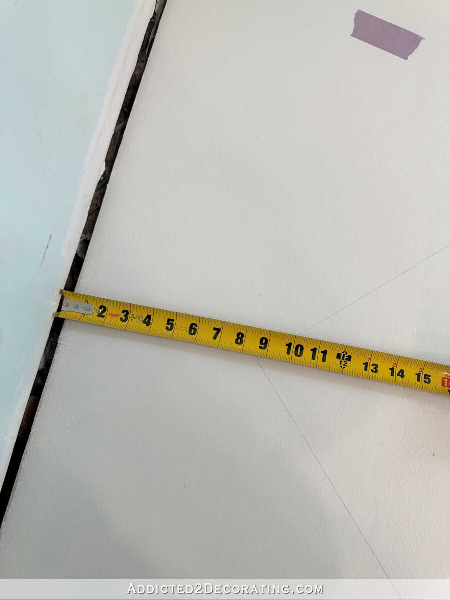
I know that probably sounds so stupid to some people to be worried and anxious and overcome by a sense of dread over what turned out to be 3/8 inch — a measurement that the overwhelming majority of people would never even notice. (To be clear, I didn’t know at the time what the measurement would be, but I knew it wouldn’t be perfect. In my mind, it could have been an inch, or an inch-and-a-half.) But, like I explained yesterday, that’s the effect of perfectionism. It’s not pleasant, and it doesn’t lead to a peaceful mind. But I finally made myself get up and continue working. I got it done, and I’ve moved past it. Once I got over that hill, my mind relaxed, the dread left me, and I can now peacefully move on to the painting stage of the project.
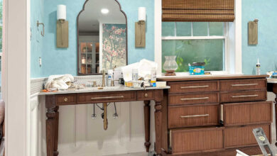
Now about the bathroom, I may try to make the wall design work. The more I look at it, the more I think it’s the yellow tile that needs to go. I think taming the accent tile by replacing it with white will actually make the wall design look softer.
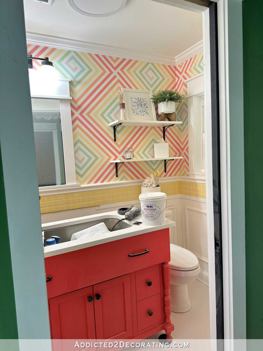
I’m still not sure if I can make it work because the vanity color needs to be changed. and the colors on the wall design may still end up being too bold.
But you can see below the vast difference between the original direction I was going with the studio, with the much bolder colors, and the new direction I’m going, with the softer pinks. The vanity color, much like the hallway bathroom vanity, looks very orange compared to the pinks I’m considering for the studio cabinets. And when compared, you can really see the touch of purple in the new paint samples.
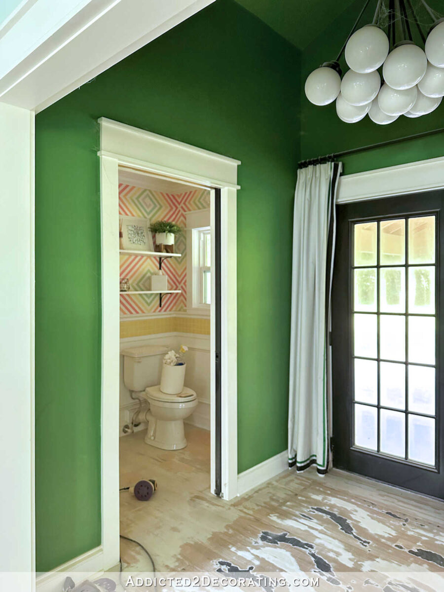
And finally, several people suggested that I use the flower mural on the ceiling of the back entry since wallpapering the walls is too expensive for my budget.
I love the idea of a wallpapered ceiling, but I do wonder if the ceiling is too high for that. I think the ceiling is about 11 or 12 feet high, and unless you’re standing in the back entry or very close to the cased opening, the ceiling isn’t even visible. So I’m not 100% sold in the idea, but I do love the idea of a wallpapered ceiling.
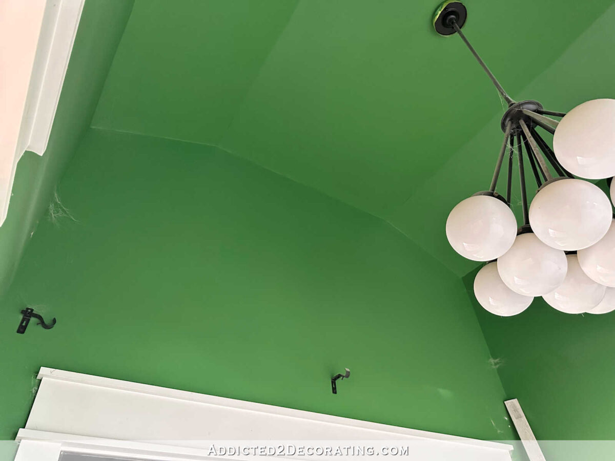
The other reader suggestion that really appealed to me is loading up these walls with my own art and crafty creations.
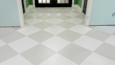
(That’s an older picture. The floor is now primed and painted, and ready for the white areas to be taped off and painted.)
One thing I thought about was making a whole lot of resin petri dishes in colors that coordinate with the studio colors, and using them on the walls in a loose “floating bubbles” design, similar to the way I hung the ceramic birds on the corner wall in the living room…
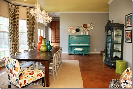
…or how I hung the plates in Cassandra’s dining room MANY moons ago. (Wow, that was 12 years ago!)
But you get the point. It’s that random floating/drifting design that I’m talking about, as opposed to my standard “everything symmetrical and square” design that I’m generally so drawn to.
So I’ve narrowed down the back entry options to those two — wallpapered ceiling with a solid color on the walls, or paint the walls a solid color and use something like a “floating bubbles” design of resin petries all over the walls.
Things are moving forward, and I’m hoping to get a lot accomplished on Thursday, Friday and Saturday!

Addicted 2 Decorating is where I share my DIY and decorating journey as I remodel and decorate the 1948 fixer upper that my husband, Matt, and I bought in 2013. Matt has M.S. and is unable to do physical work, so I do the majority of the work on the house by myself. You can learn more about me here.
Source link