
The Federal Communications Commission has launched a new map designed to show consumers what kind of cellular coverage they can expect in a given area from AT&T, T-Mobile, US Cellular, and Verizon. It’s been a long time coming, and it looks like an improvement over the agency’s past attempts to show gaps in the nation’s broadband coverage, which were woefully inadequate and inaccurate.
As Verge editor-in-chief Nilay Patel pointed out on Twitter, it shouldn’t have taken this long for this map to be available. The law requiring that these maps be made, known as the Broadband Deployment Accuracy and Technological Availability (DATA) Act, was signed in March 2020, and the lack of details about broadband coverage has created confusion about the so-called digital divide for years.
It’s also worth noting that the map isn’t based on data that the FCC collected or crowdsourced. FCC acting chairwoman Jessica Rosenworcel said in a news release that the data was provided by the carriers who don’t have a great reputation for having the most accurate picture of where they do and don’t provide broadband (though the FCC is working on getting a better picture of home internet availability, and The Verge and Consumer Reports are working on examining how cost-effective broadband is).
:format(webp):no_upscale()/cdn.vox-cdn.com/uploads/chorus_asset/file/22766633/FCC_Map_Vs.png)
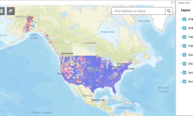
The interactive map lets users select which carrier’s coverage map they want to see, and it provides information about LTE coverage, voice coverage, or both. The FCC says the map is the work of its Broadband Data Task Force. The map is fairly user-friendly; instead of having to flip between T-Mobile, AT&T, and Verizon’s coverage maps, users can see all of the data in one place, overlaid on top of each other. The map also provides a distinction between data availability and voice availability — which is useful, as being able to make a call and being able to get online are obviously two very different things.
One big thing the map is missing is data about 5G coverage, or really any indicator of what kind of speeds users can expect. In a note about the map’s launch, Rosenworcel says the network has to provide at least 5Mbps down and 1Mbps up to qualify as 4G data coverage. If one carrier provided an area with 100Mbps speeds and another provided 10Mbps speeds, that could be difficult to distinguish on the map.
Rosenworcel also admits that this map is only a first step in the FCC’s work to improve the information available to consumers, but it’s an important one. It at least lets consumers know the minimum of what they should expect in a given area and gives them the tools to make more informed decisions about their cellular provider.