
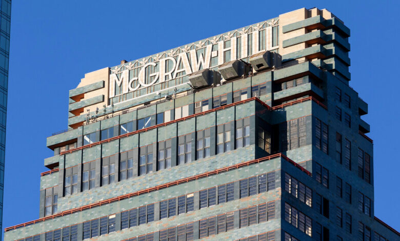
For 90 years, the name of the publisher McGraw-Hill, rendered in intricate Art Deco terra-cotta lettering, has adorned the crown of the eponymous blue-green modernist building on West 42nd Street, which rose above a scraggly tenement neighborhood during the Great Depression.
Even after the company left in the early 1970s for a skyscraper at 48th Street and the Avenue of the Americas, the name continued to embroider the Hell’s Kitchen skyline. The building was designated a city landmark in 1979, and just last year a restoration of the 35-story tower’s distinctive terra-cotta cladding won an award from the New York Landmarks Conservancy, which praised the way the “11-foot-tall Deco style ‘McGraw-Hill’ sign was stripped to reveal the preserved original glaze.”
Yet on Jan. 13, Deco Tower Associates, the building’s owner, presented a proposal to remove the name from the crown and replace it with “330 W 42nd St” — a designation that doesn’t exactly roll off the tongue. Although the address was to be rendered in the same style and materials as the name it was intended to replace, the Land Use Committee of Community Board 4 was taken aback by the plan, which it unanimously opposed.
In response to the brewing controversy, the owner removed the crown signage change from the alteration proposal presented to the city Landmarks Preservation Commission on Feb. 9. As part of the tower’s redevelopment into contemporary office space designed by MdeAS Architects, the owner still plans to add the address to the 42nd Street entrance. Both the commission and the community board unanimously approved that change.
“A lot of what historic preservation is about is trying to find the balance between the tangible fabric and the intangible fabric of a building, and names and signs are very much getting into that territory,” Bill Higgins, the project’s preservation consultant, said in an interview.
“The intangible is: What’s the name of the building? What is its identity? Is it still thought of as the Chrysler Building,” Mr. Higgins said, even after Chrysler is gone? “Is it still thought of as the Pan Am Building when there is no Pan Am? Is it the McGraw-Hill Building when there still is a McGraw Hill, but it’s in a different place?”
In the case of the McGraw-Hill Building, the intangible identity is tangibly integrated into the very masonry of its north and south facades, in an uncommonly prominent manner. And for some neighborhood residents, the durability of the terra-cotta name on that crown helps impart a reassuring constancy to the building, making it feel like a reliable old friend in an ever-changing cityscape.
“On 9/11, McGraw-Hill, staring at that from my rooftop on 47th Street was something that didn’t change,” Christopher LeBrón, a community board member, said at the public meeting. “And it means a lot to this community.”
Founded in 1917, the McGraw-Hill Publishing Company bought land in 1930 for a new headquarters at 42nd Street west of Eighth Avenue. To design it, James McGraw hired Raymond Hood, a nimble architectural provocateur whose neo-Gothic entry had won the design competition for the Chicago Tribune Tower. In New York, Hood left his mark with such diverse projects as the Daily News Building and the dazzling, Gothic-inspired American Radiator Building.
His McGraw-Hill Building was a strikingly spare and colorful modernist skyscraper that loomed over its hardscrabble, low-rise neighborhood. Incorporating elements of the European-born International Style, the tower asserted a bold horizontality, ribbons of tall, factory-style windows alternating with eye-catching blue-green bands of terra cotta.
The flamboyant edifice provoked suspicious harrumphs from conservative critics, but Henry-Russell Hitchcock and Philip Johnson, who disdained applied decoration, admired it enough to include it in their influential Museum of Modern Art exhibition and book “The International Style.”
Their main quibble? “The heavy ornamental crown,” with its intricate interplay of colors and planes, which they deemed “an illogical and unhappy break in the general system of regularity.”
But those crinkled noses were a mild reaction compared to the cri de coeur the tower’s crown aroused among those who made their living building signs.
“Who will control the sign industry of the future — the advertising man, architect or mason?” asked Signs of the Times, a trade magazine. “When the light of neon wanes in the advertisers’ eyes, will this type of display take its place … floodlighted in symphonies of brilliance and color to make our cities stare and admire?”
Produced by the Federal Seaboard Terra Cotta Corporation from plaster molds, the main body of each handmade letter was composed of white terra-cotta blocks that protruded six inches from a starkly contrasting blue-green background. Shipped from the factory packed in hay, the pieces of this giant jigsaw puzzle were sorted at the job site.
“It’s totally unique, or almost totally unique,” said Thomas E. Rinaldi, a sign historian and the author of “New York Neon.”
At the community board hearing, the building owner’s representatives argued that there was precedent for replacing a landmark’s prominent signage, but their examples were easily removable signs not physically integrated into a building the way the McGraw-Hill name is.
“I do not accept that it’s just an ephemeral sign, perishable in the way we accept signs as being perishable,” Mr. Rinaldi said in an interview. “I think it’s completely irrelevant to the conversation whether McGraw-Hill even still exists, much less whether they’re still in the building. To me, it’s more akin to something inscribed in the entablature of a portico than to neon letters mounted onto a metal armature on a roof.”
The landmarks commission has previously approved the replacement of corporate signs on high-profile landmarks, but none involved a name embedded into an edifice’s structure at a scale comparable to that of the McGraw-Hill Building.
The crown of 30 Rockefeller Plaza, an Art Deco tower designed by Hood, was originally adorned with the name of Rockefeller Center’s largest tenant, RCA, the 24-foot-high letters made of tubes filled with glowing amber gas. First illuminated in 1937, the RCA signs (they appeared on three sides) were replaced in 1969 with the same letters in a mod new design.
In 1985, Rockefeller Center, of which 30 Rock is the centerpiece, was given landmark status, and in 1989, after General Electric swallowed up RCA, the commission allowed the three letters at the building’s crown to be replaced with two: GE.
In 2013, Comcast bought GE’s stake in NBCUniversal, a deal that included naming rights to 30 Rock. The commission then approved the replacement of the GE signs with LED-illuminated signage: NBC’s multicolored peacock logo on one elevation and the name Comcast topped with the logo on two others.
The Germania Life Insurance Building, at 50 Union Square East, has also worn various hats. Initially a sign bearing the words Germania Life adorned its mansard roof. After anti-German sentiment sparked by World War I induced a name change to Guardian Life, the signage changed accordingly. The building became a landmark in 1988, and in 2000 the city permitted the words on the roof to be changed to the hotel name W Union Square in letters “of the same size, color and font.”
After The New York Times left its longtime home at 229 West 43rd Street in 2007, the word Times was stripped from the landmark’s tower, and in 2014 the city approved the installation of purple signs displaying the name Yahoo!
One of the more subtle changes to a famous city building’s integrated signage occurred at 230 Park Avenue, which straddles the avenue at 46th Street. Built in 1929 for the New York Central Railroad, the ornate tower originally bore the carved words New York Central Building above its entrance. But when the structure was leased in 1958 to Irving Brodsky, it was rechristened The New York General Building, a name chosen, Mr. Brodsky said, because it required the alteration of only two letters “chiseled in granite on the building.”
The edifice was given landmark protection in 1987, but not before it was acquired by Harry Helmsley, who removed the words and splashed the name The Helmsley Building across the facade in Trumpian gold letters.
Right upstairs, hulking above 230 Park, is the obtrusive and unloved skyscraper built in 1963 for Pan American World Airways. For three decades the name Pan Am, rendered in aluminum and neon, was affixed to the tower’s top, one of the most visible signs the city has ever known.
Pan Am went bankrupt in 1991, and when the building’s owner, the Metropolitan Life Insurance Company, announced plans to change the tower’s name, the architect Robert A.M. Stern asked cheekily, “Couldn’t they just leave the sign up and take the building down?”
But the tower has now worn its “new” name nearly as long as it wore its old one, and to a generation of New Yorkers who were born or arrived here since the early 1990s, the building is known as the MetLife.
Still, buildings’ identities die hard in New Yorkers’ hearts.
“You are a New Yorker when what was there before is more real and solid than what is here now,” Colson Whitehead, a city native, wrote in his 2004 book “The Colossus of New York.” “I still call it the Pan Am Building, not out of affectation, but because that’s what it is.”
For weekly email updates on residential real estate news, sign up here. Follow us on Twitter: @nytrealestate.