No one in the world does corporate pomposity quite like tech firms, and Chinese mobile giant Xiaomi is no exception. The company announced its new foldable Mi Mix Fold today, but it also revealed a new logo, spending more than 20 minutes describing the process in which it turned its old square design into… a squircle. (Halfway between a square and a circle.)
In fairness to Xiaomi, the company is not blind to the fact its new logo is pretty similar in appearance to the old one. “Are you disappointed at this logo, that we just made our original logo rounder?” asked Xiaomi’s CEO Lei Jun, somewhat rhetorically. No worry, Lei explained, as the company “didn’t just change the shape from square to round” but also changed “the internal spirit as well as the mentality of the brand.” So, that’s reassuring!
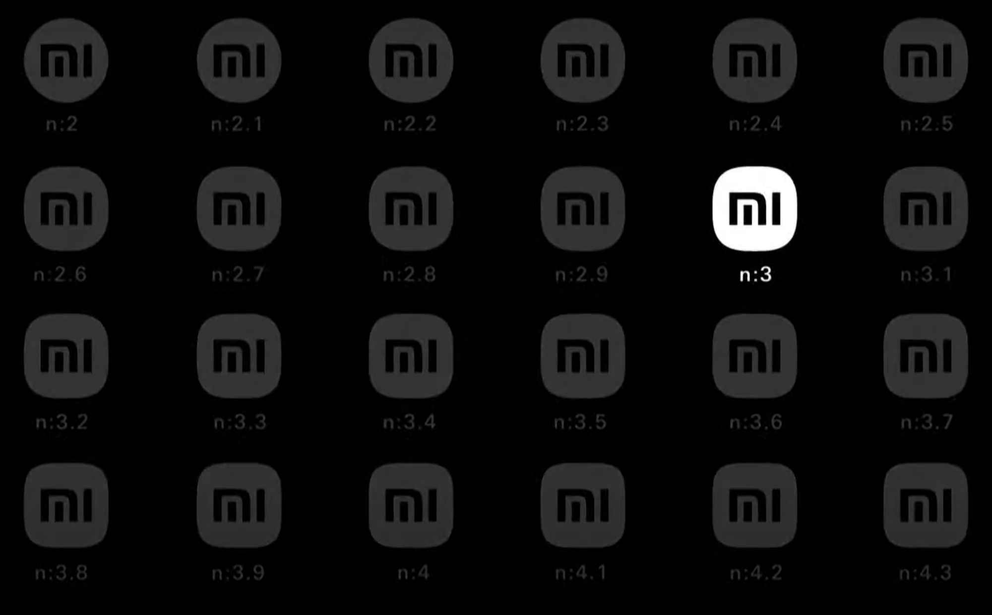
The company went on to note that the shape of the new logo can be described using mathematical equations (a property that is common to most shapes, I believe) and that it took the firm a long time to pick the right one (it started the rebranding process in 2017).
You can see some of the shapes it considered and discarded below, along with the blindingly, obviously, self-evidently superior final design. N:3, could it be any other way?

We’re having some fun at Xiaomi’s expense here, but really this is just par for the course when it comes to corporate redesigns. Indeed, this sort of long-winded, self-indulgent presentation is common to pretty much all big tech brands at this point, from Samsung to Microsoft to Apple (who started the game and remains the master of the form).
As Lei explained, the new logo is part of a bigger overhaul of Xiaomi’s “brand identity” overseen by famed Japanese designer Kenya Hara. “The new logo is not a simple redesign of the shape but an encapsulation of Xiaomi’s inner spirit,” said Hara during a video segment. “The design is essentially a reflection of the concept ‘Alive.’”
So, if you feel dead inside considering the millions of dollars of work that went into circling the square of Xiaomi’s logo: don’t. That’s disrespectful to its brand identity.
Source link