Yesterday’s poll about the possible changes to the studio office area cabinets had a very clear, unmistakable winner. And it wasn’t even close. If you took any time to read any of the 450+ responses here on the blog and on Facebook, you know that this option with the wall color around the window and at the back of the cubbies was the winner.
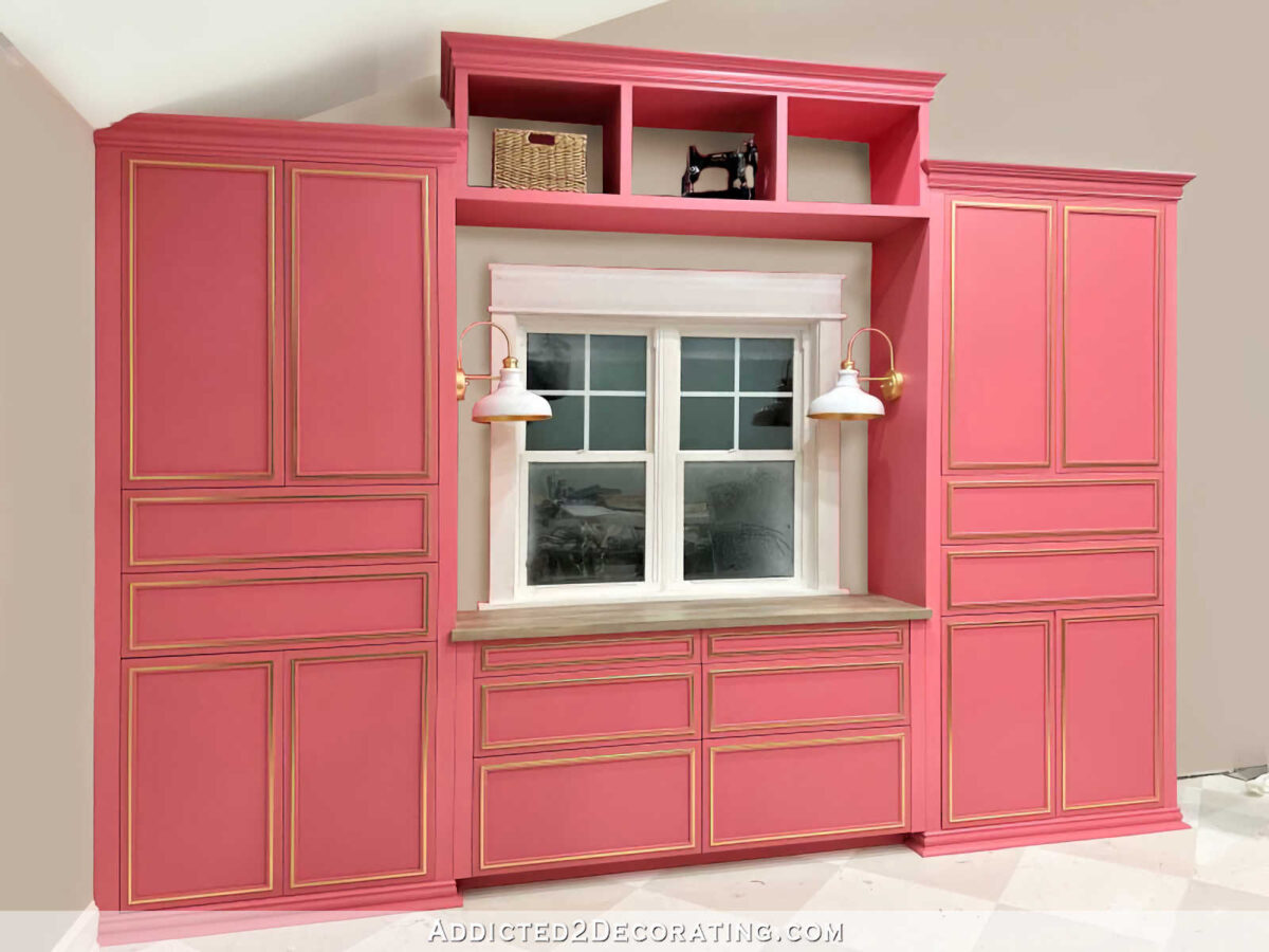
Of the three options, that is also the one that was the winner among the three of us when my mom, my brother, and I were at lunch on Wednesday. But yesterday afternoon, I did have one more thought. I wondered what it would look like to use gold leaf on the backs of the cubbies rather than the wall color.
Hear me out. My concern is that with the wall color at the backs of the cubbies, it makes the bridge look incomplete, like it doesn’t have a back on it. A bookcase, cabinet, or bridge without a back kind of gives the appearance of looking cheap to me, like it’s either a cheap piece of furniture that was so cheap it didn’t come with a back, or like the person building it ran out of plywood and just decided, “Well, that’s good enough to hold some books.” So while option #3 from yesterday’s post (shown above) was my favorite of the three, the thought of it looking incomplete didn’t thrill me.
And then this idea popped into my head. I think the appeal of this option is that it lightens things up. Instead of everything being pink, this option adds some brightness. So I tried to think of a way to make the backs of the cubbies light and bright while maintaining that solid look (i.e., with a back on it) and tying it in with the side cabinets.
And then I thought, “What about gold leaf?!” People keep telling me that the bridge needs gold somewhere to tie it in with the side cabinets, but I’m not going to add any trim to gold leaf. That seems unnecessarily forced and contrived to me. But I think that gold leafing the backs of the cubbies could accomplish everything that’s needed! It would lighten up the cubbies, maintain the look of a solid backing, while also tying it in with the side cabinets. And while that would technically be a very large area with gold leaf, once I have things in those cubbies, only a small portion would peek through.
So I’m considering it. I have plenty of gold leaf to spare, so this weekend, I might cut some of my scrap plywood to fit into the backs of the cubbies, gold leaf those, and see what I think. Now that the idea has embedded itself into my brain, I won’t be satisfied until I at least try it out.
My plan was to use it on the wall next to my desk in the office area of the studio. But once I got the cabinets in this area painted, I didn’t really like the idea of such a huge, colorful display being on the wall right next to the cabinets. I do want colorful, and I do want something large, but each month of that calendar is 16″ x 20″, so with all 12 months displayed (which is what I plan to do), it would be too imposing.
Plus, with that wall being kind of narrow, I would have to hang the calendar in four rows of three, which means that I’d probably need a step stool to reach and write on the top three. That didn’t seem practical to me.
And then on the one large, blank wall that remains in the studio, I was trying to figure out how to arrange that, keeping in mind the three non-negotiables that I still wanted to add to the studio — a print of our landscape design that Matt bought for me, my Spoonflower color map, and a TV. As much as I tried, I was having a hard time figuring out how to make those things work on this big wall.
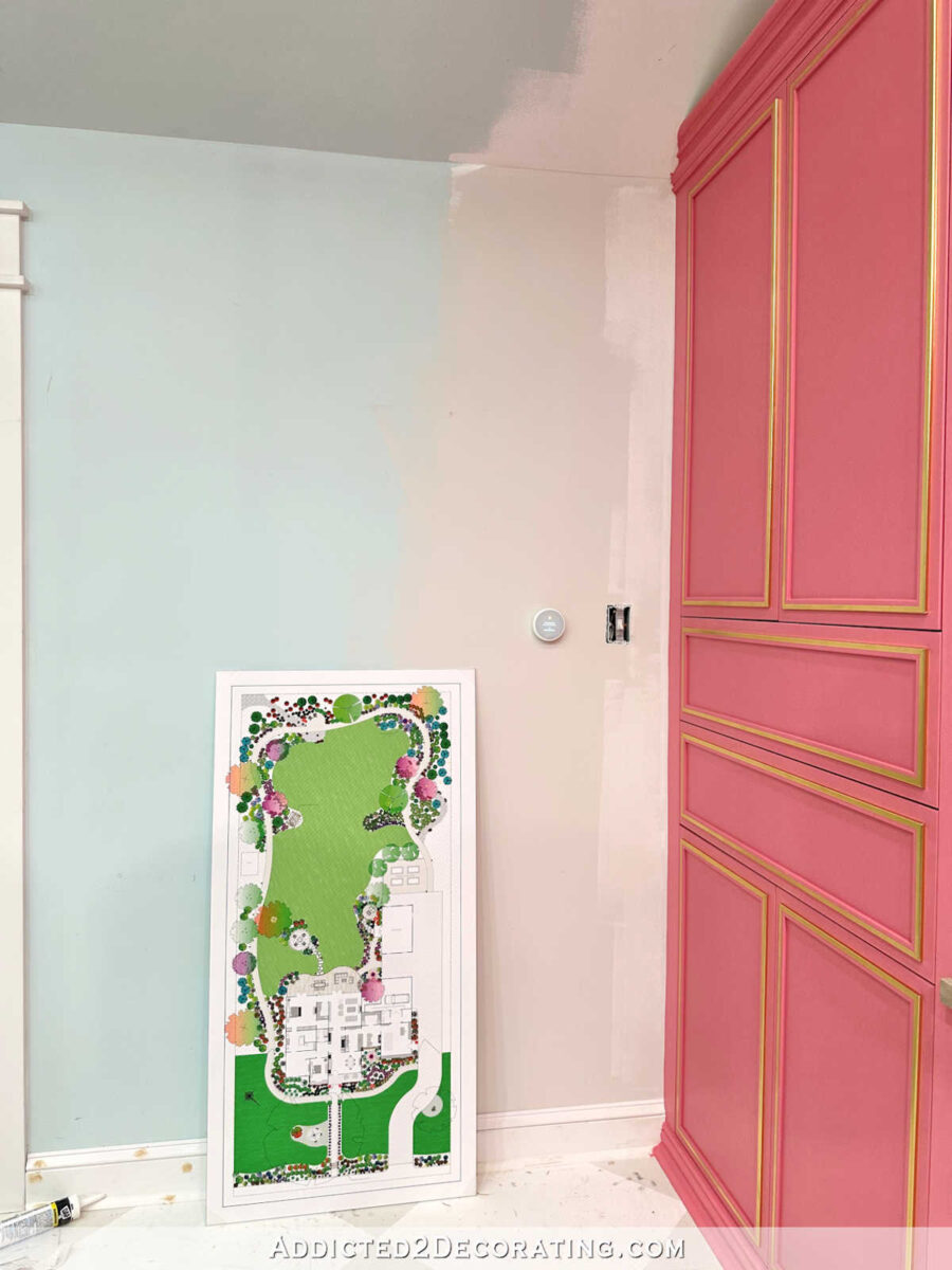
So yesterday, I decided that my plan needed to be tweaked. Instead of trying to force that giant colorful calendar next to my desk, it needs to go on the big wall. And instead of relegating the beautiful landscape design to the large wall, where it would need to be printed pretty small, and would then get lost on that huge wall, I’d have it printed large and use it on the narrow wall in the office area next to the cabinets.
So I headed to FedEx Office yesterday afternoon, and had them print it for me in their largest “poster” size and then mount it on foam board for me. It cost just over $100, which I thought was a very reasonable price for something so large to be printed and mounted. Here’s how it turned out…

Isn’t that awesome?! I love it so much! I had to do hours of editing on this thing to get it ready to be printed. If you’ll remember, this is how it looked when the landscape designer sent me the file…
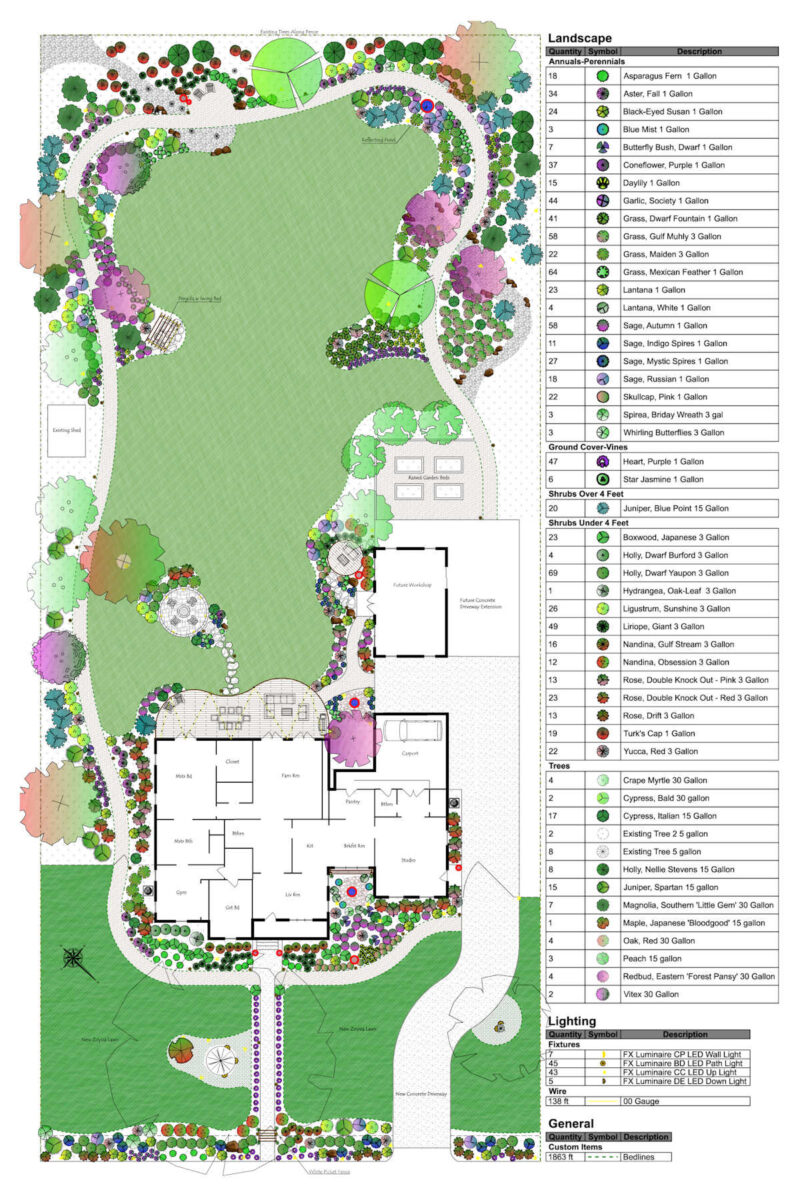
The house floor plan wasn’t exactly right and had the rooms labeled (some of the labels were wrong), the car in the carport was faced the wrong way, and then there were loads of other little changes that I wanted to make.
The one that he gave us was fine for what it was intended to be — simply a landscape plan. But for hanging it on the wall and displaying it as artwork, it needed lots of work. I swapped out the house floor plan completely for the new one showing furniture placement. Although, unfortunately, I did this before I decided to bump out or addition an additional seven feet to add walk-in closet space. But there was no way I was going to spend additional hours redoing it, so this is fine.
I also moved the car in the carport, removed the plant legend (although I might redo it separately and have it printed separately to hang on the same wall), added a continuous black line to frame the whole thing, changed the driveway/concrete areas, etc. It was a ton of work! But I think the end result looks amazing!
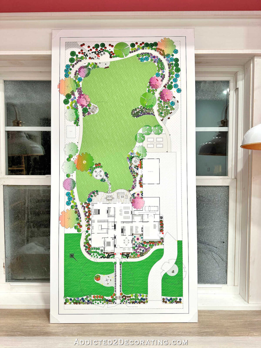
I honestly couldn’t be happier with how this turned out. And I LOVE how the greens look next to the pink cabinets!

I still have to make a frame for it, which will probably be a very simple white frame. But before I do anything with that, I remembered yesterday that I still need to put an intake vent in this wall!! I can’t believe I almost forgot!
Just on the other side of that wall is the storage closet, and that storage closet houses the HVAC system for the studio. Right now, the door to the storage closet has to remain open all the time so that the air intake can get plenty of air. I’ll sometimes turn the HVAC off and close the door when I need to take pictures…

But right now, as soon as I’m done with pictures, the door has to be opened again so that the HVAC can be turned back on. If the closet door were to stay closed, and the HVAC came on, there’s no way it would be able to get enough air to work properly.
So before I can keep the closet door closed, I have to add a large vent to this wall that goes directly into that closet to allow for the HVAC system to get plenty of air circulation. I’m not exactly thrilled about having to have a big vent on this wall, but it’s one of those necessary things that we live with. I’m hoping it can go low on the wall, just above the baseboards, so that it won’t interfere with the things I want to hang on this wall. But that definitely needs to be done first. As much as I’d like for pretty artwork to be priority, a properly-working HVAC system is top priority here in central Texas.

Addicted 2 Decorating is where I share my DIY and decorating journey as I remodel and decorate the 1948 fixer upper that my husband, Matt, and I bought in 2013. Matt has M.S. and is unable to do physical work, so I do the majority of the work on the house by myself. You can learn more about me here.
Source link