An American Express Airport Lounge in the Sky? Not Quite.
[ad_1]
Another members-only club has opened in New York. But unlike its predecessors, which include Soho House, Aman, Casa Cipriani, and others, the Centurion New York was designed not by an architect or hotelier — but by a credit card company.
American Express opened its first Centurion members club, an 11,500-square-foot space with wraparound views of Manhattan in March. Like the layout of a home, there are distinct spaces meant to serve different purposes: a salon, a wine bar, and casual and fine dining spaces. Even the scent — a Santal with notes of sandalwood — bathing over you after exiting the elevator was planned.
American Express brought on Michelin-starred chef Daniel Boulud to create the menu, which includes simple dishes like lobster rolls and cheesecake. The studio Yabu Pushelberg designed the interiors. The art collection, curated by Hanabi, features more than 100 pieces.
To get in, you’ll need the colloquially known “Black card” — a status-wielding card that provides perks such as elite status with hotels and airlines but is available by invitation only.
Centurion guests are discouraged from taking photos, following the policy of other members-only clubs. But unlike other clubs, Centurion’s is open to the public. An Amex Black card will get you in the door, but so will a Resy (which is owned by Amex) reservation, though Resy guests have access limited to the fine dining and studio spaces. A bar with views of the Chrysler Building is for Amex cardholders, said Pablo Rivero, the vice president and general manager of global dining at Resy.
Though Centurion Lounge has made its mark on airports worldwide, the Centurion New York is distinctively darker and moodier than the light and bright lounges where Platinum and Black cardholders can take a break. You won’t find an all-you-can-eat buffet, showers, phone booths or playrooms for children, who aren’t allowed in the space after 6 p.m.
That’s by design, people who worked on the space said. If the airport lounge is meant to be a temporary space on a person’s journey, the Centurion New York is intended to be the opposite.
“Our intention is that it becomes a haven for our members, and it is the destination they’re going for,” said Kate Hardman, the director of global brand design at American Express.
These interviews have been lightly edited for clarity.
Daniel Boulud, head of dining and menu strategy
We played with different notes of seasoning and spicing that worked very well. There are, of course, techniques that we applied that we are familiar with and confident with, and there are ideas that we may have never explored, but want to go there for the opportunity. For example, on the studio menu, we have lunch things, such as lobster rolls, because that’s something I love. I like to play with American classics, which can also be a pizza, a New York classic.
We have dishes that people can identify very well. In the studio, we have steak and mashed potatoes. I think people feel comfortable with that. There’s a sense of comfort and quality that is always in focus, and where people feel like we didn’t want them to get lost in the menu because it was trying too much to play a role they weren’t expecting in this environment or this setting.
Kate Hardman, director of global brand design
We wanted Centurion New York to feel reminiscent of a sophisticated private home, but we wanted it to feel like this informal cultural hub or meeting place for people who enjoy art, fine wine and fine dining.
Each room is meant to have its own persona. The entry is meant to feel like this portico moment, transforming you from the outside world into this inside world. The salon is meant to be akin to your living room. There’s this consistent theme running throughout, connecting to a celebration of the vibrancy of New York City since that’s where we are. We think of New York as an incubator of fashion, art, and culture, and a hub of creativity.
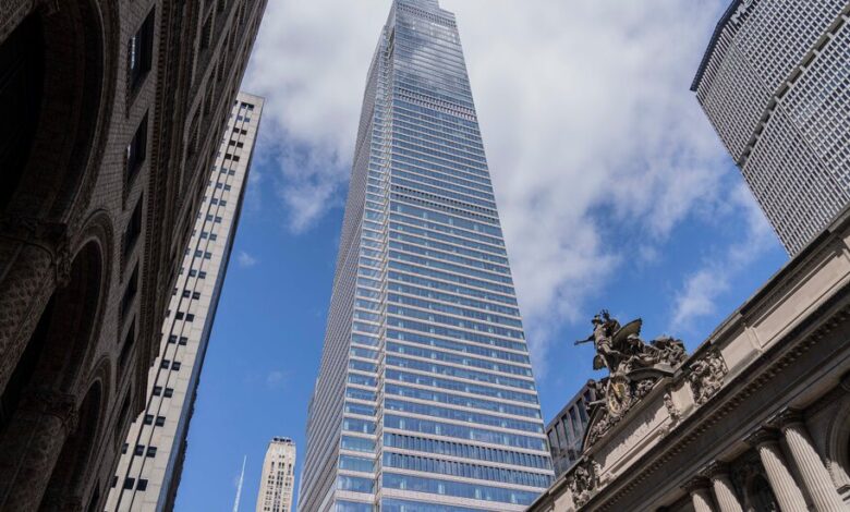
One Vanderbilt is an interesting building for us to open this type of space. It’s one of the most recognizable buildings in New York, it’s easy to get to and it’s in the heart of Manhattan. We’re in this environment where there are a lot of tourist attractions and restaurants around. . Our task was how do we make this feel even more intimate once you get off the elevator? Throughout the design, we were able to incorporate these intimate moments, but they sit against the backdrop of 360-degree views of Manhattan. And that’s unique to One Vanderbilt. We couldn’t have gotten that elsewhere.
Pablo Rivero, vice president and general manager of global lounge experiences
We’re trying to create and deliver a destination. The destination that you have at the airport is trying to take you away from the hustle and bustle and deliver a personalized service experience. Here, it’s also a destination, but in the city. So what we need in the city differs from what you need in an airport. Here is an opportunity to unplug, have a conversation and socialize with people.
You come here, and you get to experience all of New York because you get to see it everywhere. When you create the destination, we didn’t just want to highlight one thing — we are in the city. How do we best represent the city? We’re creating a space where you can just be yourself. You want to drink or have a conversation, you can do that. If you want to have casual dining or a private event, you can do that. That’s the experience that we deliver in an elevated setting.
Jamie Stagnitta, founder of Hanabi
The main idea behind curating this collection was to imagine what a modern-day salon would be. Historically, salons were gathering places where artists from all different mediums — poets, writers, musicians, visual artists — would come together and discuss contemporary ideas.
We tried to imagine what the modern-day salon would be like. We took inspiration from New York City in the ’70s and ’80s, where societal boundaries were very blurred. The goal here was to create a collection that was a bit unexpected — a collection that was thought-provoking and a collection that spoke to their understanding of what is going on in the art world. So they recognize certain artists, and then they’re exposed to new artists. It’s meant to be a relaxed enjoyment of the various spaces.`
[ad_2]
Source link


