From Bottega green and Hermès orange to Tiffany Blue, we examine the origins of the most notable designer hues.
In the acclaimed fashion film The Devil Wears Prada, the Anna Wintour-inspired character Miranda Priestly (Meryl Streep) delivers a nearly two-minute monologue on the significance of the colour blue — or not blue. Stylists, eager to impress their cutthroat boss, bounce frantically from rack to rack as the fashionably unaware assistant Andy Sachs (Anne Hathaway) marvels at their inability to make seemingly insignificant decisions about fashion “stuff.” In defence of said “stuff,” Miranda proceeds to lecture Andy on the nuances of detail in the fashion world — not least of which is colour. “That sweater is not just blue — it’s not turquoise; it’s not lapis — it’s actually cerulean,” she says. Point taken, Miranda.
RELATED: What’s With All the Recent Shake-Ups in the Fashion Industry?
You see, colour can become synonymous with a brand and establish a visual shorthand that is perhaps even more powerful than a logo. Observe: A bright orange is not simply orange; rather, it’s Hermès orange. A shocking pink is now Pink PP courtesy of Valentino, which elevated an ordinary shade to a trademark hue. With countless colour contributions from the industry trickling into the mainstream, it no longer takes a design aficionado to identify Tiffany Blue or Bottega green. Here, we delve into the cultural significance and fated origins of some of fashion’s favourite colours.
Hermès Orange
Nothing says orange like a citrus-hued Hermès box, but the iconic boîte wasn’t always this colour. In 1942, during the Second World War, a shortage of cream-coloured cardboard boxes meant that the French fashion house had to use whatever the supplier could provide for packaging. As it turned out, the boxes were orange. Although their size, their shape and even their shade have varied over the years — from a subdued rust orange circa 1945 to a vibrant tangerine reflective of the ’60s — the use of an orange hue has been consistent.
Valentino Pink PP
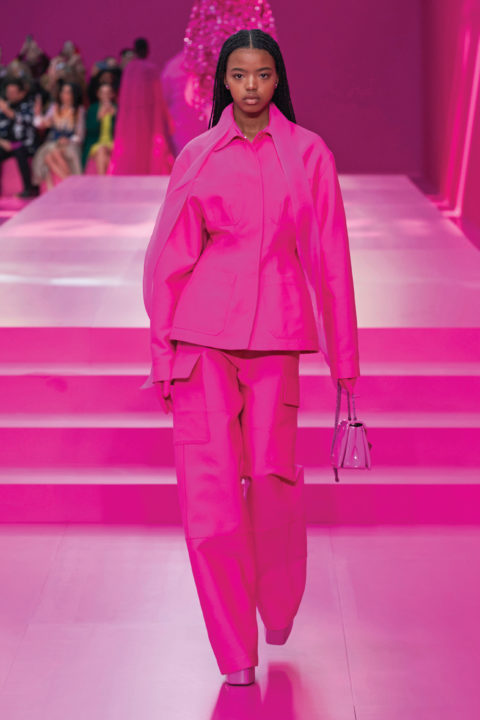
Pink is having a major fashion moment — and Valentino’s high-octane Pink PP is leading the pack. You’ll find this shade at the intersection of fuchsia and magenta, but it’s got its own fierce electricity. At Valentino’s Fall 2022 Ready-to-Wear show, 48 single-hued hot-pink ensembles were presented. The collection’s stream of monochromatic looks no doubt contributed to the rise of the Barbiecore trend, with celebrities from Zendaya to Florence Pugh following suit in head-to-toe pink Valentino attire.
This playful shade, made in collaboration with the Pantone Color Institute, was named “Pink PP” after the initials of Valentino’s current creative director, Pierpaolo Piccioli. “Pink PP is the result of research and a necessity; I just needed to put all my hopes and dreams and basically everything that makes me feel good into a colour,” Piccioli told British Vogue.
Off-White’s Industrial Yellow
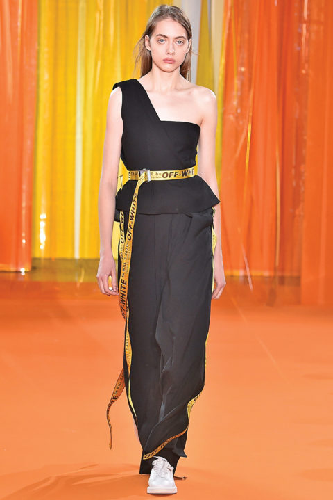
After the late Virgil Abloh sent a construction-yellow “industrial belt” down the runway at the Off-White Fall 2016 menswear show, it swiftly became a street-style staple. The inspiration for this buzzy belt and its colour is clear from its name — visions of caution tape and construction-site signage come to mind. Off-White is also known for its love of workwear, and this distinctive cautionary-yellow shade has lent itself to a multitude of other creations throughout the years, including logos, clothing and footwear.
Bottega Green
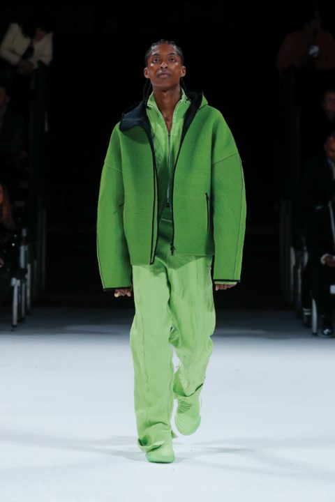
One of former creative director Daniel Lee’s greatest contributions to Bottega Veneta (and fashion!) — alongside the coveted Pouch bag and Puddle boots — is Bottega green. For the Italian house’s Spring 2021 Ready-to-Wear show, the set was immersed in both emerald lighting and looks, and thus commenced the reign of the now celebrated colour — although it seems that Lee’s Bottega green itself may be a revival of a longtime favourite of the fashion house. A strikingly similar shade appears in the form of some folded fabric in the 1985 short film Bottega Veneta Industrial Videotape, directed by Andy Warhol — as well as on the exterior of the Bottega Veneta flagship store in Vienna, captured in Polaroid images 10 years later. Coincidence? I think not.
Tiffany Blue

The precise origin of Tiffany Blue — “a color so famous, it’s trademarked” — and why company founder Charles Lewis Tiffany decided to use it aren’t known for certain, but the historical significance of the colour turquoise in the 19th century might have been a contributing factor. (Tiffany & Co. was created in 1837.)
“Turquoise was a favourite of Victorian brides who gave their attendants a dove-shaped brooch of turquoise as a wedding day memento, which increased the color’s popularity,” offers the luxury jewellery retailer. Beyond using the shade for its boxes, Tiffany & Co. recently collaborated with Fendi for the 25th anniversary of its Baguette bag, made famous on Sex and the City by lead character Carrie Bradshaw. A Tiffany Blue Baguette, modelled on the arm of Bella Hadid, debuted on the catwalk during Fendi’s Resort 2023 show at New York Fashion Week.
Louboutin Red
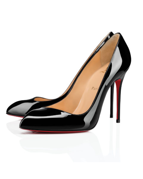
A sexy stiletto with a rich rouge sole is instantly identifiable as the work of Christian Louboutin. It’s been reported that in 1993, after one year of business, Louboutin sought to create a shoe inspired by Warhol’s 1964 Flowers print series. It’s said he believed that the initial prototype (a pink stacked heel with a black sole) lacked the true pop-art essence of a Warhol piece, but an assistant painting her nails red nearby inspired the designer to paint the sole with her polish to make it pop.
Thus, the famed red bottom was born, and so it has remained — but it’s not without its imitators. Louboutin continues to fight legal battles the world over in an effort to protect its trademark sole, most recently securing a victory in a Beijing court over a competitor.
This article first appeared in FASHION’s Summer 2023 issue. Find out more here.
Source link