How to Make an Entrance, Whether You Have a Real Foyer or Not

[ad_1]
Functionality is important in a foyer or entry hall: You need somewhere to put down your packages and keys, take off your shoes and hang up your jacket.
But there’s something else that matters just as much. Whether you have a proper foyer or not, the entry to your home is the first space you (and your guests) encounter after stepping through the front door. Why not give it some style and spark a little joy?
The foyer “sets the stage for what’s to come in the rest of the house,” said Jennifer Bunsa, the founder of Bunsa Studio, a Miami-based interior design firm. Because entryways are often small, they’re usually not very architecturally impressive, she added, “so we want to introduce some other elements that will attract the eye and make an impact.”
We asked her and other interior designers for some advice on how to do that.
Treat the Walls
In any small space — a powder room, a foyer — adding wallpaper, an appealing paint color or paneling can make the room feel more special. “Sometimes people get a bit scared of using wallpaper in a space that maybe isn’t huge, because they feel like it might be too busy for the eye,” said Nicole Salvesen, a founder of Salvesen Graham, a London-based interior design firm. “But it can actually help to calm the space.”
In an Arts-and-Crafts-style house in Boulder, Colo., Salvesen Graham added Jasper wallpaper with a repeating blue-and-green floral pattern, and painted the trim around it sage green. That helped create a cohesive look “that’s actually gentle on the eyes,” Ms. Salvesen said. In the narrow entrance hall of a home in London, the designers used a different approach to similar effect, adding fluted-plaster panels to the walls to create visual interest without making the space feel suffocating.
When designing the foyer of her midcentury-modern home in Roslyn Harbor, N.Y., Cara Woodhouse, a New York-based designer, lined the walls with custom wallpaper from Surfaces by David Bonk. The pattern features pieces of silver leaf that are crowded together near the ceiling but spaced out farther down the walls, so they appear to be tumbling toward the floor. “It looks almost like snowflakes,” Ms. Woodhouse said, creating an effect that is eye-catching but “very light, bright and airy.”
Address the Floor
As you put on and take off your shoes, it’s natural to focus on the floor of your entryway. That creates another opportunity to do something interesting.
Ms. Bunsa is a fan of using encaustic cement tiles with colorful graphic patterns in foyers. In a home in Jamesport, N.Y., she installed hexagonal tiles with mustard, light blue and dark blue details from Popham Design in a randomized pattern for a bold, geometric look. In her own home in Miami, she used rectangular tiles with free-form, black-and-white shapes, also from Popham Design, running them across the floor and up one wall.
“I wanted to play with the idea of the classic black-and-white checkerboard tile floor,” she said. “But the Popham tile changes it up and makes it feel more modern.”
For a client’s home in Roslyn, N.Y., Ms. Woodhouse riffed on a traditional stone floor by installing triangular marble tiles from Artistic Tile in various colors, including white, black, red, pink, blue and green. “Because it was a small space, we were looking for that eye-candy moment that would pop,” Ms. Woodhouse said. “It’s where you would least expect it, which really makes a statement.”
Consider the Ceiling
If a statement floor isn’t for you, or if you already have a serviceable plain floor in place, you could change the look of the ceiling with paint or wallpaper.
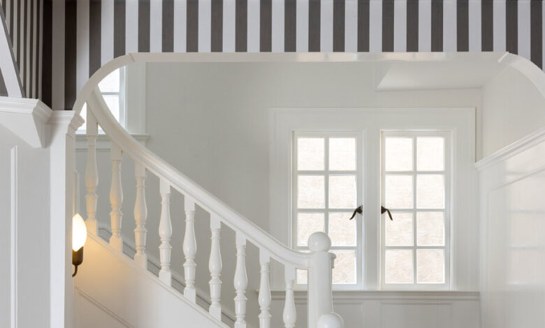
When Marea Clark, an interior designer based in Northern California, was renovating the foyer of a 1906 house with a dark hardwood floor and handsome white wall paneling, she decided to liven things up by adding striped wallpaper from Schumacher to the ceiling.
“We wanted to keep it feeling very elegant, but add a playful quality,” Ms. Clark said. Now, she said, “The room has an almost tented feel.”
Add Statement Lighting
A foyer is a great place to install a sculptural pendant, chandelier or sconces, as large light fixtures can make small spaces feel a little more grand. In a country house in Surrey, England, the designers at Salvesen Graham installed a pair of Jamb metal-and-glass globe pendants in a narrow entryway. “Choosing a big, round light fitting can make the space feel a bit wider and more spacious,” Ms. Salvesen said.
In the foyer of a house outside San Francisco, Ms. Clark chose a traditional two-foot-tall lantern from Coleen and Company for the center of the space. The powder-coated pink metal frame adds a touch of whimsy. “It’s just that pop of color, which is unexpected,” Ms. Clark said.
Ghislaine Viñas, a New York-based interior designer, sometimes looks for light fixtures that offer multiple points of light. In a house in Los Angeles, she installed a multi-armed, flush-mount fixture that stretches out with eight diffusers. For a home in Palm Beach, Fla., she chose a PET Lamp fixture with six shades woven from recycled soda bottles sprouting from a single ceiling canopy on multicolored cords.
“We wanted to juxtapose the formality of the architecture with some really good informality,” Ms. Viñas said.
Mix In Unexpected Furniture and Art
When guests arrive at a 19th-century Gothic Revival house in upstate New York where Ms. Viñas designed the interiors, the center table in the foyer, from Moooi, stops them in their tracks: It’s shaped like a pig, with a tray on its back. “Having the first object you see inside be a little tongue-in-cheek is unusual,” Ms. Viñas said. “Doing things that are not just the obvious choices speaks to the personalities of the people who live there.”
Of course, those choices don’t have to be so playful, but selecting standout furniture and accessories that encourage closer inspection can help make the foyer a destination. When designing her home in Miami, for instance, Ms. Bunsa installed a geometric planter from Bzippy in Yves Klein blue that holds a tall cactus, as well as a bench with an intricately woven seat from Peg Woodworking to create multiple moments of interest.
In more traditional homes, Salvesen Graham aims to mix intriguing antiques, fabrics with colorful patterns and contemporary art to create interiors that feel lively. In the foyer the firm designed in Surrey, for instance, they installed antique blue-and-white ceramics, lampshades and pillows made with a yellow gingham fabric and three-dimensional cut-paper contemporary art by Jack Milroy mounted in an acrylic box.
“In all our interiors, we use antiques and vintage pieces to help the house feel more authentic and grounded,” Ms. Salvesen said. “We use a real mix, because that’s how people really live.”
Don’t Be Afraid of Full-Size Furniture
Ms. Salvesen also recommended installing full-size furniture, even in moderately sized foyers where you may assume you need smaller pieces. While truly tiny entryways do require space-saving furniture, if you have just a little extra breathing room, “big pieces of furniture can stop it from feeling like a long, narrow space,” Ms. Salvesen said, and make it look like a proper room.
If you have enough space, install a bench with a generous upholstered seat, for example, rather than one so skinny it feels like sitting on a two-by-four. If you have an empty corner, bring in an armchair. Likewise, choose an impressive credenza or center table instead of feeling like you have to find a shallow console or wall shelf.
Ms. Woodhouse, blessed with a large entry space, took this approach to heart and installed a velvet-covered ottoman that provides seating on all sides. “People don’t usually hang out in entryways,” Ms. Woodhouse said. “But I have to tell you, people actually hang out in my entryway.”
For weekly email updates on residential real estate news, sign up here.
[ad_2]
Source link


