Is There Really Any Such Thing As Timeless Design?
[ad_1]
I’ve been working in the studio this week, clearing out the room, packing things up, and getting ready to paint the ceiling, walls, and floor. It’s a big job because that room is large, and it has accumulated a lot of stuff! But yesterday, while purging and packing up the room, I came across my stash of design magazines. There were probably 300 of them, at least. And they dated way back to around 2005.
I didn’t take the time to look at them, because I just wanted to get the room cleared out. I decided to get rid of all of them. I mean, the chances of me looking at any of those magazines again was slim to none.
But one caught my eye. I think it’s a Better Homes & Gardens special publication. At first, I thought it was Elle Decor, but it’s not. And as you can see, the cover literally says “The Most Stunning Rooms Ever”. That’s a pretty big claim!
I actually remember buying this. I was in Barnes & Noble, and I saw it, flipped through it, and was absolutely captivated by it. I thought that the claim made on the front cover was 100% accurate at the time.
So yesterday, when I came across this again, I was curious. Would these rooms stand up to that label today? Are these designs timeless? Or would these rooms look outdated today? Is there even any such thing as timeless design? Let’s take a look at a few of them, because I’m curious to know what you think.
First, let me give you some background and some perspective. This special publication is dated Fall/Winter 2006. So it’s about 16.5 years old. That was the year before I started this blog. Facebook was about 2.5 years old. Pinterest wouldn’t come into existence for another two years, and we were still four years away from Instagram. So social media was in its infancy. Myspace was the most popular social media website. Facebook was relatively new. And the very first iPhone was still about six months away from being introduced to the world.
So in that pre-social media, pre-iPhone world, when most of us were still getting all of our design and decorating ideas from magazines and HGTV, here’s a taste of the most stunning rooms ever.
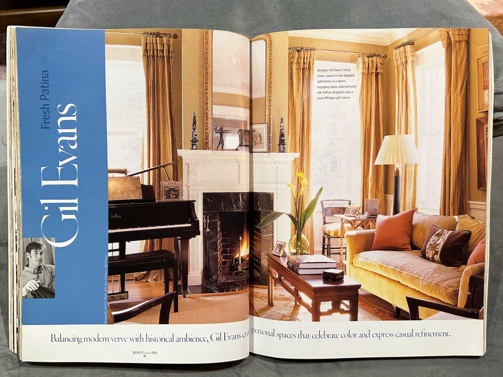
I have to admit that it starts off strong with me. While there are definitely things that I think should be changed in this room, I don’t see it and immediately think “outdated”.
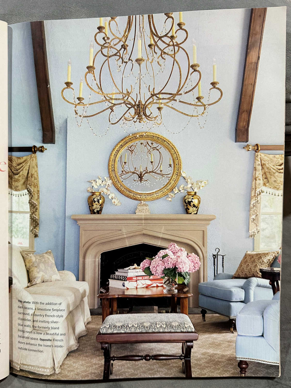
At least for me, I think the wall color is still very pretty and fresh. The main thing I’d want to change is the window treatments. See that swag thing (I forgot what those are called) on the left window below? I remember making one of those for a client, and in 2006, my interior decorating business was one year old.
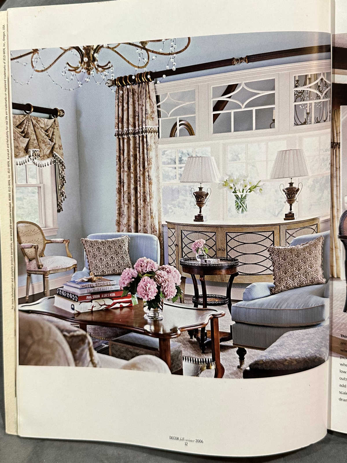
We just don’t see many (or any) window treatments like those today. Window treatments today seem to have been much more simplified with window shades and/or simple curtains and drapery panels.
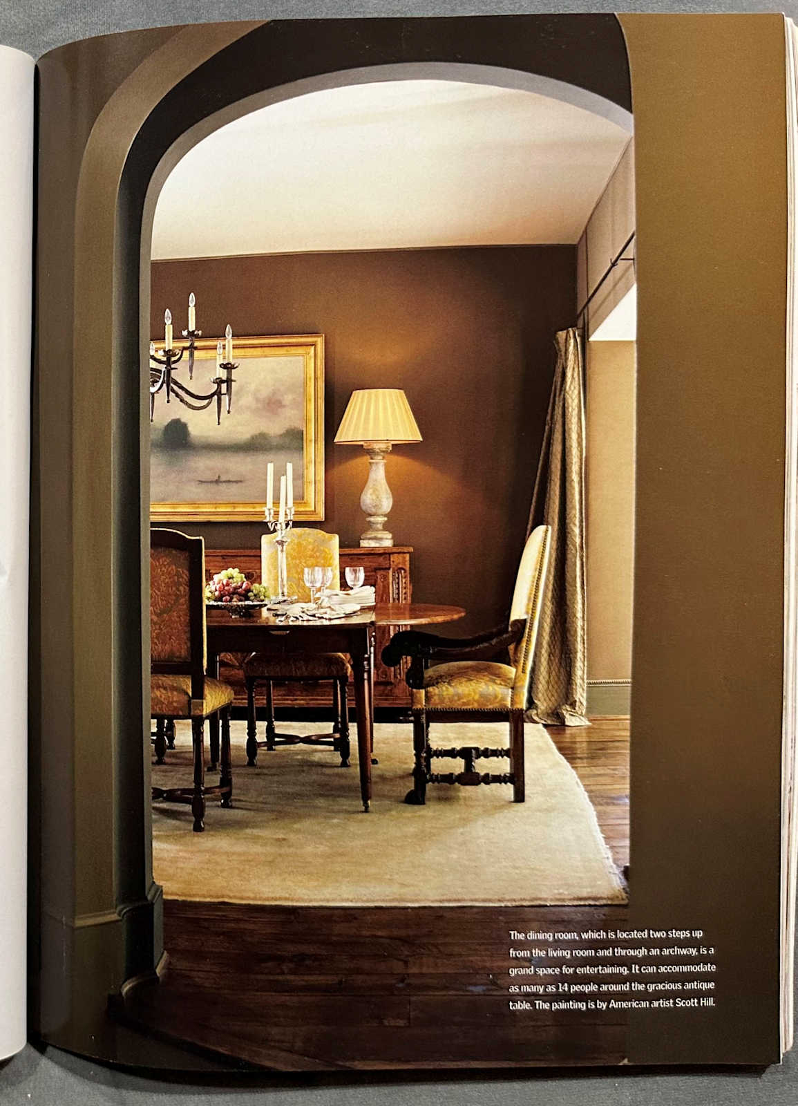
This next one is pretty. If I walked into this room today, I wouldn’t necessarily think it was outdated. It’s definitely not my personal style, and the colors seem too heavy and dark for me, but it doesn’t seem outdated.
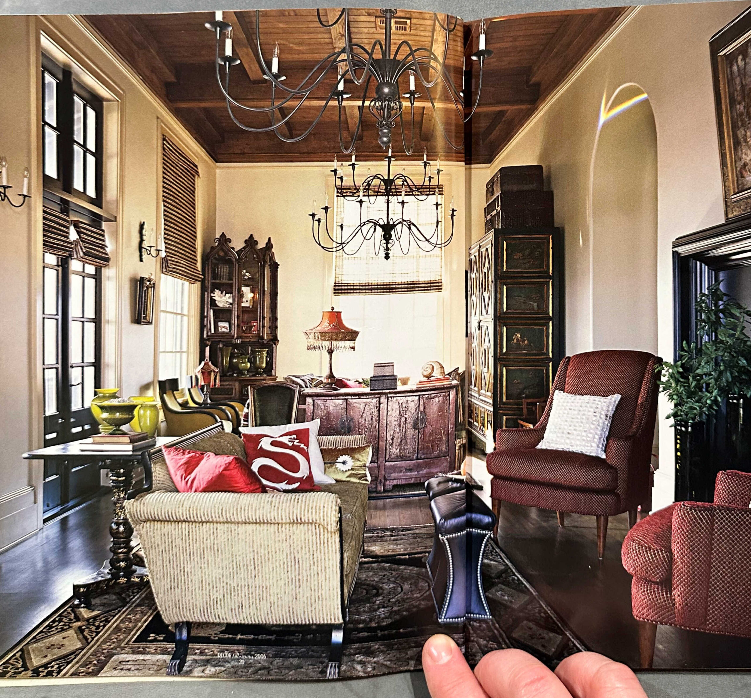
This is a wider view of that same room. What I did notice about so many of the rooms in this magazine is that the rooms seem to fall into two different categories for me. First, so many of them seem dark and the furnishings seem very heavy and overdone. And second, the ones that don’t seem overdone seem very plain. You’ll see what I mean later. So those two categories seem to dominate.
But with that said, there are many elements in this room that would look right at home in 2023 with just a few minor updates.

This next one is a perfect example of what I meant by dark, heavy and overdone. I remember this era well because again, this is when I had my interior decorating business. And this is when just about every new client I met with had one of two requests, and the most popular request was Texas Tuscan. My goodness, I came to hate that term. Texas Tuscan. And while this isn’t exactly what Texas Tuscan would look like, it still has that same feel to it.
In case you’re curious, the second most-requested look back then was Pottery Barn. I kid you not. About 90% of my clients wanted either (1) Texas Tuscan or (2) Pottery Barn. And that’s precisely why the excitement about decorating for clients wore off pretty quickly, and I only did that for seven years before throwing in the towel and focusing on my blog, where I could escape from Pottery Barn and Texas Tuscan. And that’s probably why you’ve never seen me decorate my house with anything from Pottery Barn. 😀
Anyway, moving on. I remember this kitchen well. This thing is etched in my mind, but only because I remember seeing it in another publication where they had edited the color so that it look pink. And I was mesmerized with that pink kitchen! I loved it so much. And then when I saw that it was actually red, I was so disappointed.
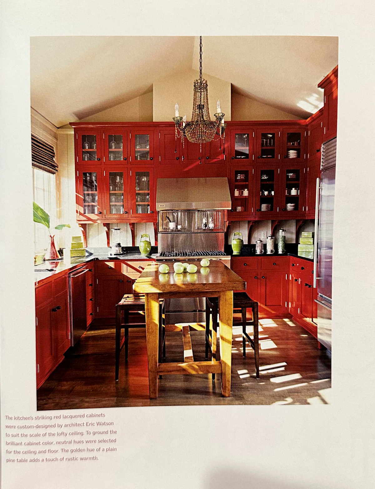
But that was probably one of the first colorful kitchens that really caught my eye, and made me realize that I’d never be satisfied with a white kitchen. And I think with some minor changes (like taking the wall color to a nice soft white rather than taupe), that kitchen would be just as great today as it was in 2006.
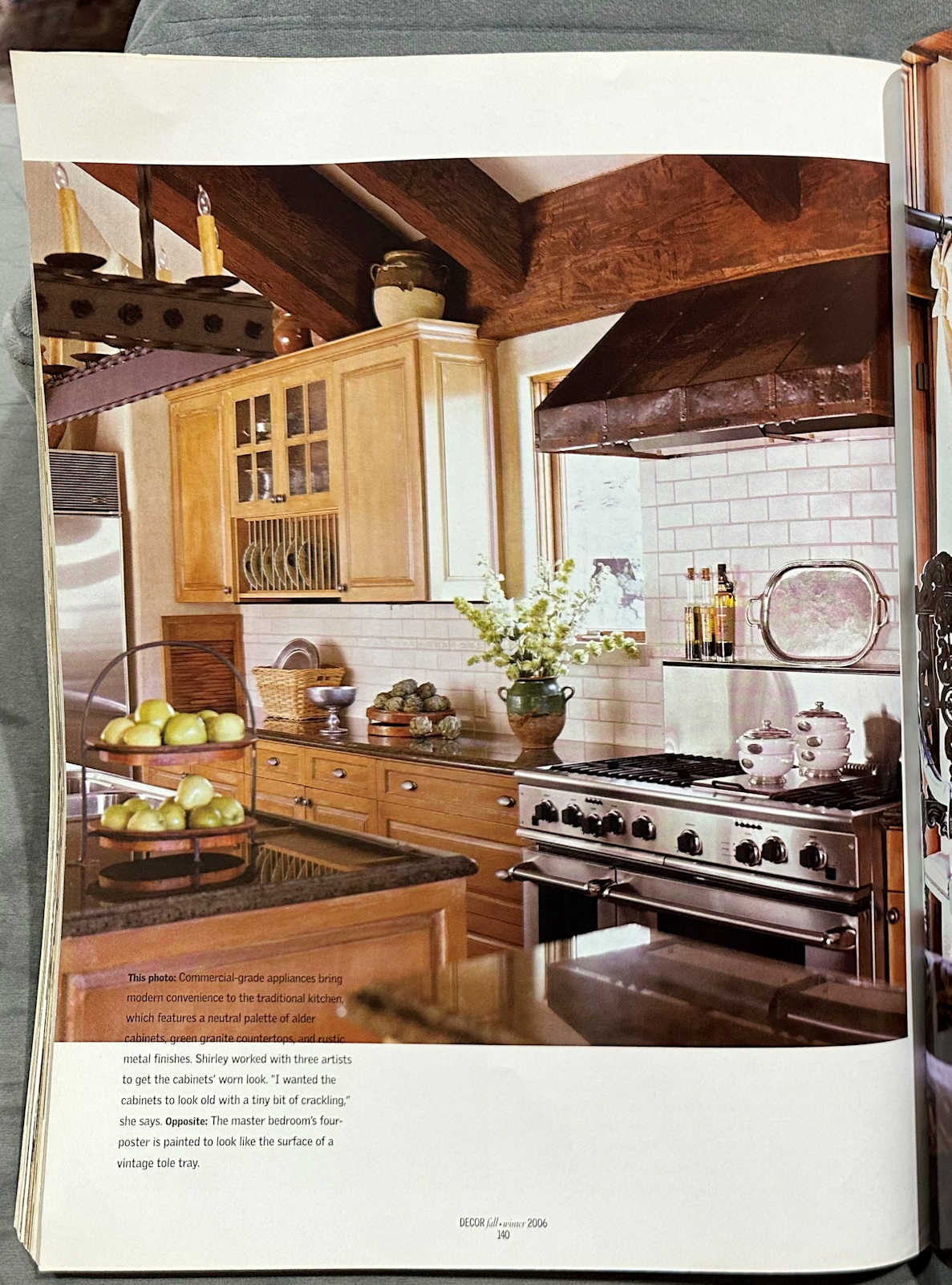
Here’s another kitchen. I don’t know if this is a case of this looking outdated to me, or if it’s just so opposite of my own personal style, but I’d personally have to redo everything in this kitchen.
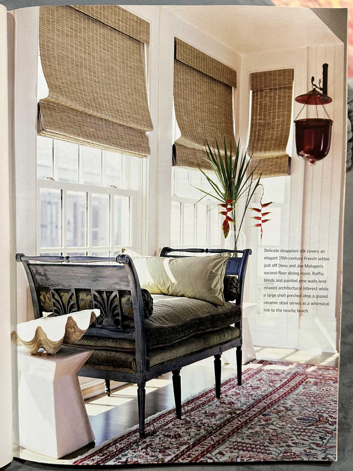
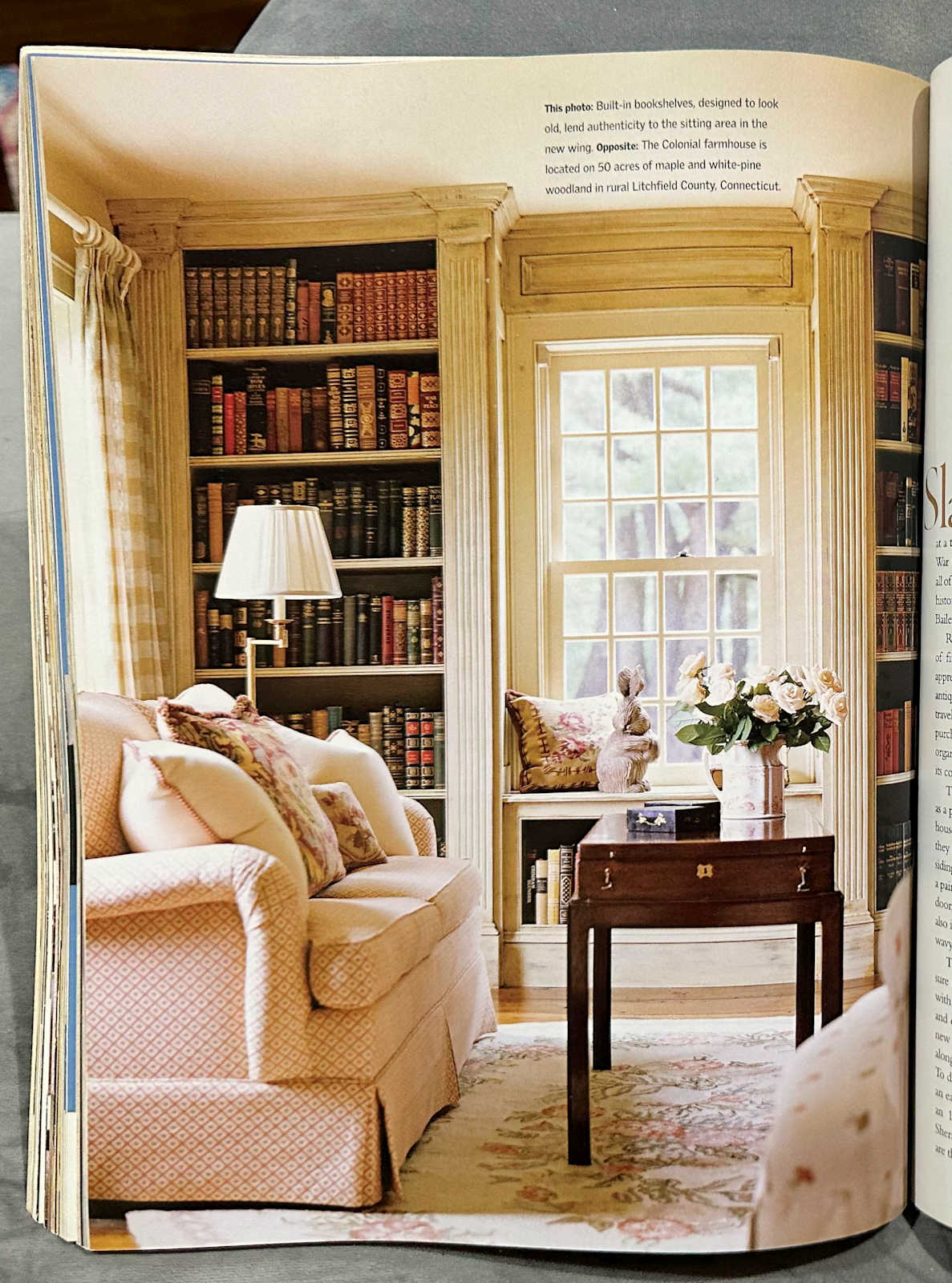
This little sitting room is pretty, but do people still do those antiqued finishes on wood work? I don’t really see that anymore these days. But do you see what I mean about dark and heavy and overdone? Heck, even the rooms where the walls are a light color, they still feel ark and heavy to me.
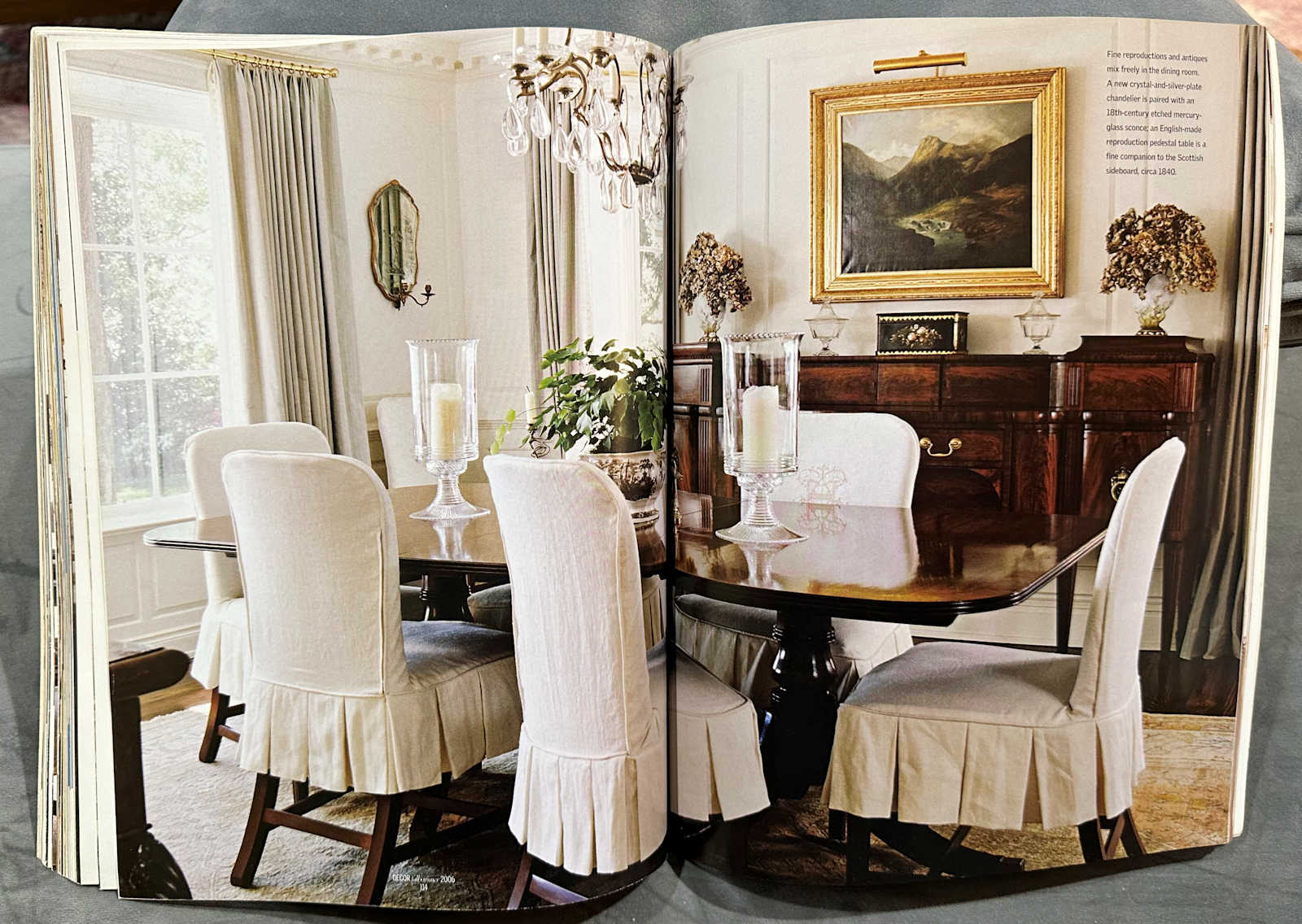
I do think that this dining room is very pretty. This particular style never appealed to me personally, but if I walked into this room today, I would think the room was very well done. Although if the homeowner asked my opinion, I might suggest refinishing at least one of the dark pieces of furniture (probably the table) to make it a more natural color to lighten the look a bit.
This bathroom is very pretty, but again, even with walls that are seemingly light, the room feels dark and heavy.

Let’s just say that after looking through this magazine, I can totally understand why everything shifted to paint-it-all-white farmhouse design.
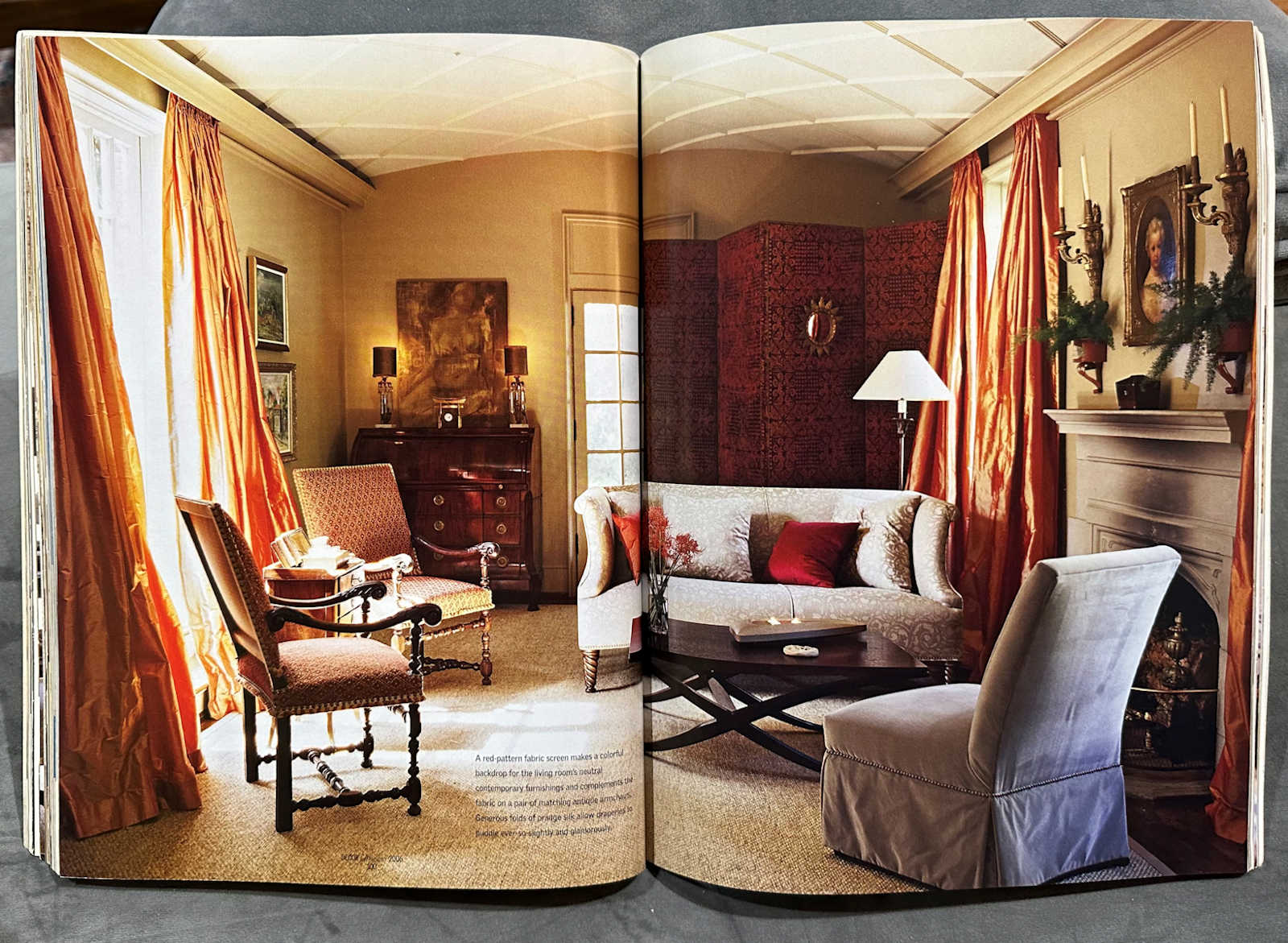
I’ve never been a paint-it-all-white farmhouse kind of person, but I’ll have to admit that I think so many of these rooms could fit in perfectly in 2023 with a can of white paint. Not that everything needs to be white, but some things could definitely stand to be lightened and brightened a bit.
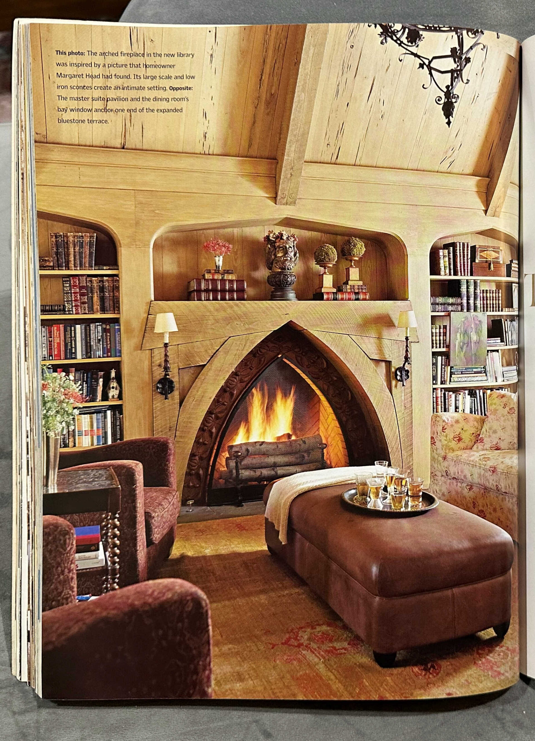
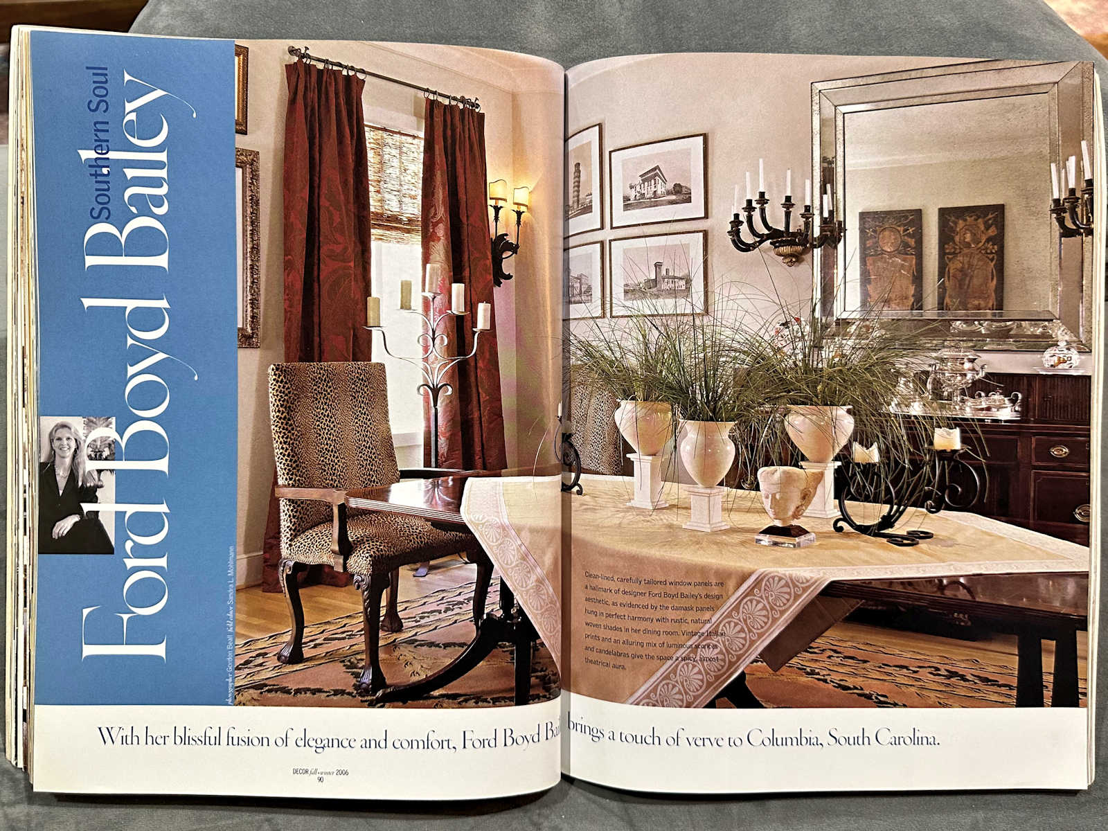
The heavy curtains, animal prints, all of the browns everywhere. I really do feel like the whole white farmhouse look was a pushback against this kind of decorating. I hadn’t realized it or understood it until flipping through this magazine and remembering just how popular these looks were back then.
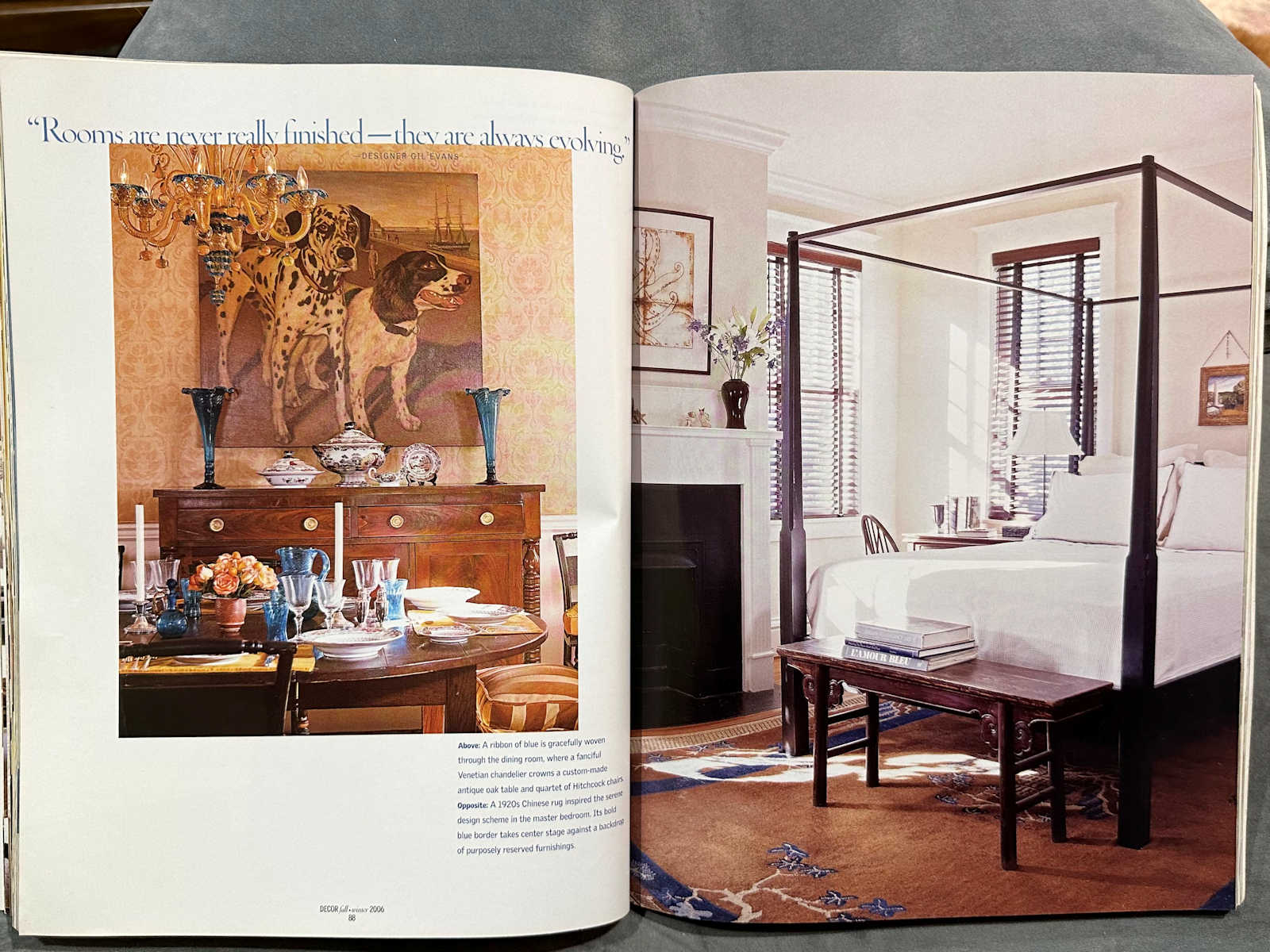
The bedroom below on the right is an example of the second category I mentioned above — very plain. There’s nothing to this room, and certainly nothing that looks “designed” about it to me. I don’t know that this would make the cut for most stunning room in 2023.
This one was probably the biggest shock to me. Not everyone in 2006 was doing the dark, heavy, overdone rooms. Kelly Hoppen was one of my favorite designers during this time. I remember being amazed at her modern minimalist aesthetic. I would sit in Barnes & Noble and look at her book, studying everything about her rooms and designs. So looking back at this, I was shocked.
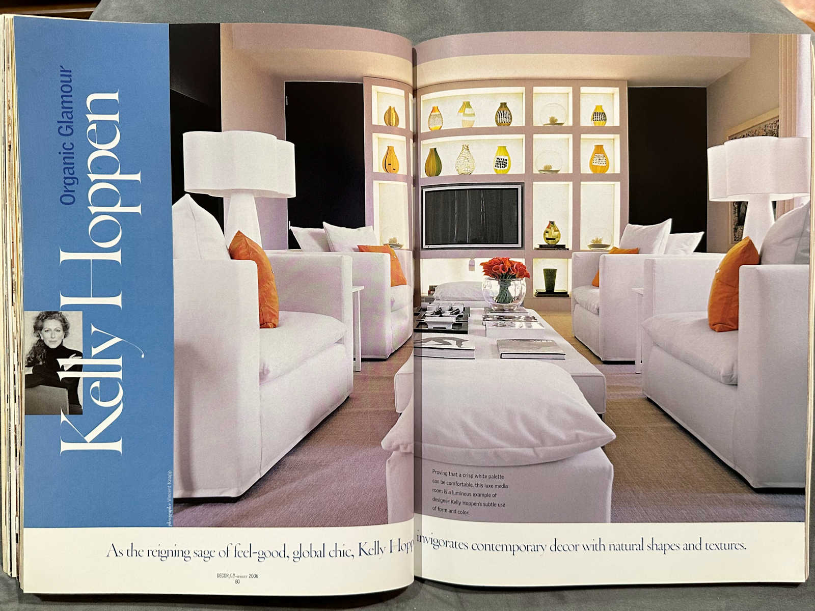
If someone showed me that picture without her name attached, and asked me to guess when and what it was from, I would have guessed that it was a Vern Yip Trading Spaces room.
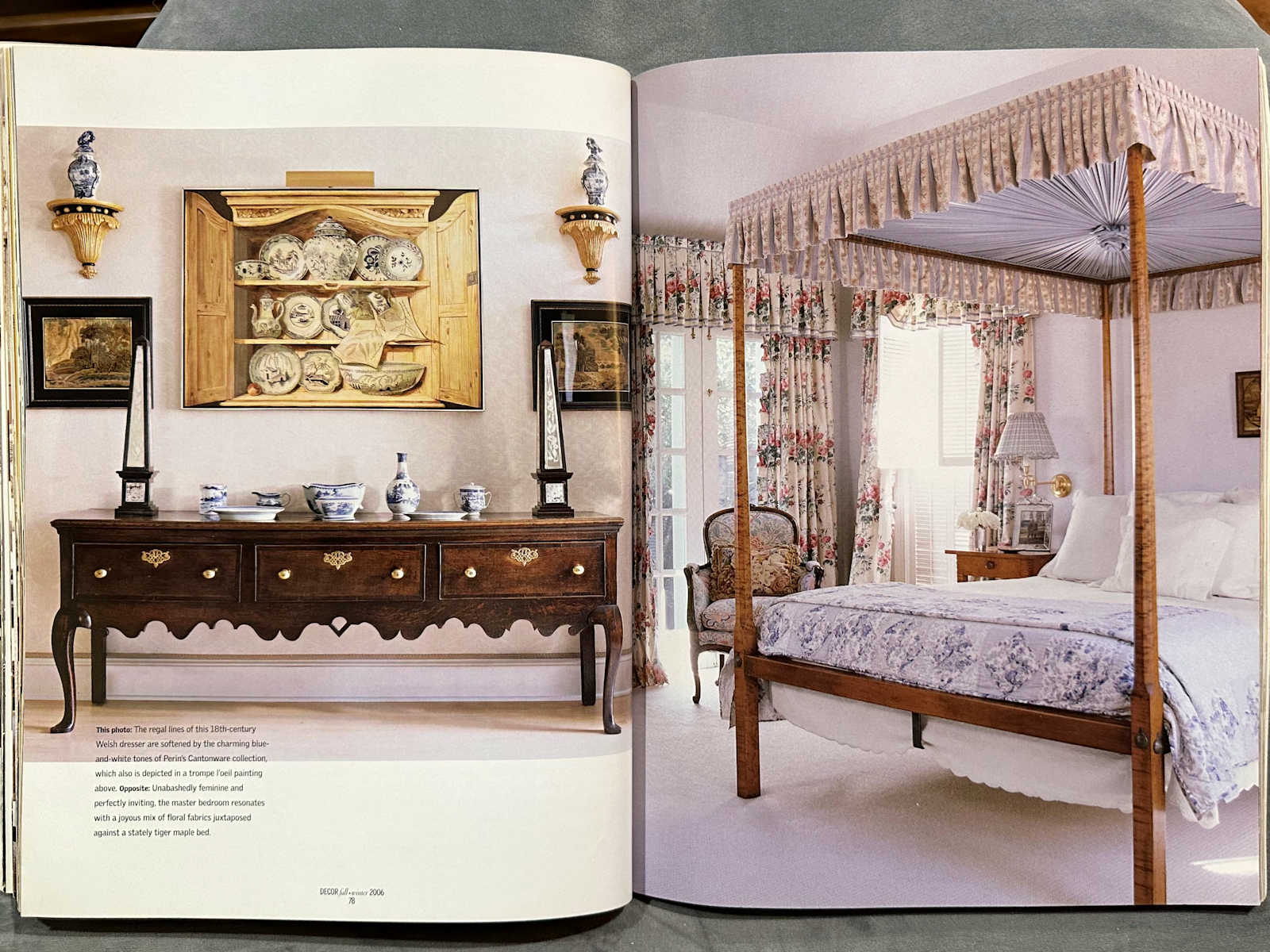
And then we’re back to overdone. But again, I honestly can’t tell if I would put this in to the “outdated” category, or if I would just put this into the “this is so not my style” category.

But this bedroom below on the right seems dated to me. I can’t help but wonder what it would look like today if they removed the valance from the windows and just had the drapery panels, and then removed the canopy from the bed.
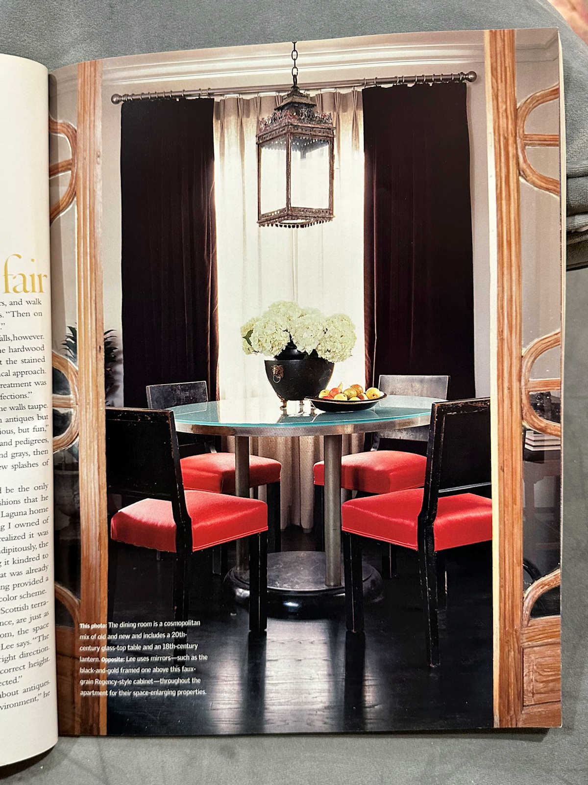
This dining room is definitely a 2006 dining room. I’ll leave it at that.
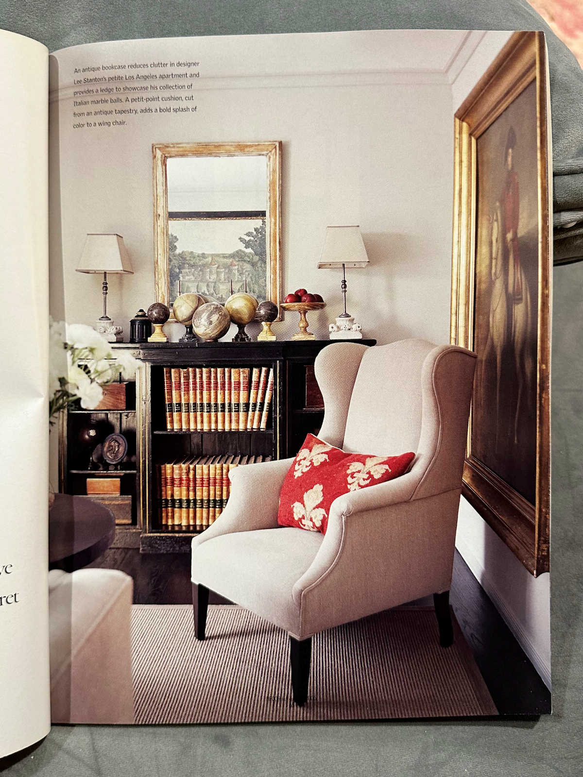
This little sitting area is one of the few pictures that I think looks timeless. I might swap out the lamps, but other than that, I think it’s really pretty.
This bedroom is another one of the rooms that falls into the plain category for me. The room is fine, but I think it’s way too plain to make the cut for “most stunning room ever” in 2023. I think we expect a whole lot more creativity from rooms that are going to be bestowed with that label these days.
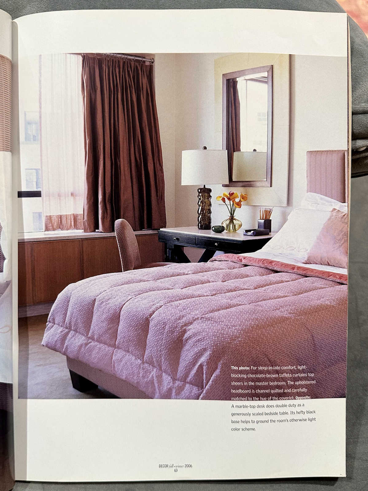
I have the same opinion of this room. The room is fine, but there’s no way it would be considered impressive today, much less “most stunning”.
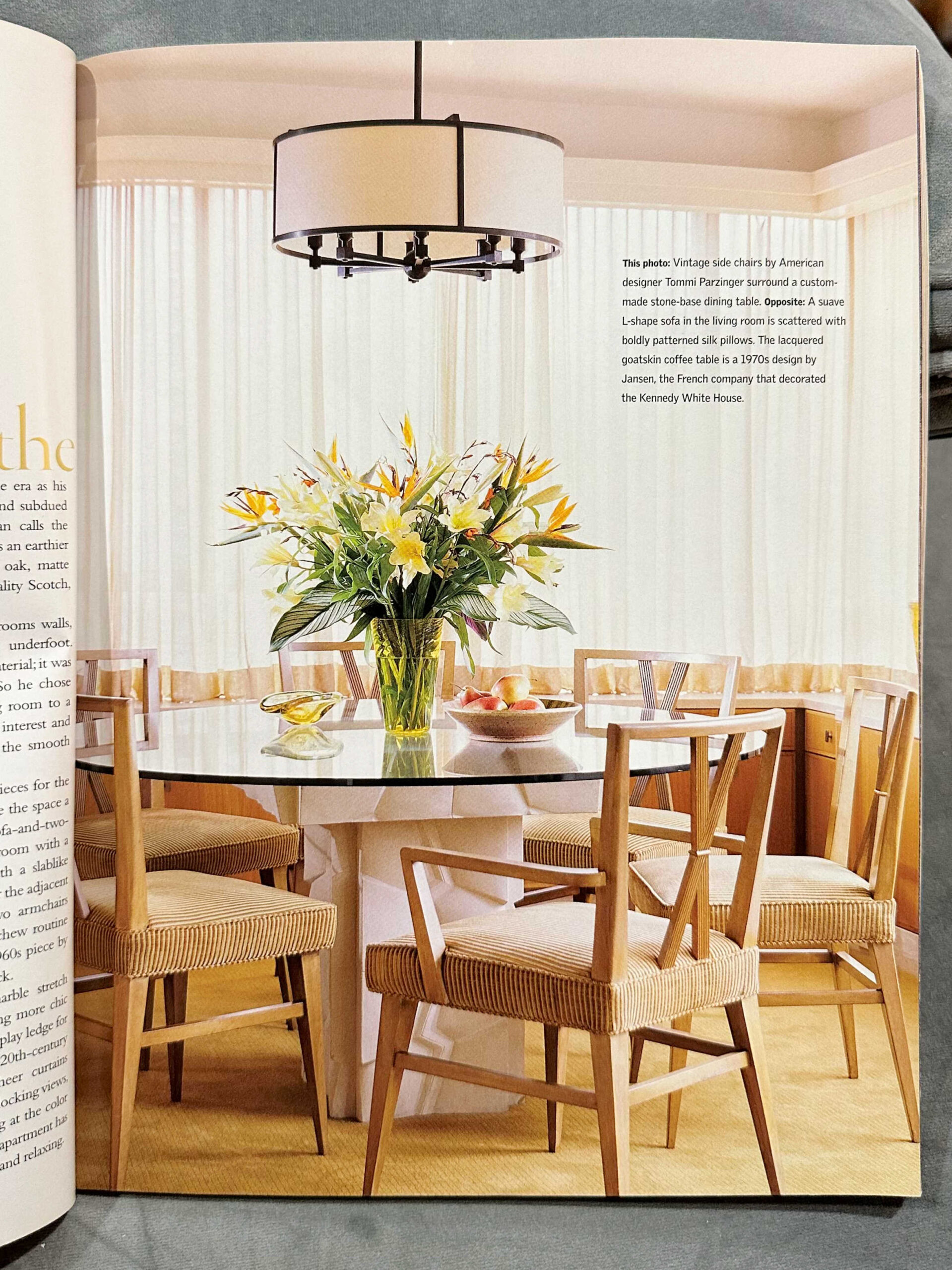
And again with this bedroom. It’s fine. If I walked into a house with this bedroom today, I would think it was nice. But it is not a “most stunning” room by today’s standards.
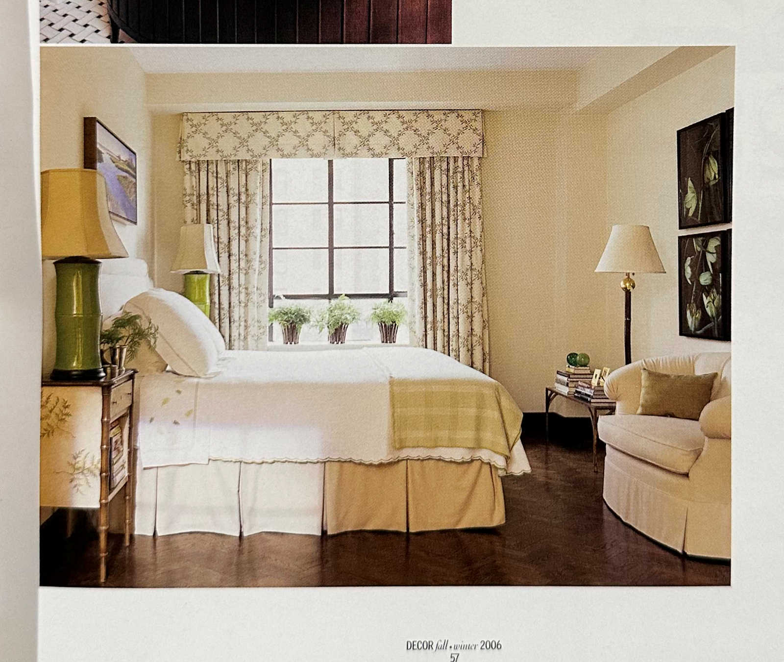
I think that since the advent of blogging and social media, we’ve just seen way too many people with way too much creativity and out-of-the-box thinking that we’ve come to expect really spectacular things from any room that we would deem “stunning”.
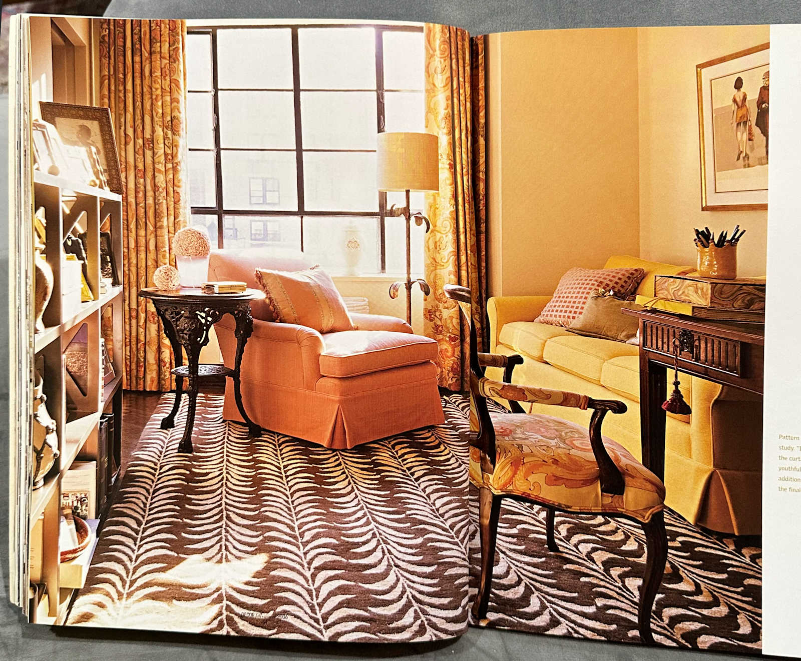
We didn’t have all of that back in 2006, so the bar for “most stunning” was relatively low. These days, we’re blown away by everyday homeowners DIYing their own homes and coming up with some of the most creative ideas ever. The bar has been raised considerably just because we have so much easier access to ideas.
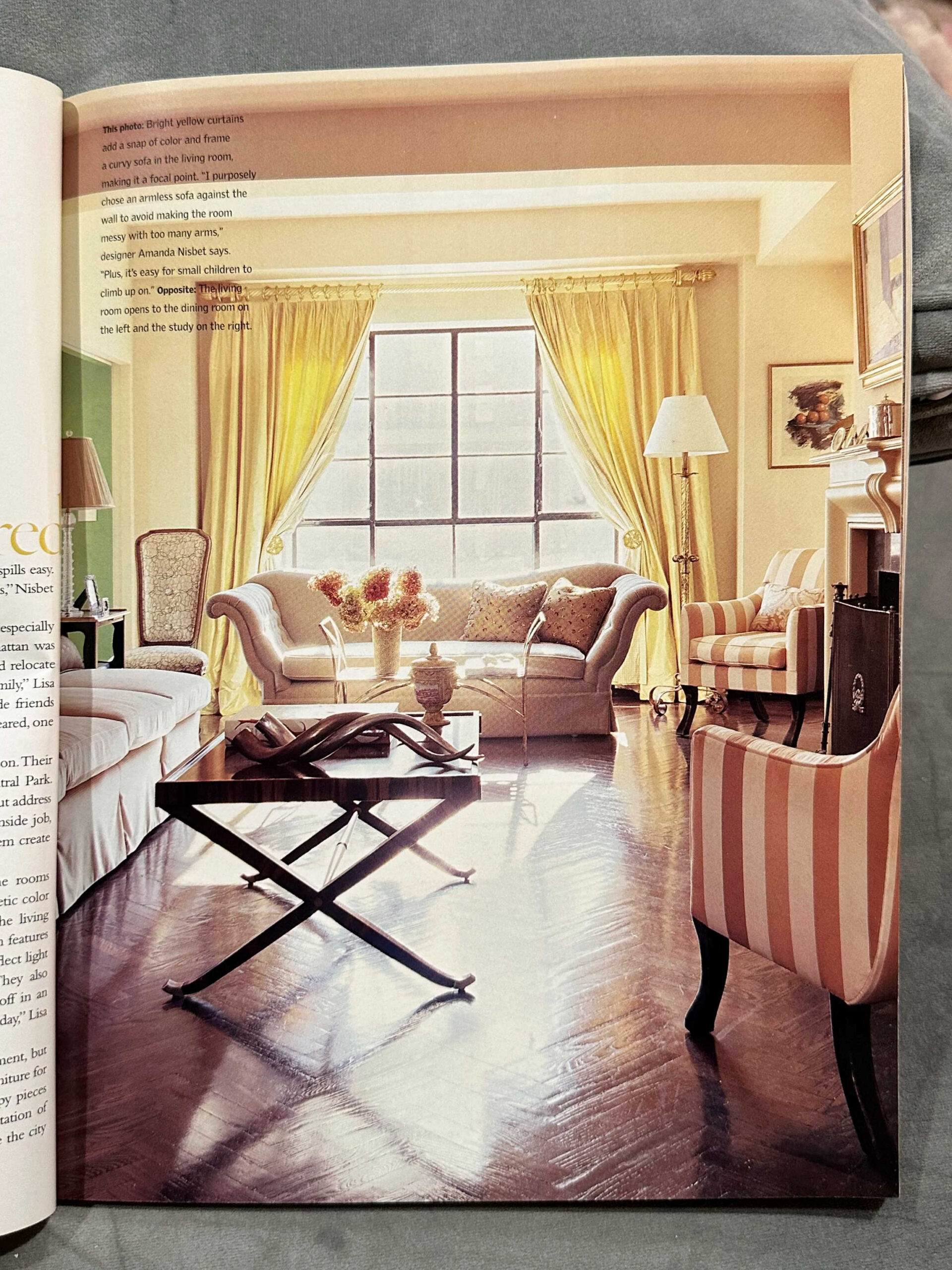
But I would love to go back and see what 200d6 Kristi thought of this room below. I can’t remember. But 2023 Kristi thinks that this room is best left in 2006. 😀
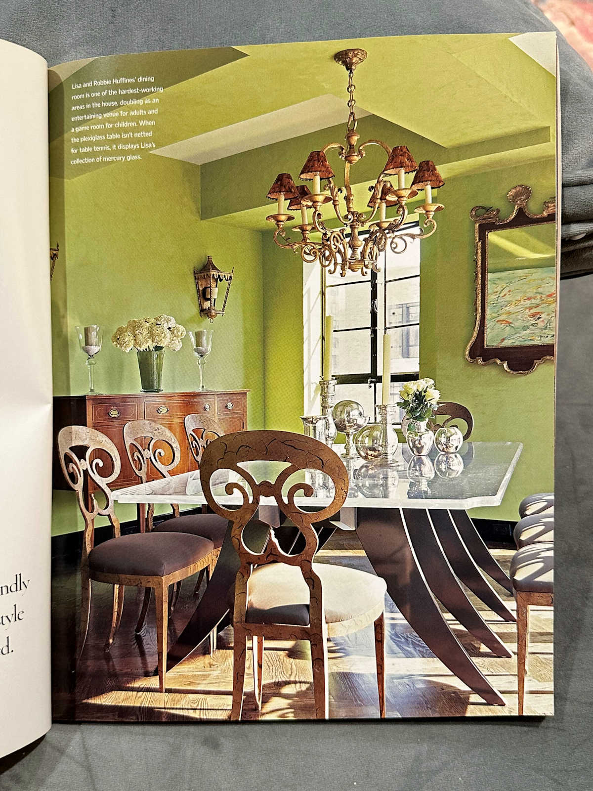
Anyway, this was a fun little walk down memory lane. I remember poring over this magazine several times, studying every little detail of every room. I truly was mesmerized with them.
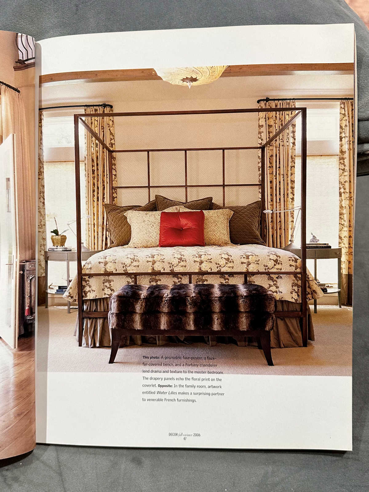
But are any of them truly timeless? That’s the question. Could any of these room show up just as they are in Instagram today and be considered current?
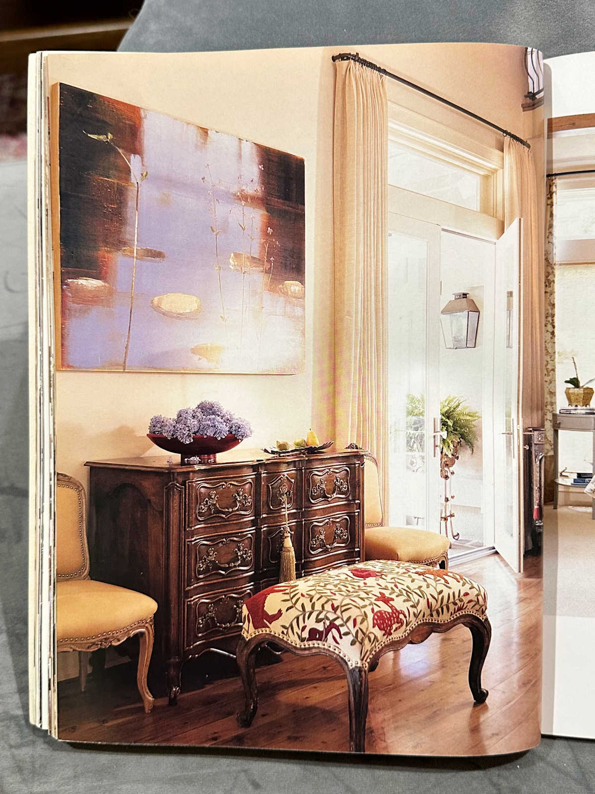
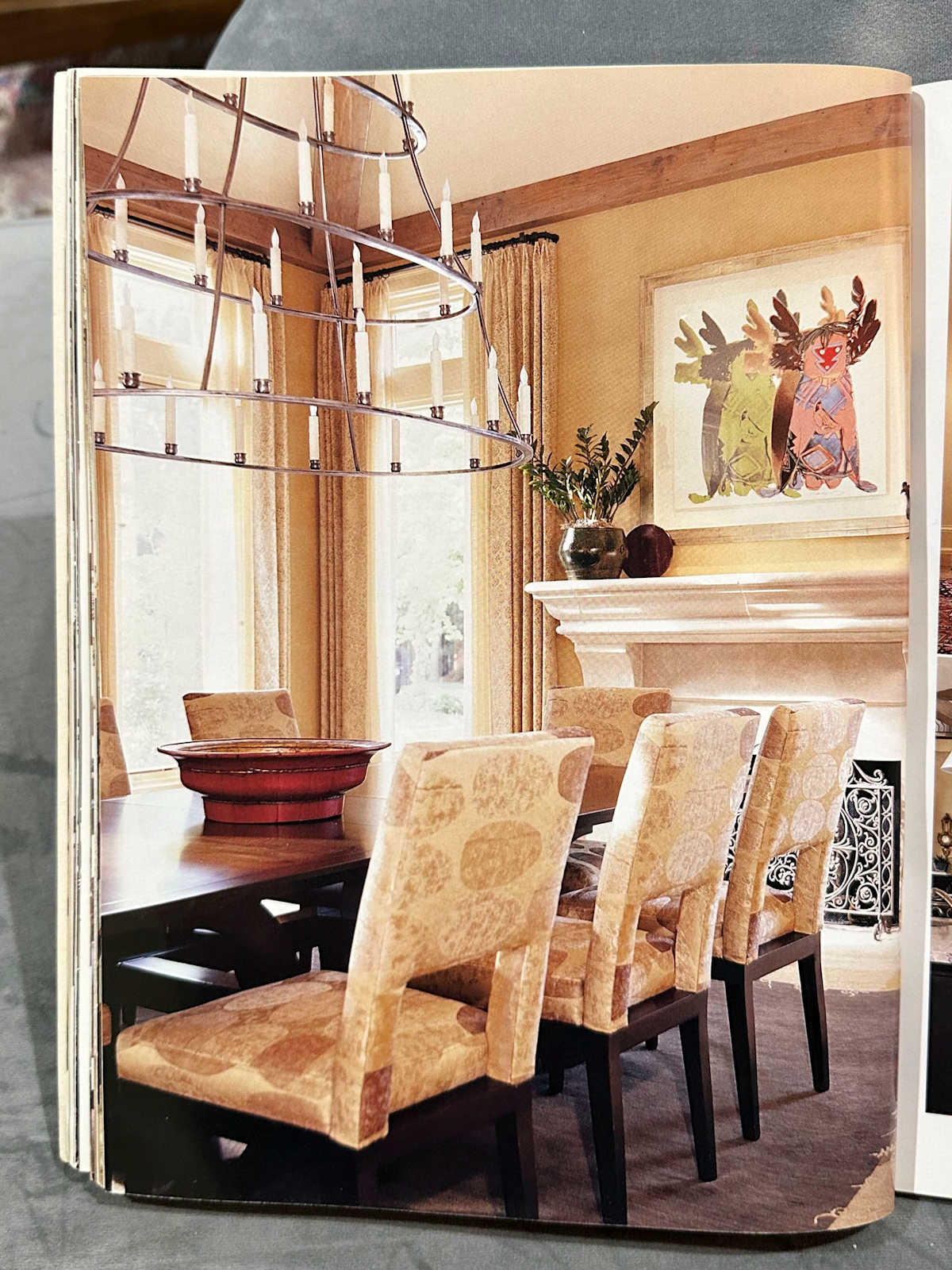
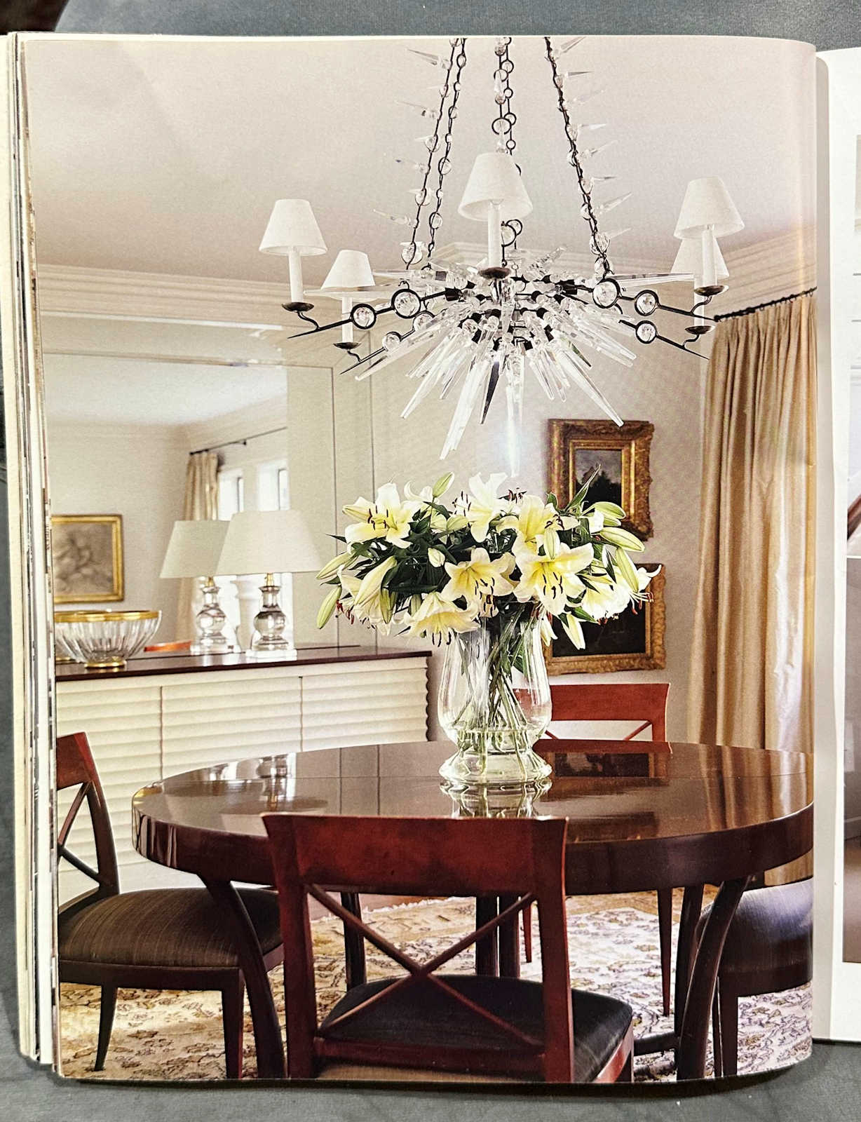
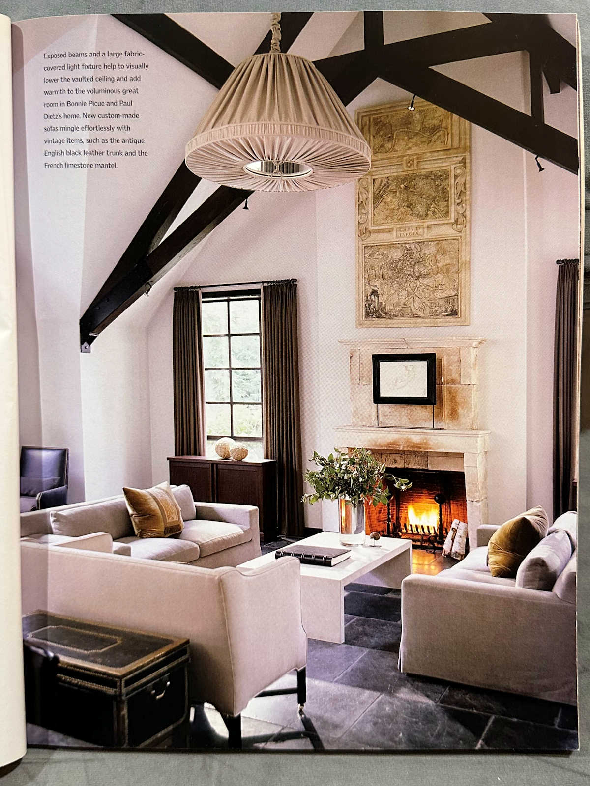
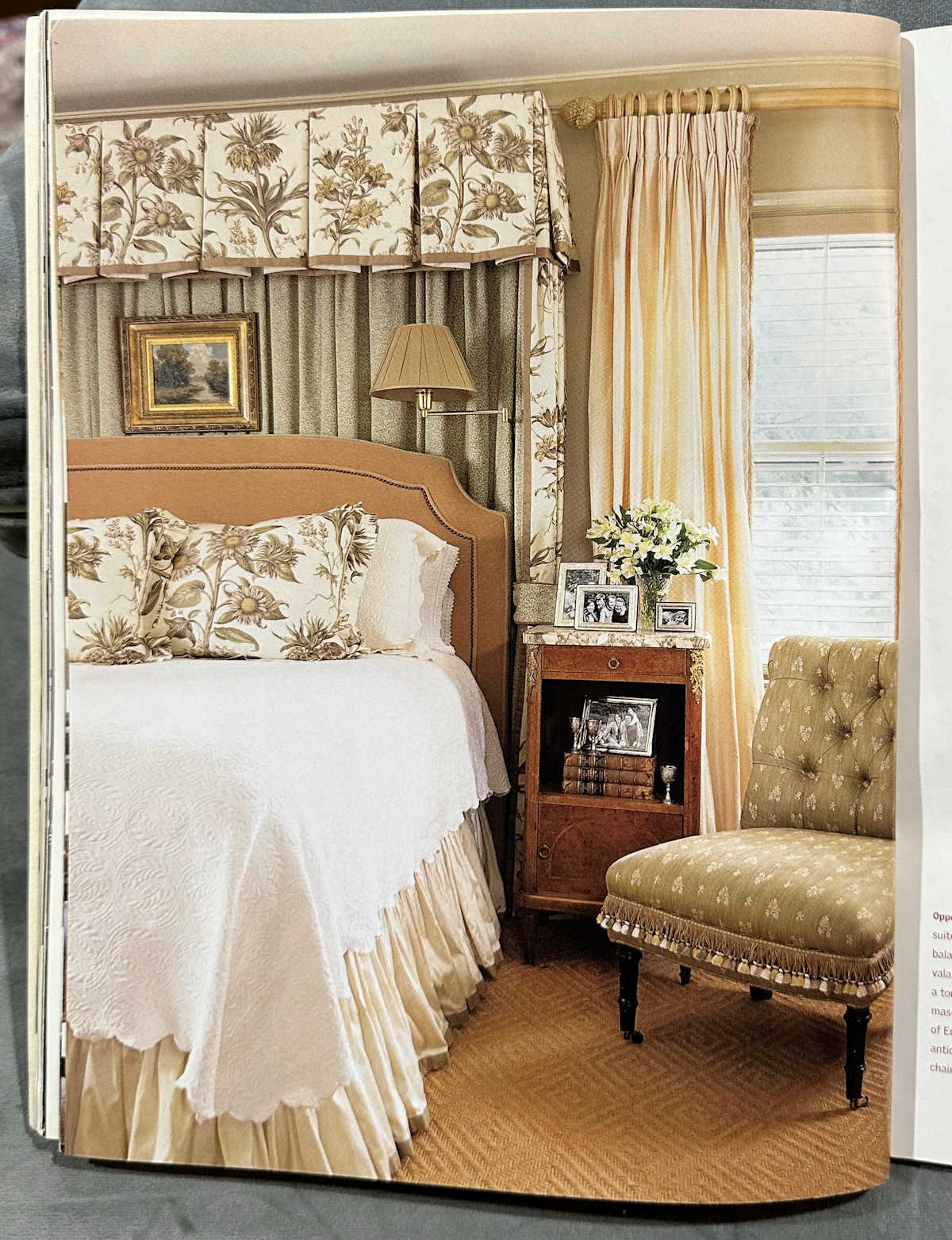
It seems like every single one of these rooms would need something tweaked or redone in order to be impressive in 2023. Do you agree? Or do you see some that look truly timeless to you? I’ll leave you with a few more without commentary. You can let me know what you think. Is there really any such thing as timeless design?





Addicted 2 Decorating is where I share my DIY and decorating journey as I remodel and decorate the 1948 fixer upper that my husband, Matt, and I bought in 2013. Matt has M.S. and is unable to do physical work, so I do the majority of the work on the house by myself. You can learn more about me here.
I hope you’ll join me on my DIY and decorating journey! If you want to follow my projects and progress, you can subscribe below and have each new post delivered to your email inbox. That way you’ll never miss a thing!
[ad_2]
Source link


