I have been around the color wheel and back in my effort to choose a new paint color for the back entry of the studio. If you’ll remember, I recently decided to bring the floral design to the back entry by having the floral pattern printed on fabric which I’ll use for curtains on the back French doors.
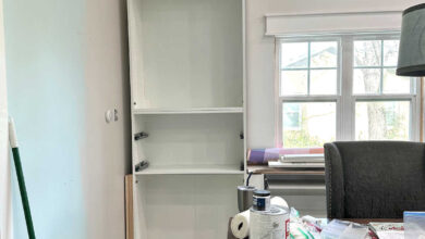
The back entry walls are currently painted green (I haven’t been able to track down the name of the color), but that particular green is all wrong for the mural and fabric. So I’ve been testing out different colors, and I just can’t seem to make up my mind.
My first thought was to go with a dark blue or dark purple. In my mind, going dark would allow the walls to contrast beautifully with the slightly purplish medium pink (Sherwin Williams Tuberose) that I plan to put on the studio cabinets. So I tried two Behr colors — Vintage Velvet, which is kind of a purplish blue, and Black Sapphire, which is the super deep purple that I used on the buffet in the breakfast room (sitting room). You can see these below, with Vintage Velvet on top, and Black Sapphire on bottom.
I ruled out Black Sapphire immediately. In this area, it just looks black. I can’t tell any difference between the Black Sapphire and the black door. Here’s what it looks like in the breakfast room…
So of those two, the only real option is the Vintage Velvet. On the sample card, this color looks a lot more like a dark blue. But once I got it home, and accidentally spilled it in the carport (oops! 😀 ), and then put it on the wall, I could see a whole lot more purple in the color. I used my photo editing software to expand the sample so that it covers that whole wall, so this might not be 100% accurate, but it will give us a pretty good idea of what it would look like.

I really like this color, but I’m just unsure about it with black doors. I don’t think those play nicely together. I’m not totally opposed to painting the doors, but the only other door color I think would work with this wall color is white, and y’all know how I feel about white doors. Bleh. White doors are always my absolute last choice. But again, I’m not totally opposed to it if this wall color is the best option, and if it would work better with white doors.
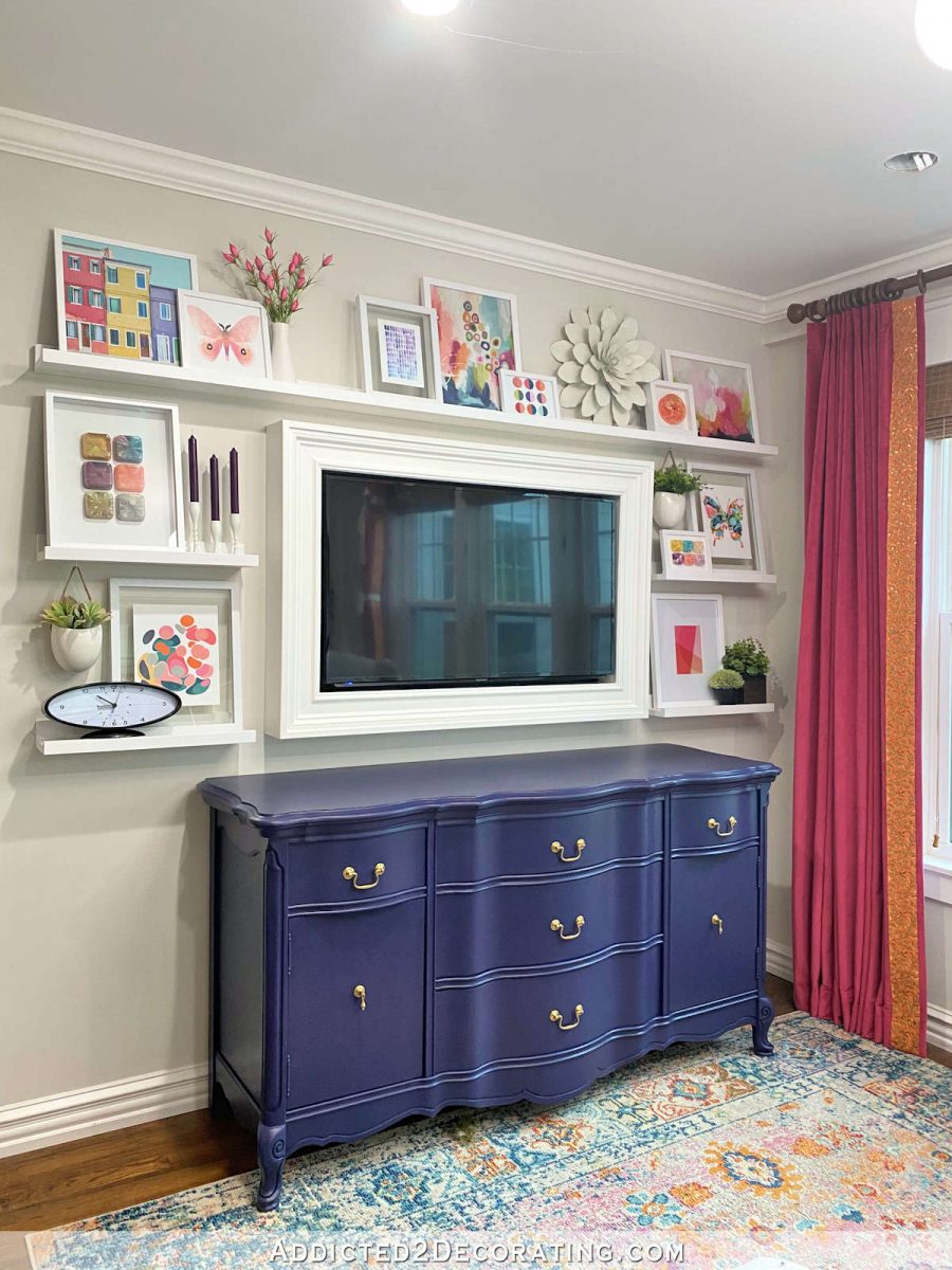
The main thing I’m concerned about is that the back entry wall color needs to work well with the color that I plan to put in the cabinets in studio. The paint color is called Tuberose from Sherwin Williams, so to see how they work together, I just copied and pasted a sample right onto the photo. Of course, in reality, these colors won’t be this close together.

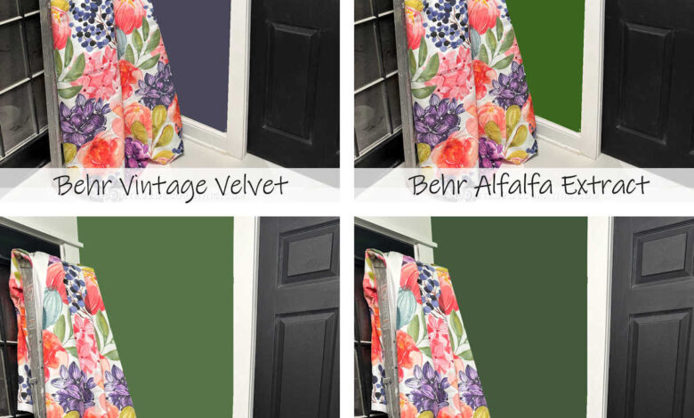
The only other color I think will work for the walls is green, but the green that’s currently on the walls is completely wrong for the fabric and wallpaper mural. So I took a scrap of wallpaper to Home Depot to choose a new green, and I narrowed it down to two — Scallion on the left and Trailing Vine on the right. The Trailing Vine doesn’t exactly come from the wallpaper, but I preferred the depth of color on that sample, so I thought it might work even though it doesn’t exactly match any of the colors in the leaves.
But when I got the samples on the wall (Scallion on top, and Trailing Vine on bottom), I wasn’t thrilled with either one of them. But that could be the original green throwing everything off. I do like the greens with the black doors, though.

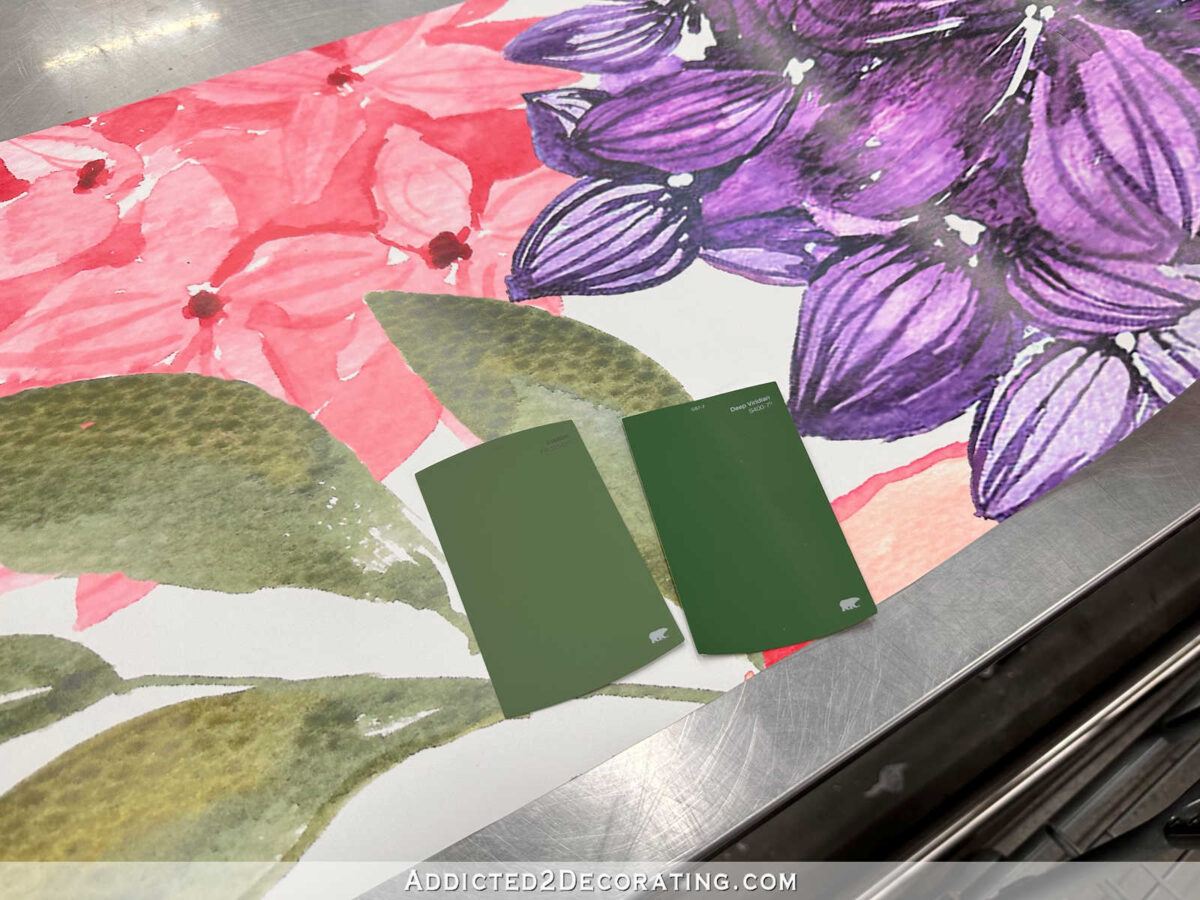
Since I wasn’t completely sold on either one of these, I rummaged through the other samples to see if any of them caught my eye. I thought that this one, called Alfalfa Extract, looked really nice with the fabric. (See the paint sample taped to the fabric?)

You can see that it’s darker than the original green, but it’s brighter and truer green than the new samples.

Here it is against the original green so that you can really see the difference.

So here are those three colors on the whole wall (which I did with my photo editing software, so the real thing might be slightly different). This is the Behr Alfalfa Extract.

And here’s the same color with the cabinet paint color sample.

Here’s what Behr Scallion might look like on the whole wall…

And here’s that same color with the cabinet color sample.

And finally, here’s what the Behr Trailing Vine might look like on the whole wall…

And here it is with the cabinet paint color sample.

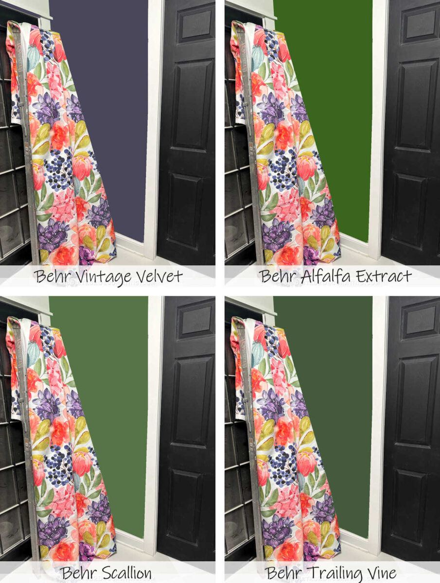
So here are the four options all together. From left to right, (1) Vintage Velvet, (2) Alfalfa Extract, (3) Scallion, and (4) Trailing Vine. I really do like the Vintage Velvet, but I don’t love it with the black doors. Of the greens, I’m quite shocked, but the one that stands out to me is Scallion. But I just can’t seem to make up my mind.

Addicted 2 Decorating is where I share my DIY and decorating journey as I remodel and decorate the 1948 fixer upper that my husband, Matt, and I bought in 2013. Matt has M.S. and is unable to do physical work, so I do the majority of the work on the house by myself. You can learn more about me here.
Source link