Yesterday’s post about the four color options for the studio back entry walls didn’t clarify anything for me. (If you missed that post, and didn’t see the four color options, you can see them here.) There was a definite winner. The crowd favorite was unmistakably Behr Scallion.
And I was fine with it. I was gearing up to paint my walls Behr Scallion…until I walked into the room around 6:00pm yesterday and saw the sample colors on the wall in natural light at that time of day. It was immediately a hard no from me. That green that looked so nice and unmistakably green during the brightest part of the day had turned into a dark, muddy, brownish green. I know that kind of green is very popular right now, but it’s not popular in my house and to my eyes at all.
So that was disappointing. The other greens weren’t any better, so all of the greens are out. And since I’m clearly not 100% sold on the Vintage Velvet color either, I decided to start doing some mock ups based on the suggestions that I found in the comments on yesterday’s post. And my goodness, did y’all have suggestions! 😀
I couldn’t mock up every single one of them, and really, many of the suggestions were the same or variations on a theme. So I’ll share the ones that caught my attention.
Many of you suggested painting the walls the cabinet color. I actually really like this! I do wonder if it would end up being too much of a good thing, though. Or maybe it would bring balance to the room with the back entry walls and the cabinets on the opposite side of the room being the came color. It’s hard for me to tell. Too much? Or great balance?

Several people suggested painting the walls a lighter version of the cabinet color. That would be something like this…

And then a couple of people suggested going a darker shade of the cabinet color. I actually really love this.

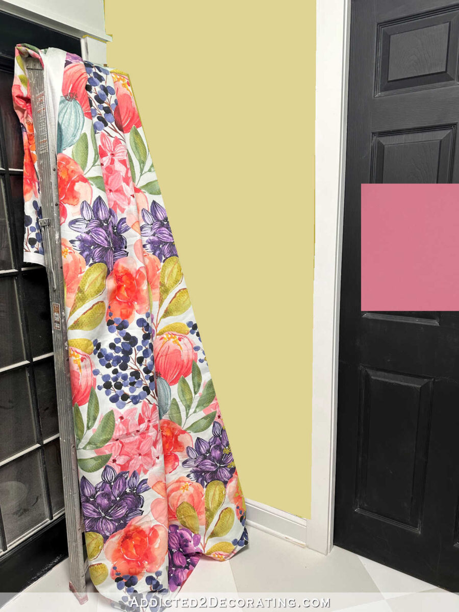
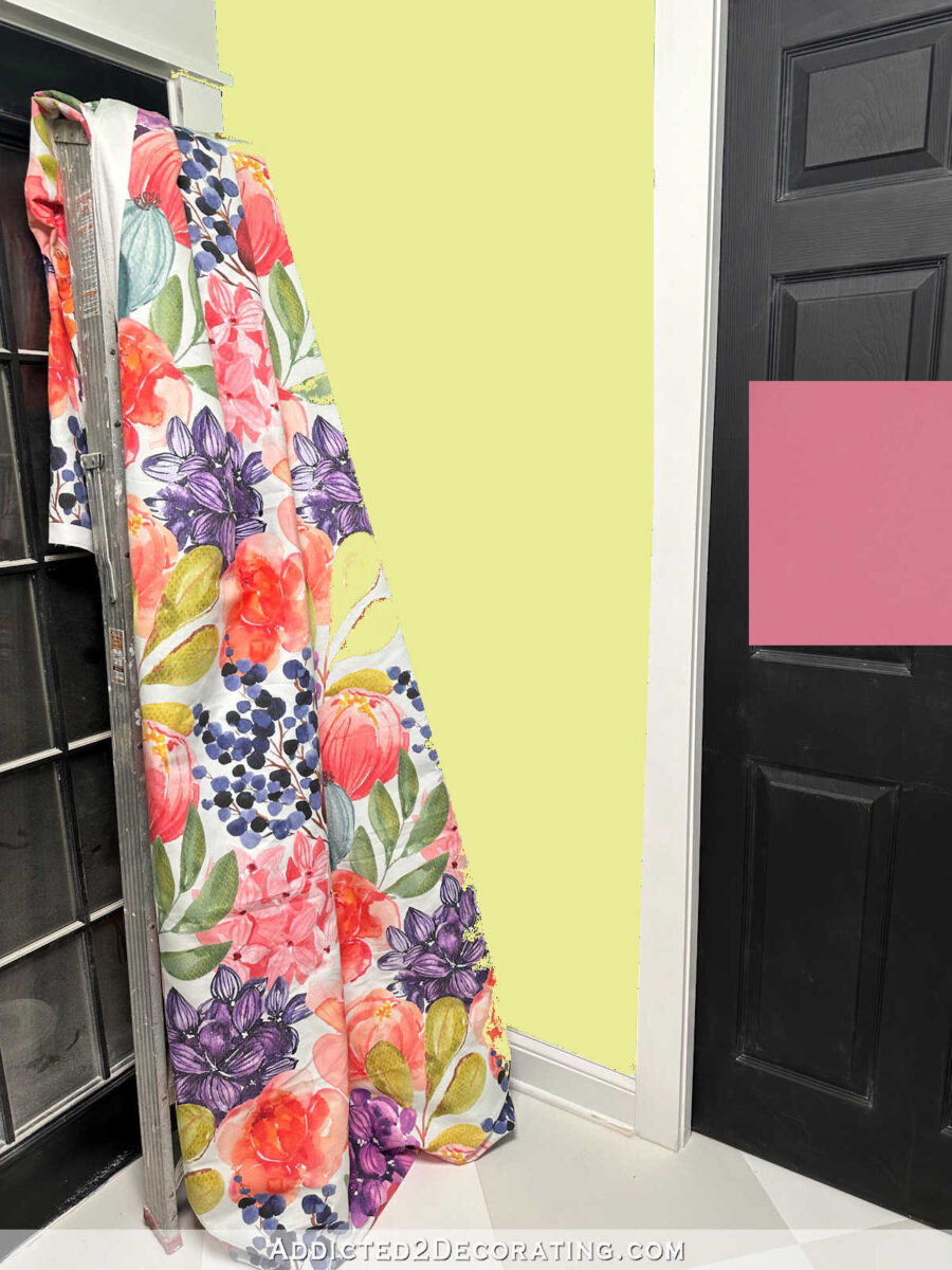
So many people suggested colors in the gold, greenish yellow, citron families. Here’s a greenish yellow…
This one is more of a buttery yellow…

And then a truer gold color…

And here’s one that’s more of a citron color…
Next up, there were several suggestions for colors in the orange and peach color range. This is probably as orange as I could go…
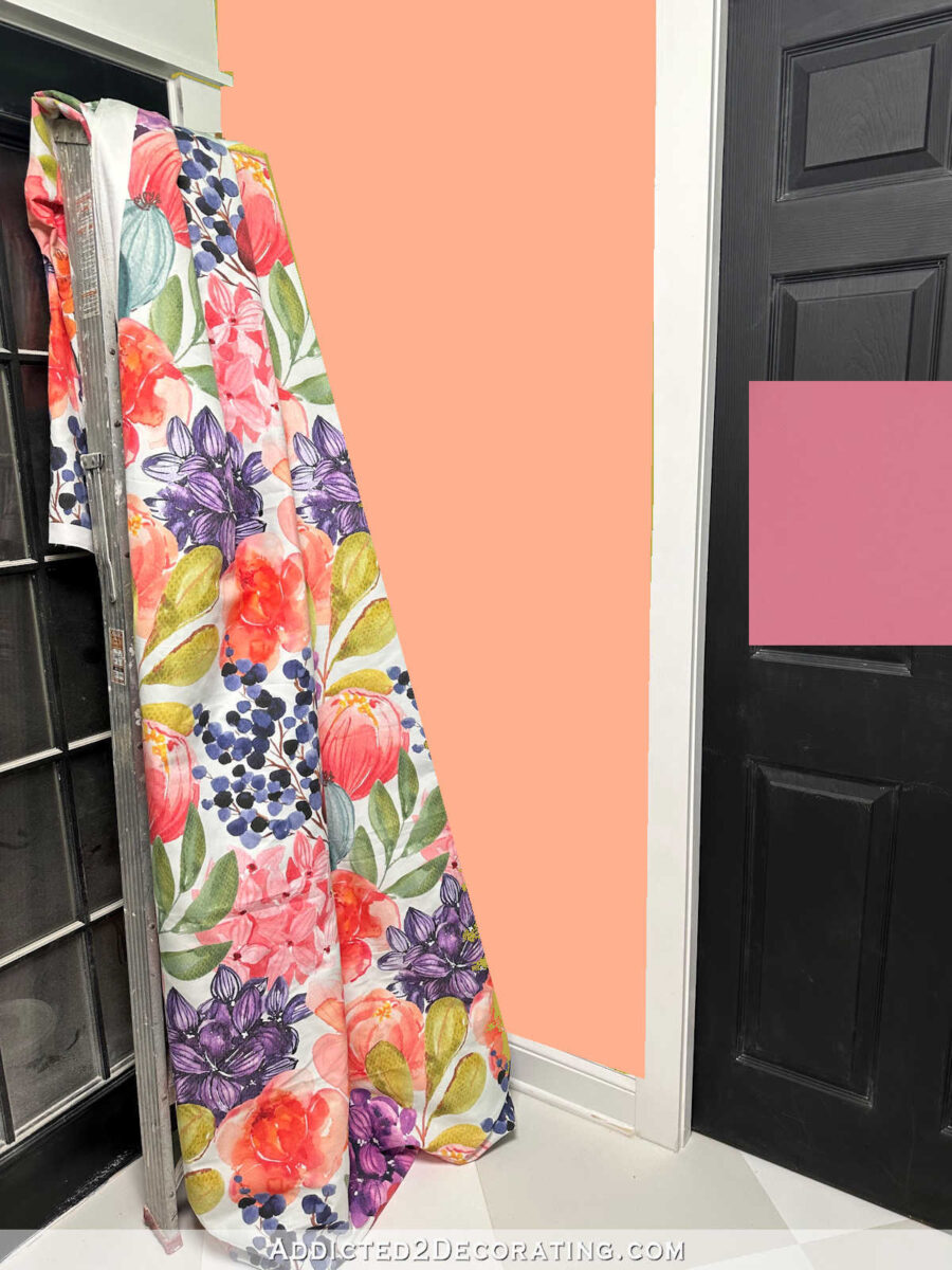
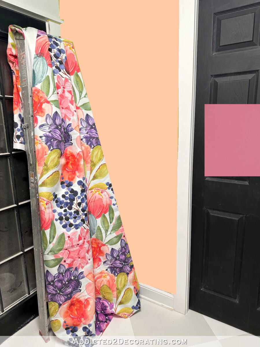
And this is a little lighter…

And then a little lighter still…
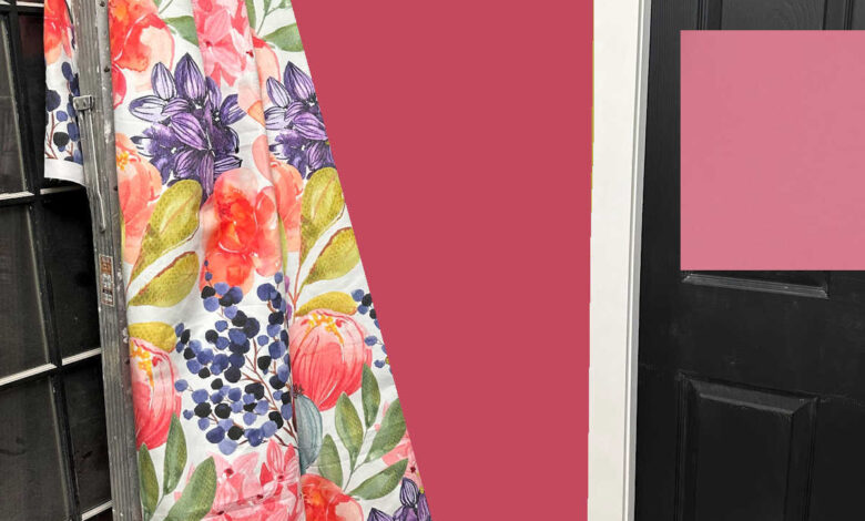
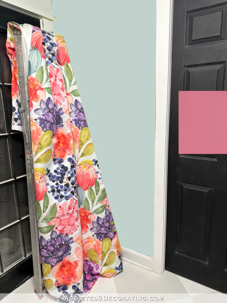
Next up were the blue and teal suggestions. Those teal flowers that are on the top left edge of the fabric (are those even flowers?) aren’t as prominent or bold as the other colors, but that’s where I got the blue-green color that’s on the walls of the studio (which I am willing to repaint, by the way). So here’s a very light blue-green. It almost looks blue-gray.
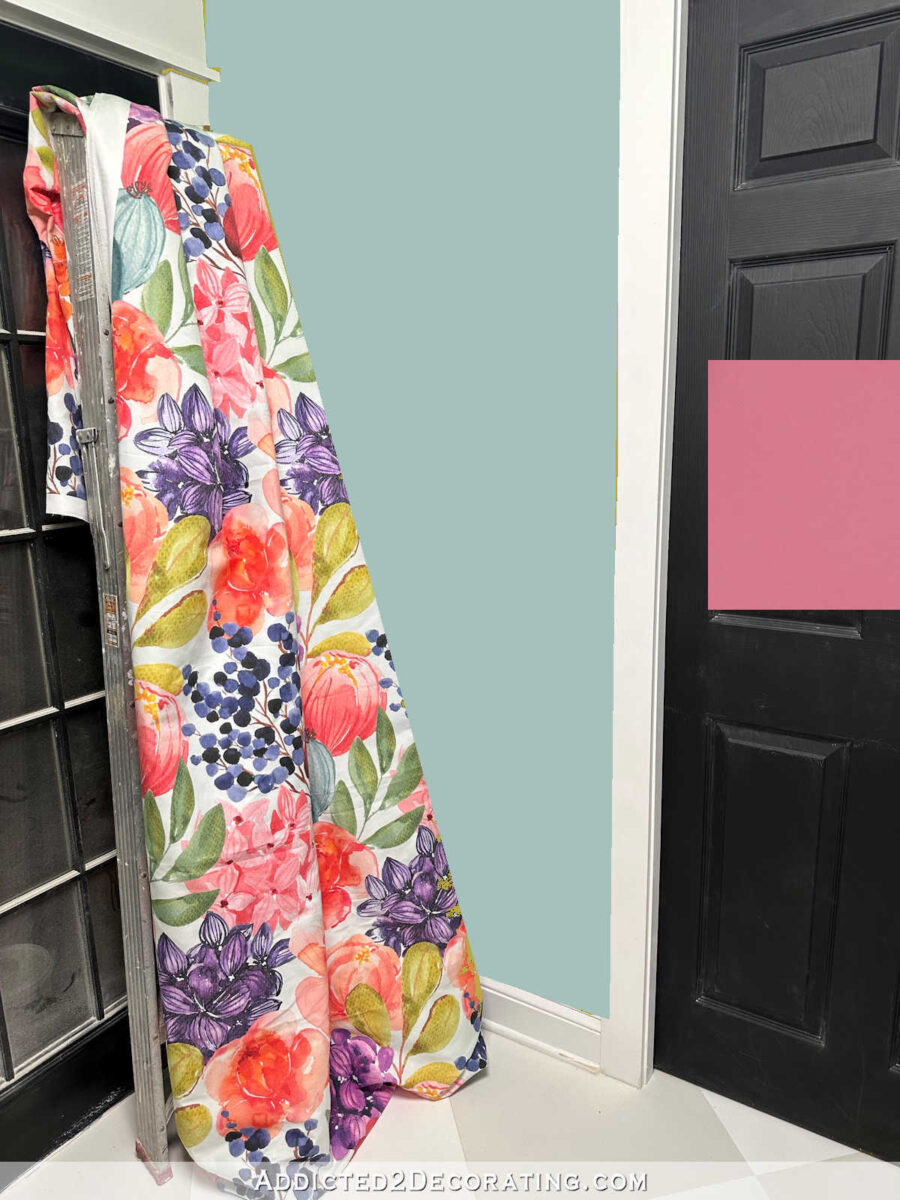
And then here’s a little darker blue-green…
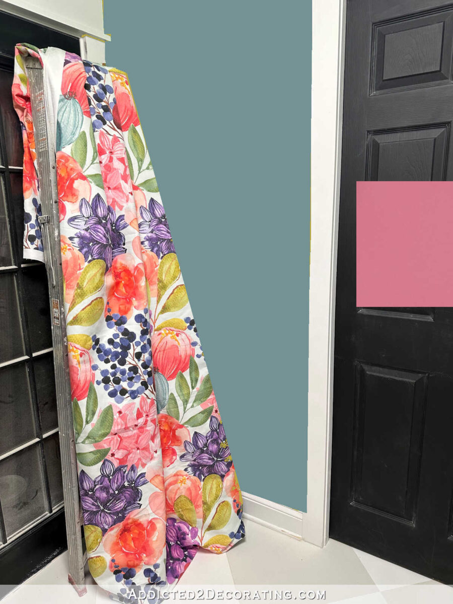
And then even darker…
And of course, several people suggested truer and lighter purples. The problem is that I’m very particular about purples, and I only really like purples that have a lot of blue in them, or purples that are really deep. Once we start venturing into the light purples, lilacs, periwinkles, etc., I’m not a fan. Those just remind me of Easter egg colors, and I don’t like them in large quantities in my house. But since they were suggested many times, I thought I’d do mock ups anyway.
Here’s a medium-light purple…

And here’s one that’s more in the lilac range…

And an even lighter lilac color…

I’m sure I could have done more, but they would have just been variations of the above themes. I think I’ve pretty much exhausted the main suggestions. So what stands out to you? Any of these?
I do want to note that (1) white walls in the back entry are not an option, and (2) painting the walls in the studio is an option, and I would actually consider white for the studio walls.

Addicted 2 Decorating is where I share my DIY and decorating journey as I remodel and decorate the 1948 fixer upper that my husband, Matt, and I bought in 2013. Matt has M.S. and is unable to do physical work, so I do the majority of the work on the house by myself. You can learn more about me here.
Source link