Tanya Watson Shows Her Lake House Makeover — Lake House Renovation Before and After
[ad_1]
Courtesy of danslelakehouse.com
Tanya Watson, the blogger behind Dans le Lakehouse, leaned on a fresh color palette to transform her dated lake house into an airy oasis.
She designed her home’s palette around the artwork of her late grandfather-in-law, renowned painter Bert Weir, which hangs throughout the house. Sticking to variations on a single shade makes decorating simple: “I can just toss something in the air, and wherever it lands, it’ll look great,” she says.
Living Room
Try a unifying dark shade.
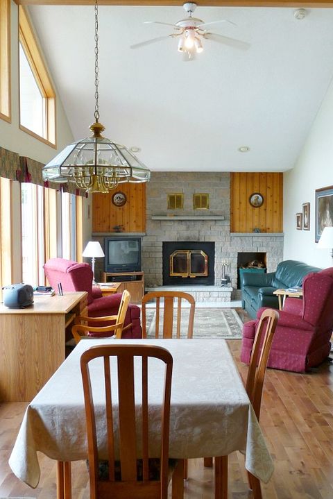
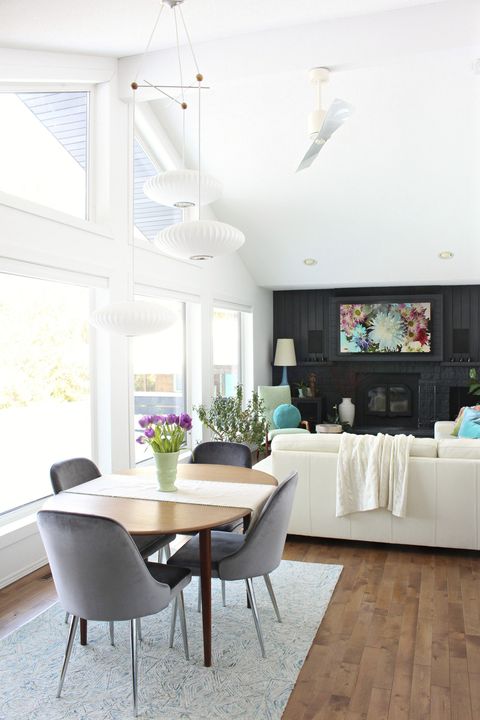
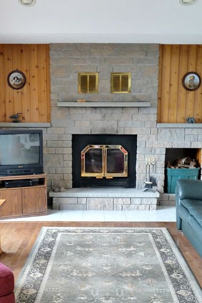
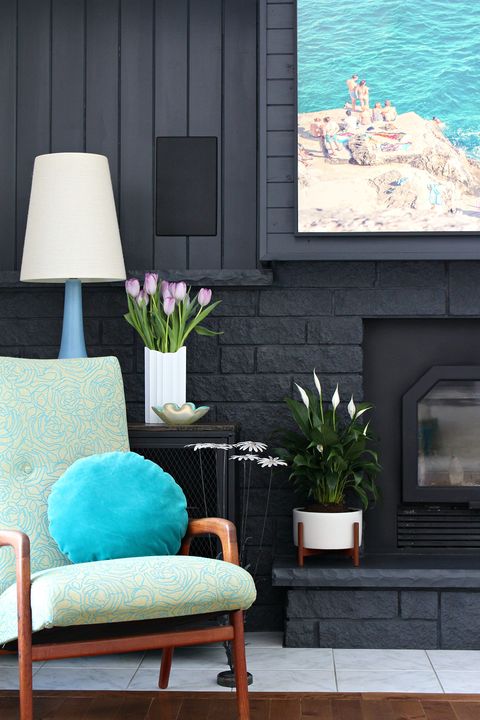
An array of colors and textures made the room lake dated and disjointed. Instead of removing the wood paneling, faux stone and old brass fixtures, Tanya painted everything a deep charcoal. Not only did it create a focal point that ties the room together, but the area also now feels longer and more spacious.
Get the look: Accent Wall Color, Behr Evening Hush, .
Hang your TV.
Mounting the television above the mantel freed up floor space. It doubles as art when the TV is off.
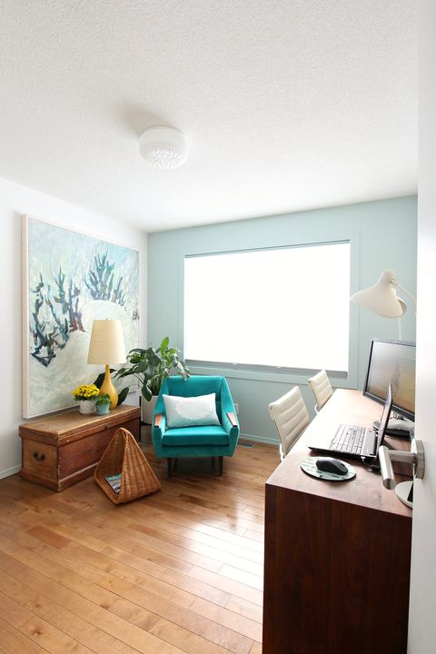
Office
Turn trash into treasure.
Tanya found the blue chair on a curb. She had it upholstered in a hue to match the art, painted by her husband’s grandfather.
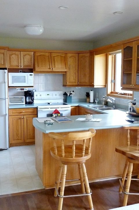
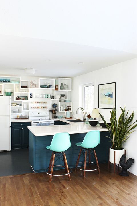
Kitchen
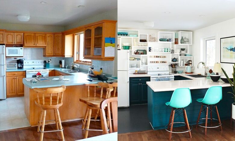
Forgo uppers.
Awkwardly placed cabinets weren’t functional and made the small kitchen feel claustrophobic. By replacing them with a collage of cubbies and acrylic floating shelves, Tanya maximized storage while creating a decorative display. Open shelves make the room look light and clean.
Get the look: Clear Acrylic Rack Shelves by NIUBEE, amazon.com.
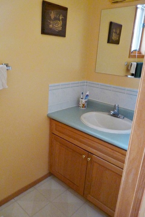
Bathroom
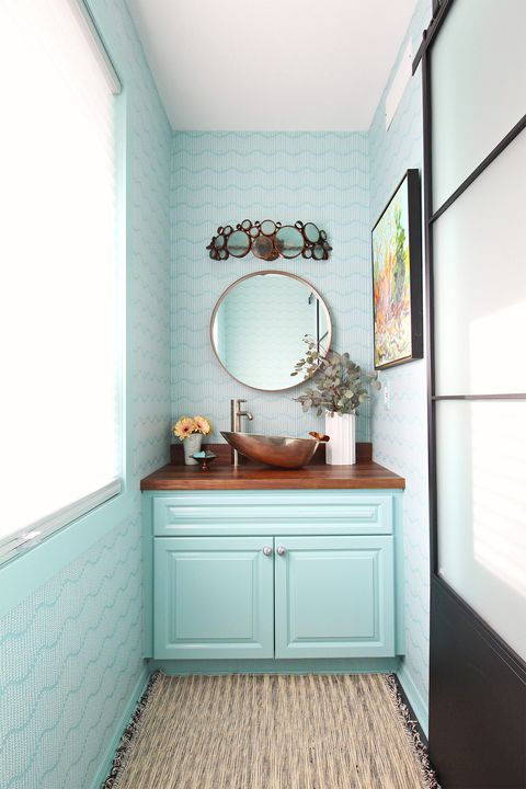
Wallpaper a powder room.
A basic sink and a half-hearted backsplash lacked pizzazz. Papering the walls from floor to ceiling gives this narrow powder room extra height. A copper bowl sink echoes the round mirror and light fixture to tie it all together.
Get the look: Sprigs on Ocean Wallpaper by Ginger Creations, spoonflower.com; Walnut Stockholm Mirror .
Entryway
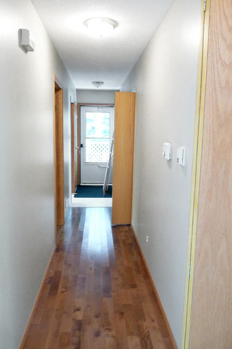
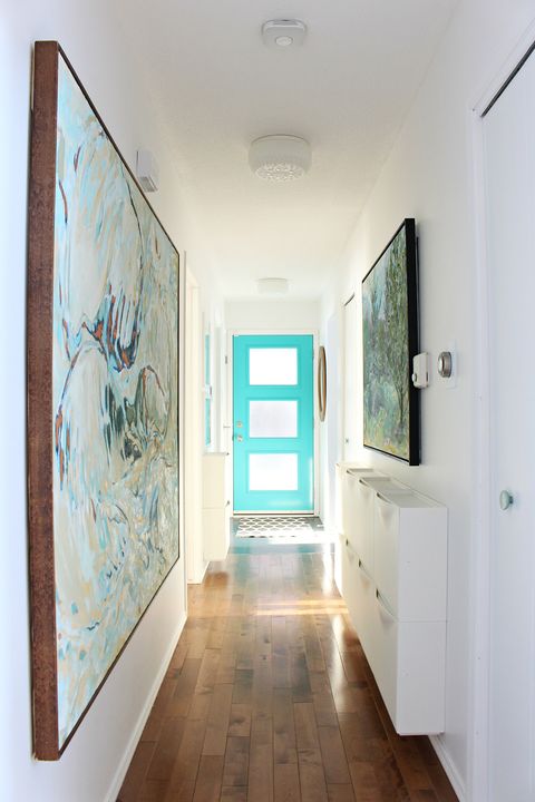
Line a hall with cubbies.
Blank walls were just wasted space in this empty corridor. Tanya can now store shoes, outerwear and other supplies right where they’re needed while keeping everything in its own place.
Front Deck
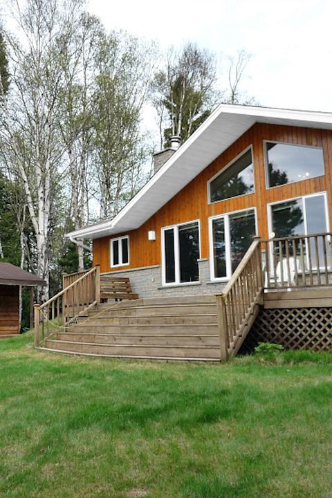
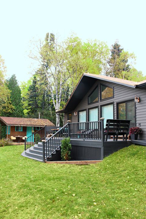
Paint everything tone on tone.
Wood paneling and natural steps looked weather-worn. Rich, deep colors on the siding and the deck help the lake house stand out amid its natural surroundings and keep it looking fresh in punishing northern winter weather.
A version of this feature appeared in the May 2020 issue of Good Housekeeping.
This content is created and maintained by a third party, and imported onto this page to help users provide their email addresses. You may be able to find more information about this and similar content at piano.io
[ad_2]
Source link


