The product-led growth behind edtech’s most downloaded app – TechCrunch
[ad_1]
Duolingo CEO and co-founder Luis von Ahn was tired of the gray and dreary design aesthetic edtech companies used to emulate universities. Instead, he and the company’s early team sought inspiration from games like Angry Birds and Clash Royale, looking to build a class that screamed more cartoon anarchy than lecture hall. From that frenetic creativity came the company’s distinctive mascot: a childish and rebellious evergreen-colored owl named Duo.
Duolingo didn’t just throw out the old colors though — it wanted to completely rethink language learning from the bottom up for mobile. So it replaced top-down curriculums with analytics-driven growth strategies, becoming consumed by an ethos that has more recently been dubbed product-led growth.
Used by companies such as Calendly, Slack and Dropbox, product-led growth is a strategy in which a company iterates its product to create loyal fans-turned-customers who popularize the product with others, creating a viral growth loop. It’s an attractive route because it vastly lowers the cost of acquiring users while also increasing engagement and thus retention. Duolingo, for example, has taken this model and found ways to embed engagement hooks, pockets of joy and addictive education features within its core app.
With early venture capital in its pocket, Duolingo could afford to focus on product over profits.
In part one of this EC-1, we explored how von Ahn’s previous products around CAPTCHA led to Duolingo’s launch, the rise and fall of crowdsourced translation as a way to disrupt language learning, and the accidental iteration of a top education app by a pair of interns. The startups’ early signs of success gave it energy to focus on growth to accomplish two things: know what they’re doing works, and garner a lot of user data so it continued iterating the product into something that was ever more addicting to use.
Now, we’ll analyze how Duolingo used product-led growth as a lever to expand its consumer base, and how a company built on gamification tries to balance its whimsy with education outcomes.
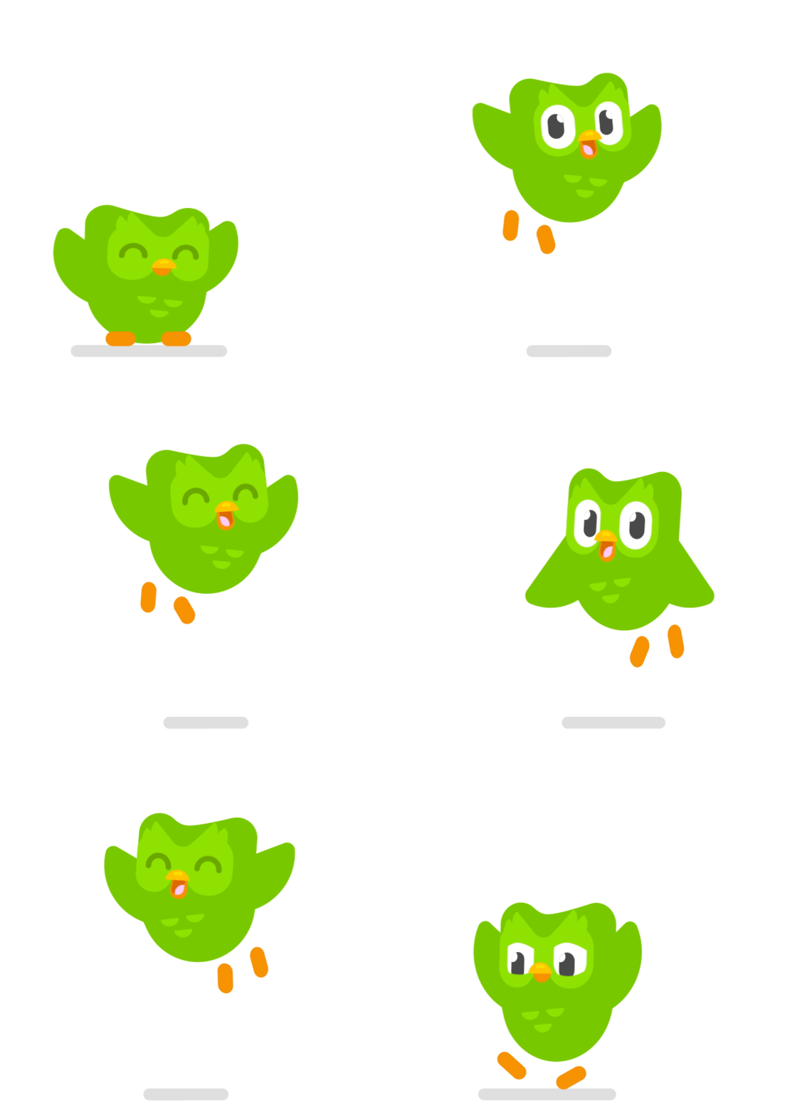
Duo, Duolingo’s mascot, flying around. Image Credits: Duolingo
From Angry Birds to an amusing and sometimes scowling owl
Tyler Murphy, having graduated from his intern position at Duolingo launching the company’s iOS app, noticed that the gaming world was rapidly innovating around him in the mid-2010s. Angry Birds was no longer the only popular game on mobile, and video games generally were getting more engaging, with in-app currencies, progress bars and an experience that felt creatively addictive. He suddenly saw connections between the entertainment that games provided and the patient learning required for languages.
“Wouldn’t it be cool if the skill got harder and harder, kind of like how a character in a game gets more powerful and powerful?” he remembers asking. Duolingo had taken early inspiration from Angry Birds as well as Clash Royale later, following that game’s launch in 2016. “Half the people at Duolingo were playing Clash Royale, at some point,” he said. “And I think that shaped our product roadmap a lot and our design language a lot.”
Games solved a problem that was acutely personal for Murphy. The employee, who would go on to become chief designer at Duolingo, had gone to college to teach Spanish to students, but ultimately left the field after struggling to inspire kids in a classroom setting. The realization that Duolingo could borrow from gaming instead of monotonous edtech companies gave an adrenaline rush — and permission — to the team to experiment with new approaches to learning.
Every game needs some form of experience points and leveling up, and for Duolingo learners, that progress comes in the form of skill trees.
These trees, which were conceived by a design agency during the company’s early development, are Duolingo’s core experience, a visual representation of language skills that are interconnected and get progressively more difficult and refined over time. Each skill is a prerequisite for another. Sometimes it’s just logic: in order to be able to speak about restaurants, you probably should be able to introduce yourself first. Sometimes, however, it’s a necessary building block: in order to speak about your routine, you should be able to speak about basic everyday activities.
In Duolingo, each unit has its own suite of skills, each of which is broken down into five lessons. Once you complete all five lessons, you can move to the next skill. Complete all skills and you can move to the next unit. Depending on the language, a user might encounter an average of 60 skills across nine different units within a course.
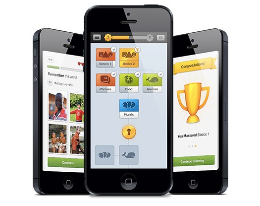
Duolingo Skill Tree UX in 2012. Image Credits: Duolingo
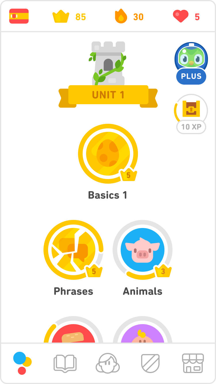
Duolingo Skill Tree UX in 2021. Image Credits: Duolingo
The growth power of a cartoon owl meme
Duolingo had its “leveling up” model figured out, but now it had to integrate gamification into every nook and cranny of its app. One of its first challenges was rebuilding the sort of teacher-student emotional bond that can help students stay motivated to learn. No one likes to fail, and Duolingo stumbled upon a scalable approach through its cartoon owl mascot Duo — also thought of by the design agency behind the skill trees.
Whenever users succeed or fail at their lessons today, they are likely to be encouraged or admonished by Duo’s presence. Designers sprinkled Duo throughout the product, looking at Super Mario Brothers as an example of how to use iconic art to create a friendly gaming experience. In early iterations of the app, Duo was present but static, more of an icon than a personality. That changed as the company increasingly pushed harder on engagement.
[ad_2]
Source link


