This 350-Square-Foot Studio Is a DIY Dream

[ad_1]

Lisa Lu completed her first home project — installing a mirrored bar shelf — when pandemic restrictions meant she couldn’t hire someone to help. “Once I got that up, I was like, what else can I do?” she says.
One project led to another until she had single-handedly redecorated her 350-square-foot studio in New York’s Chelsea neighborhood, using paint, Ikea hacks, and renter-friendly upgrades. The final result was featured in Embrace Your Space by Real Simple’s Katie Holdefehr, a home design book filled with organization and decorating ideas for renters in small spaces. Here, we interviewed Lisa about her colorful home…
LIVING AREA

Storage bins: Ikea.
On maximizing space: People often divide studio apartments into separate rooms using temporary walls or screens. But my approach has been to embrace the open space, while still creating zones. My apartment is long and narrow, so I’ve experimented with several layouts, including pushing my bed all the way to the window. But I like the current arrangement best, because it means I can fit an extra dresser and walk around my bed.
On creating extra storage: At first, I stored off-season clothing at my mom’s house, but then I installed Ikea BESTÅ units near the ceiling. It was a big undertaking, and I was like, Oh my god, they’re going to fall. But they’ve stayed up for three years. Now I just use a step stool to change things out each season.

Tufted sofa: West Elm, similar. Side table/stacking stool: Ikea, similar. Wall sconce: CB2, similar. Rug: Annie Selke. Ceramic vase: H&M. Wall art: Gail Schechter, Kate Baird, Emma Currie, Karin Haas, and Tyler Mitchell for Elmhurst Hospital Center.
On secondhand finds: The trunk is vintage, as is the dresser that serves as my media console. They’re hand-me-downs from my younger sister. She moved to L.A. and I was supposed to just hold onto them for her, but now I think they’re kind of mine!
SLEEPING AREA

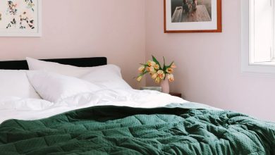
Bedding: West Elm. Dresser: Wayfair, similar. Table lamp: vintage from Portmanteau. Painting: Carly Wilhelm.
On design inspiration: I’m very into streetwear and ’90s and ’00s hip-hop and R&B, hence the skateboard decks above my bed. I actually used them as inspiration when choosing paint colors, since I didn’t want the apartment to feel like a mishmash of colors. You can see the blue-green, the pink, the yellow — it’s all here. When you have one open space, it’s so important that things flow.
On sourcing art: The painting above my nightstand was my first piece of original art. I found the artist Carly Wilhelm on Instagram and fell in love with her work.

Shelves: West Elm, similar. Hanging planter: Capra Designs. Kate Moss print: Etsy. Drawings of Cam’ron and Biggie: Yung Lenox, “an artist who was just nine years old at the time.”
On DIY projects: I still don’t have any power tools, but I’ve got the basics, like a screwdriver and hammer, and I now know how to hang a shelf and patch holes in the wall. I’ve learned a lot from YouTube tutorials, and for everything else, I ask around for help!
DINING AREA

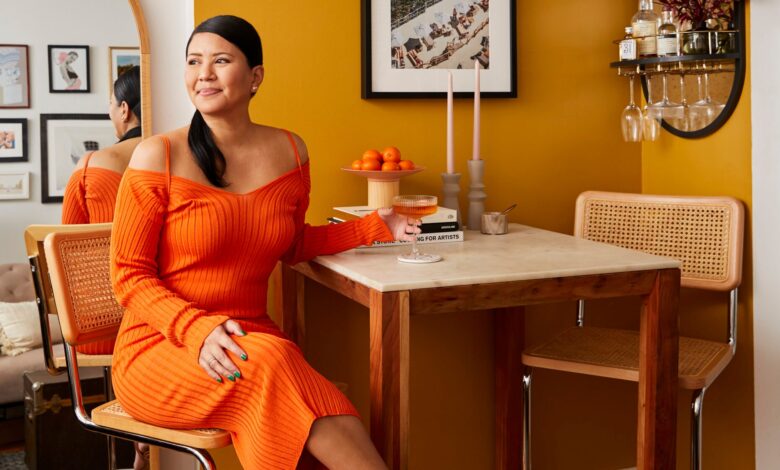
Paint: Tanlines by Backdrop. Table: CB2, similar. Bar stools: Scandinavian Designs. Wall mirror with shelf: West Elm, similar. Wall art: House of Spoils. Coupe glasses: CB2.
On working from home: During the day, I use this counter-height dining table as my workspace. Then, in the evenings, I call it ‘my little spritz corner,’ since my drink of choice is an Aperol spritz and the print above the table is of the Italian seaside.

Floor mirror: Urban Outfitters.
On entertaining: I like hosting dinner parties, but I keep them small and intimate. Also, my apartment is a sixth floor walk-up, so people are usually huffing and puffing by the time they get up here. Still, they always say it’s welcoming and feels like me, which is the best compliment. I want my home to feel personal, like you get to know me just by looking at it.
KITCHEN

Cabinet paint: Saturday On Sunday from Backdrop. Hardware: Rejuvenation. Peel-and-stick subway tile: Wayfair. Marble contact paper: Amazon. Storage crate: Hay. Tea kettle: Chantal. Rug: Loloi. Bathroom door moulding: Etsy. Bathroom floor tile decals: Etsy.
On kitchen paint: I was apprehensive about painting the cabinets, so I ordered paint swatches first. Choosing a color was such a leap of faith! I had to take off the cabinet doors off to paint the fronts, so for several days I was tiptoeing around them. Then, I added hardware, and I’m so happy with the result.
On renter-friendly upgrades: I used peel-and-stick subway tiles to cover up the existing kitchen tiles, which were dingy and yellowed, and contact paper on the counters. It’s held up surprisingly well! And for the bathroom, I used peel-and-stick flooring and added pre-cut removable moulding to the door before painting it pink. If I ever have to move, I can easily remove what I’ve added.
BATHROOM

Paint: 36 Hours in Marrakesh by Backdrop. Shower curtain: CB2. Towels: Parachute. Wall art: Angela McKay.
On embracing studio living: I think many people think of studios as transitional spots, since they’re so small. But this has been my home for so long, and even though I could afford a bigger apartment, I just really love this life. It makes me more thoughtful about what I’m bringing into my space.
On appearing in a design book: It’s kind of surreal. I just did these projects to make my apartment feel homey, and I never thought that it would be featured in print. I was like, Look, Mom, I’m in a book!
Next, Katie Holdefehr and I talked on the phone, and here’s what she told me about her book…
Kaitlyn: What inspired you to write this book?
Katie: There’s this idea in our culture that you shouldn’t invest — financially or emotionally — in a space unless you own it. This might make sense, financially, if you’re saving for a down payment; and, emotionally, there is risk in pouring yourself into a temporary space. But I’ve been a renter for years and wanted to make a home decor book that shows how sophisticated rental spaces can be. You don’t have to wait to be a homeowner to create a home that you love living in.
Why did you choose Lisa’s apartment for your book?
The first photo I saw was of Lisa’s kitchen, which had so many brilliant reversible ideas for renters, some that I had never even considered before. My favorite thing, by far, is her use of paint. Through color, she creates these little worlds within her apartment.
All the homes featured in your book are 1150-square-feet or fewer. What do you appreciate about small spaces?
Limited square footage actually allows for more creativity — it’s a problem you’re always searching to solve. Successful small spaces are pared down to include only what is useful and meaningful. When you walk into a small space that has so much personality, the impact is even greater than when you walk into a cavernous home. It’s like people’s lives are distilled into these tiny spaces.
Congratulations to Katie on her beautiful book. Follow her on Instagram, if you’d like. And thank you so much, Lisa, for sharing your home with us!
P.S. More house tours, including a tiny Swedish apartment that bursts with color and a studio that feels like a womb.
(Photos by Genevieve Garruppo for Embrace Your Space.)
Note: If you buy something through our links, we may earn an affiliate commission, at no cost to you. We recommend only products we genuinely like. Thank you so much.
[ad_2]
Source link


