Tell Me What You Think! (Master Bathroom Mural and Floor Tile Options)

[ad_1]
Today I have one guy back at the house for one more day to do all of the finishing touches in the bathroom before they hand it over to me to do all of the pretty stuff. Since I always have them do the drywall smooth (i.e., no texture on the walls), the walls always take a bit longer and require a little more attention to detail than walls that get textured. But that will be finished up today, and the project will be all mine.
So naturally, I’m thinking through all of my selections so I can be confident that I’m 100% sold on everything I’ve selected.
And of course, I’m second-guessing some things. 🙂 So I’d love your input.
The first thing is about the wall mural. I’m FOR SURE using the wall mural on the bathtub wall. But one comment on a post last week got me wondering if I need to make a change to the mural. The good thing is that if I do need to make a change, the replacement mural would only cost about $150. But here’s the issue that the commenter brought up. She said that it’s a shame that my bathtub will cover the prettiest part of the mural.
Now since I’m a teal kind of person, I would disagree that the bottom part is the prettiest. 🙂 But I do see her point. The tub will indeed cover quite a bit of the mural. I guess my thinking is that it would give the impression that the tub is sitting in this forested area, and I thought that would give it a lovely feel. It would look something like this…
The side walls will have white wainscoting on the bottom and teal Venetian plaster on top. So the tub does cover quite a bit of the bottom part of the mural, but is that a bad thing?
If I want the whole mural to show, I could continue the wainscoting on the bottom of that wall (and the wall-mounted faucet would be on the lower part with the wainscoting), and just use the mural on the upper part of the wall.
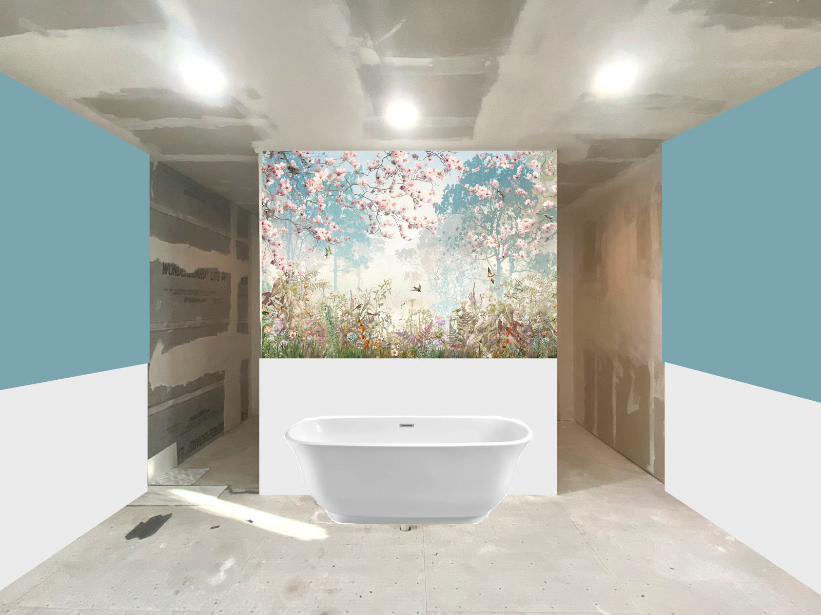
Of course, the mock up photos above only have plain rectangles of white, and that’s not quite what the wainscoting will look like. Actual wainscoting will have quite a bit more character to it than solid white rectangles. 🙂 But you get the point.
Anyway…thoughts? I’m actually torn between the two. The first whole wall option gives the illusion of the tub sitting in the forested area. The upper wall option is more like looking through a window. And quite honestly, I love it both ways. At one moment, I’ll really love the whole wall options, and then the next moment, I’ll love the wainscoting option.
So let me know your thoughts on that.
And then the next issue is the tile I’ve selected. I had selected a large rectangle (kind of) marble-look tile with very soft “veins” for the main bathroom floor. For the shower floor, I had selected a marble mosaic, and for the shower walls, a large white rectangle tile.
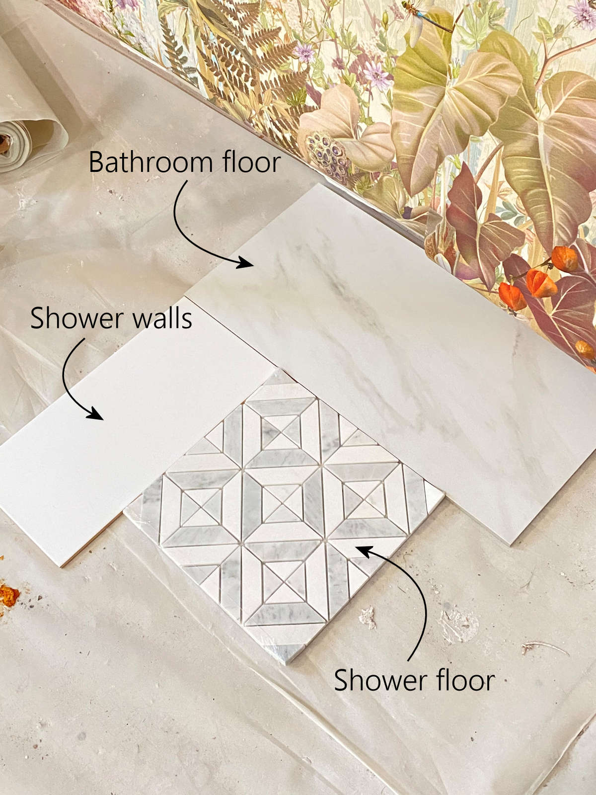
While I love that mosaic tile that I selected for the shower floor, I have two issues with it. First, I’m unsure how to transition from that floor to the main bathroom floor. Most showers have a curb around them, which makes using a different tile on the shower floor a pretty simple thing. But with a curbless shower that has no transition at all from the bathroom floor to the shower floor, it makes it a bit more challenging.
So I played around with using that dark tile that I bought (that came as a herringbone but I said I wasn’t planning on using it as a herringbone) as a transition strip between the two tiles.
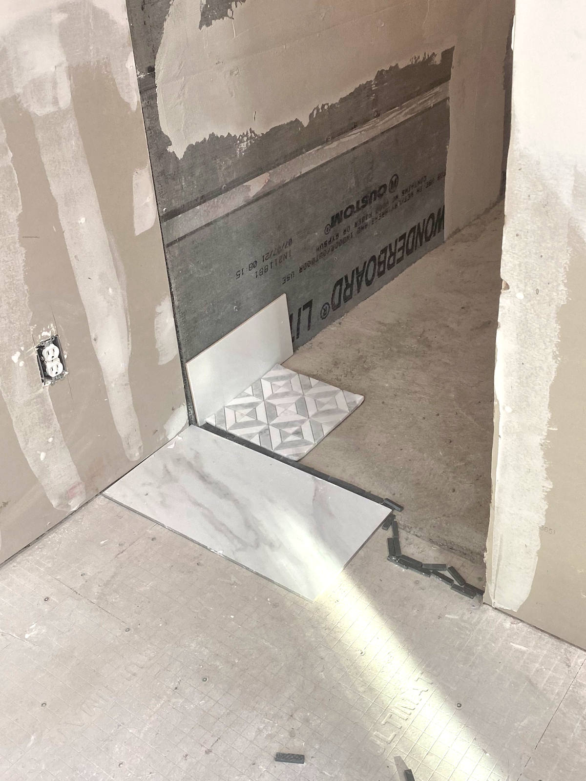
I don’t love it. 🙁 But I also don’t love the large floor tile right up next to the mosaic tile, either. So I’m not quite sure what other options there are. I think my only transition option would be to put a Schluter strip between the main floor and shower floor. Or I could even use a wider Schluter transition strip like this one. That might actually be very pretty.
The second problem is that I absolutely must have symmetry. Anyone who has stuck with me for a while knows this about me. If the shower and toilet area don’t look symmetrical (at least for the most part, but obviously not in every single tiny detail), then my head might explode.
In fact, after I came up with this floor plan (that was inspired by a new home tour by an Australian Instagrammer I follow), someone commented on one of my posts that the floor plan looks just like a bathroom by Three Birds Renovations on YouTube. As a side note, they’re also Australians, so I’m wondering if this is just a popular floor plan for full bathrooms in Australia right now.
Anyway, that bathroom (which you can see here) is absolutely, stunningly gorgeous. But the very first thing that caught my attention was the asymmetrical appearance of the shower with the tiled wall on the left, and the toilet area with the painted wall on the right. Had that been my project, the two areas would have been treated the same.
So upon seeing that video, I made up my mind immediately that in our bathroom, the two sides would definitely have to be the same. If the shower has white tiled walls, the toilet area will also (or they’ll be painted white at the very least). And that means if the shower has a tiled mosaic floor, the toilet area will also.
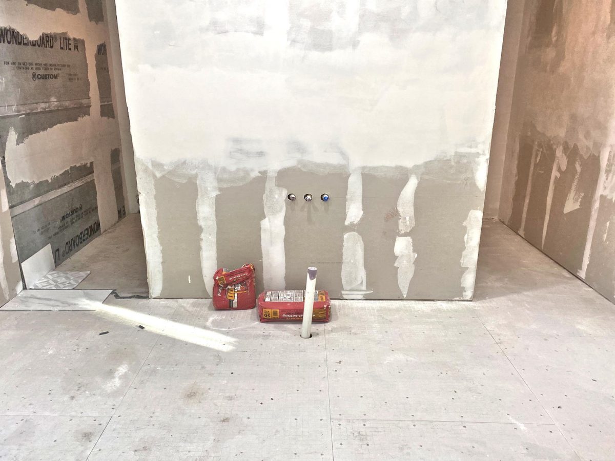
That tile is $14/square foot, so it’s about 10 times the cost of the main bathroom floor tile. And I just don’t know if I want to pay that price for something I’m just not sold on. It’s very pretty tile, but the main focus of this bathroom will obviously be the wall mural and not the mosaic tile.
A commenter on last week’s post said that when she couldn’t find a coordinating mosaic tile for her shower floor, she had her installer cut the large floor tile into smaller squares for the shower. The more I think about it, the more I love that idea. Since it’s the same floor, but just a different size, I wouldn’t feel the need for any type of transition between the to areas because they would look fantastic and seamless right up next to each other. I mean, it would be the same tile, so of course the two sizes would work together seamlessly.
And the good thing about that options is that I would only need to cut enough for the shower floor. I could use the larger tile in the toilet area. It would be a little bit different, but since it’s the same tile, I’m pretty sure my brain could handle it. 🙂
So that’s the direction I’m leaning right now, but I’d love to hear from anyone else who’s actually done that. Did it work out for you? Any pitfalls to be aware of when cutting large tiles into smaller pieces for the floor?
Alright, so gimme what you got. Wall mural (full wall or upper wall with wainscoting) and shower floor tile (original mosaic with some sort of transition, or large floor tiles cut down into smaller pieces).
Addicted 2 Decorating is where I share my DIY and decorating journey as I remodel and decorate the 1948 fixer upper that my husband, Matt, and I bought in 2013. Matt has M.S. and is unable to do physical work, so I do the majority of the work on the house by myself. You can learn more about me here.
I hope you’ll join me on my DIY and decorating journey! If you want to follow my projects and progress, you can subscribe below and have each new post delivered to your email inbox. That way you’ll never miss a thing!
[ad_2]
Source link


