[ad_1]
Laura’s Question:
I have high ceilings throughout the main living area and kitchen, and I am at a loss as to what to do with them in the kitchen and entry. The kitchen cupboards only go half way up. What should I do with the expanse of wall above the cupboards?
Nothing can be hung on either side of the front door because artwork rattles and fall off. I did stencil around the door but it seems pretty unsophisticated. Any thoughts?
I(n a follow up emails, Laura sent this additional information🙂
In my previous email, I realized I was asking your advice about two areas – the kitchen and the entry. I should have broken those down into two different emails and provided you with additional photos so you could see the entire living area. So, please let me try again!
The main floor of our house has high ceilings which I love. However, I don’t know how to decorate the entry wall. Unfortunately, I can’t hang anything there as that is a high traffic area, the wall gets bumped and artwork falls off. I finally gave up and stenciled the wall. Would you please give me advice? I’d appreciate any thoughts you have regarding the entire living room area. (Also, I’d love hardwood floors throughout the area but I am afraid it would sound echoey.)
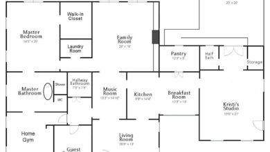
Laura’s Kitchen, Dining Room, Entryway, and Living Room:
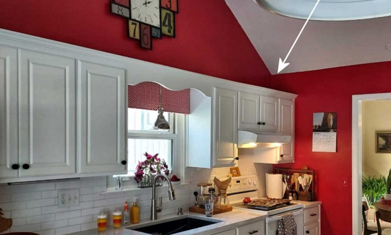
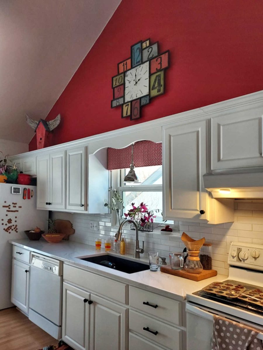
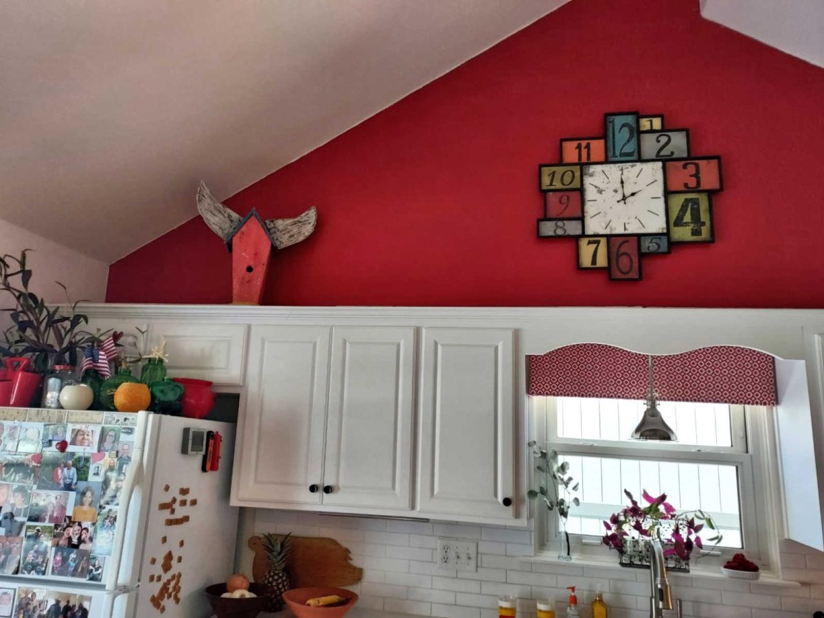
Here’s Laura’s kitchen with the problem wall. The kitchen cabinets are standard height, which leaves this large expanse of wall above the cabinets. She’s at a loss about how to decorate this area.
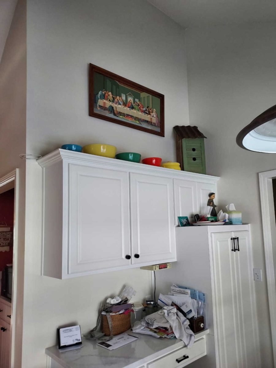
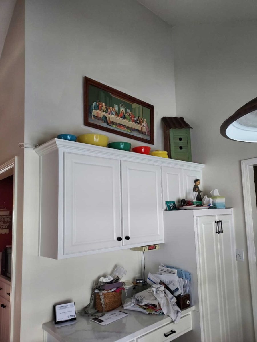
On the other side is this cabinet area with the same expanse of wall above the cabinets.
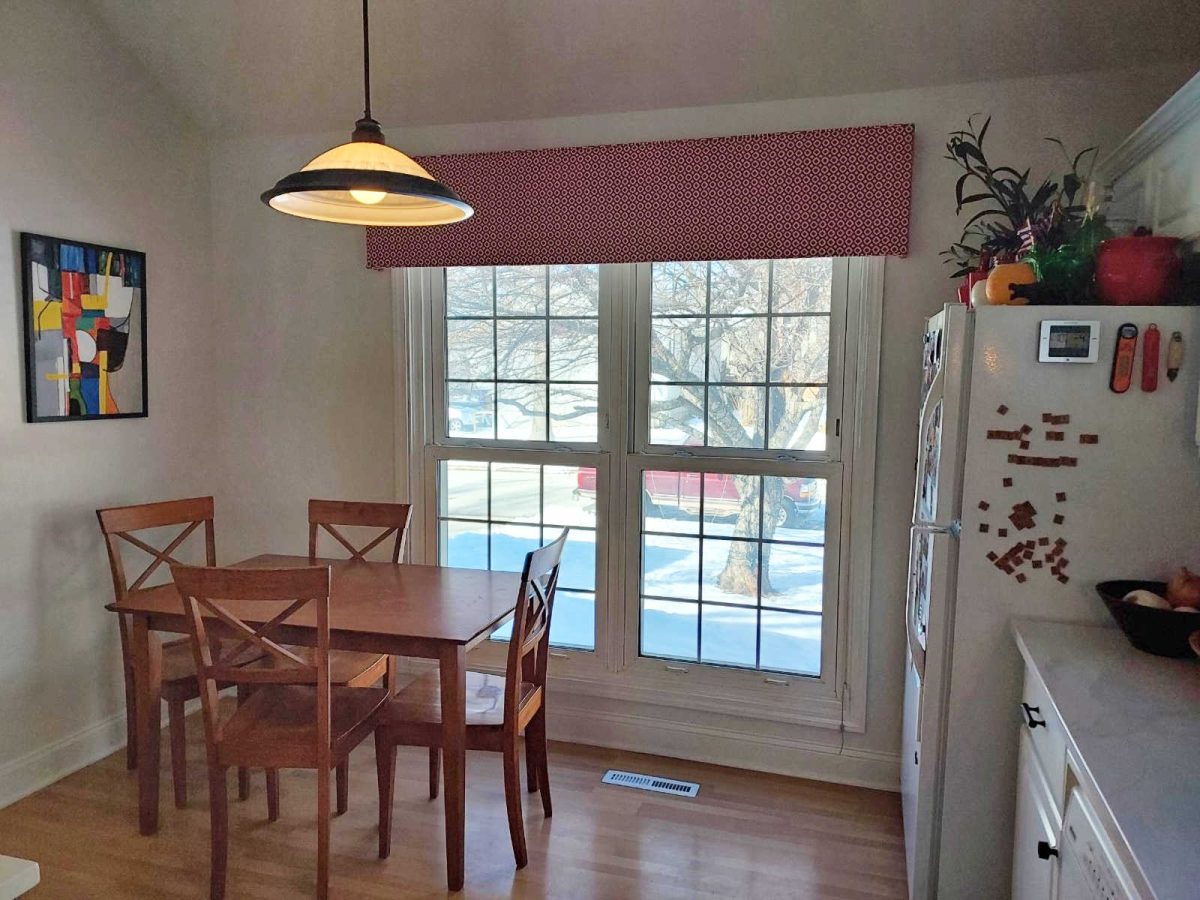
To the left side of the red wall with the cabinets is this breakfast area.
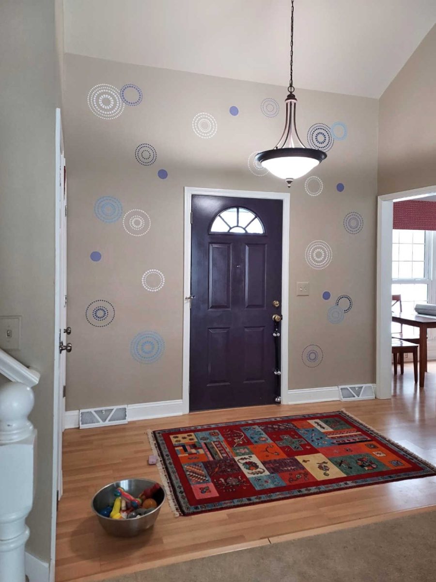
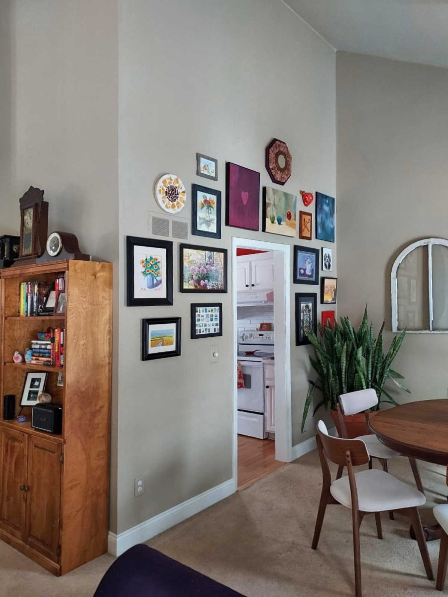
This is Laura’s problem entryway where she originally tried hanging artwork, but gave up on that idea when things would fall off when the door was closed. So instead, she went with a stenciled design.
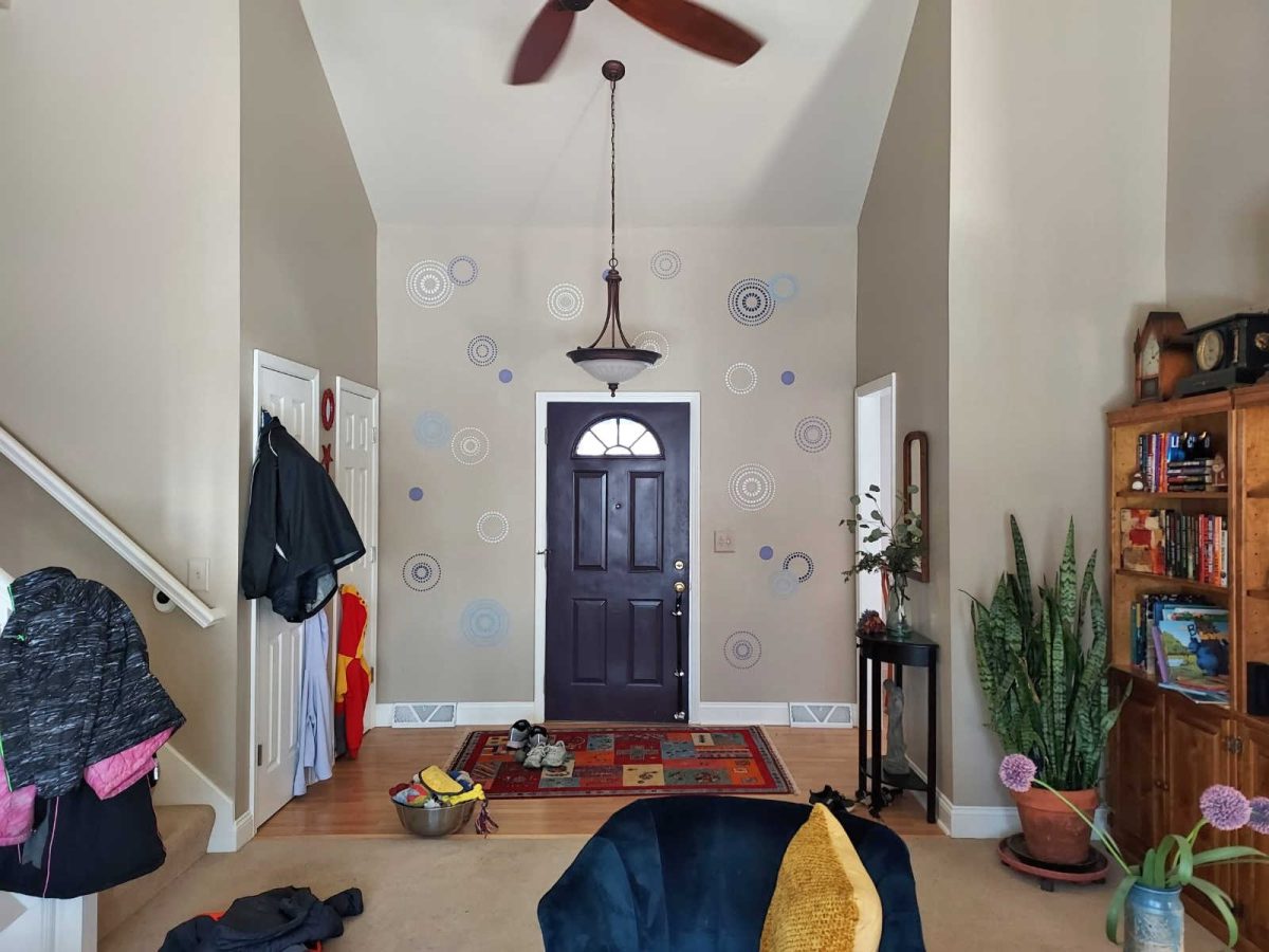
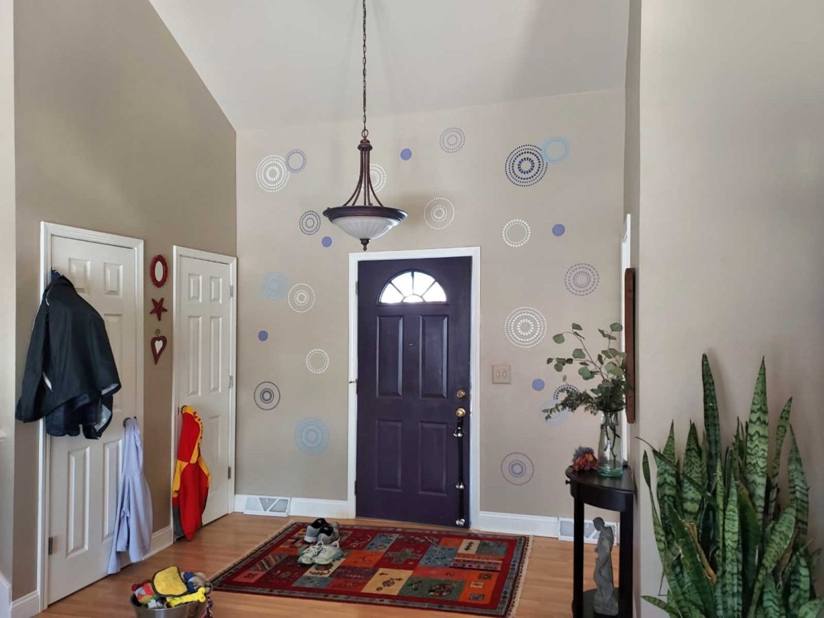
And you can see that to the right of the entryway is the breakfast area in the kitchen, which means that the red wall of the kitchen is seen from the entryway.
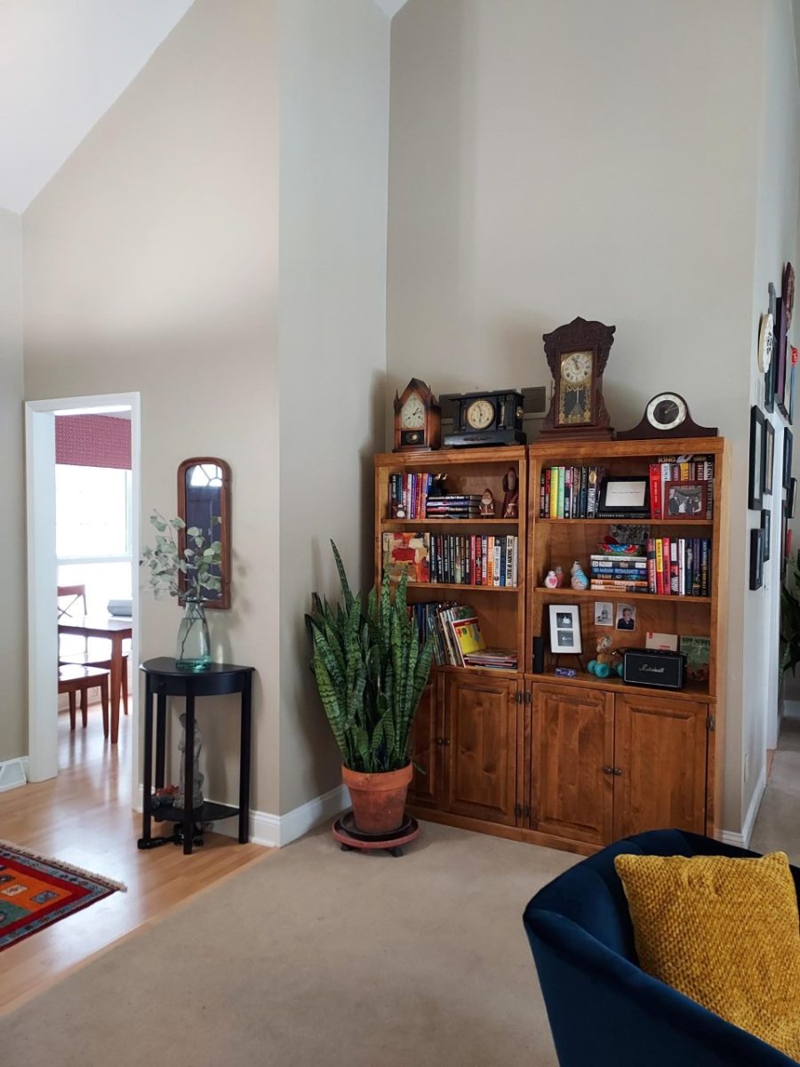
Laura has these tall walls and soaring ceilings throughout the whole main living area.
And here we can see where the doorway to the right of the red wall in the kitchen leads. It leads to the dining room.
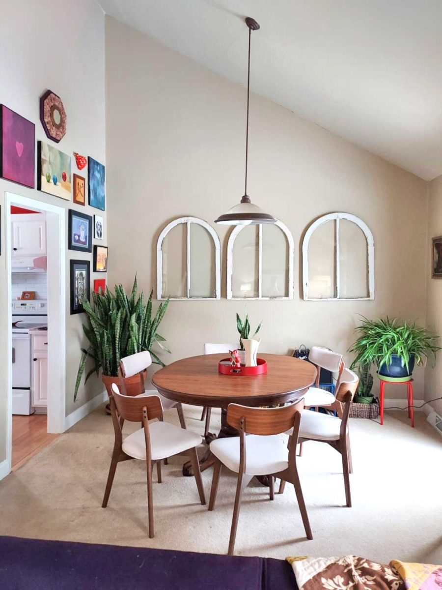
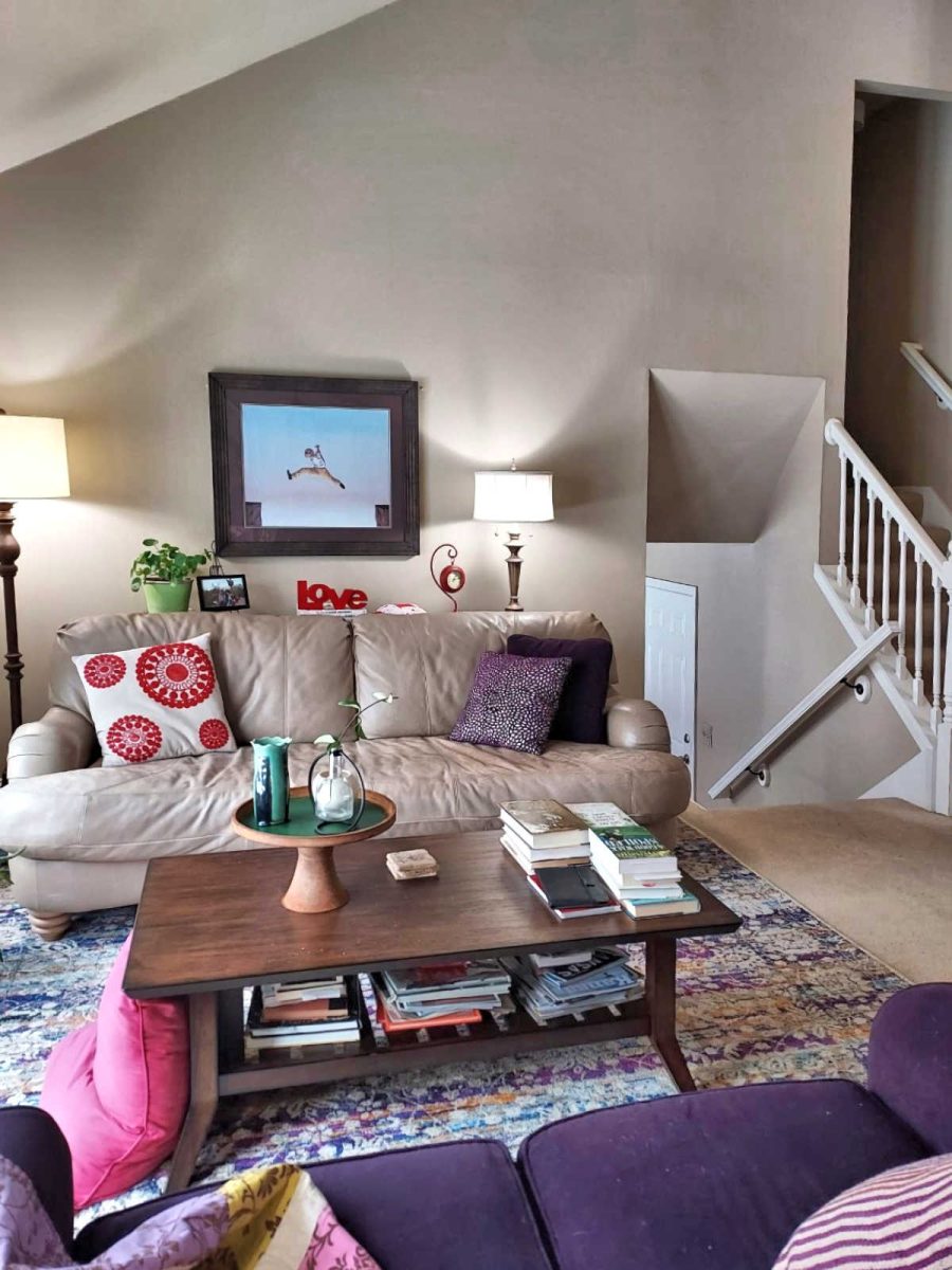
And the dining room and living room are open to each other, with the far wall of the living room being a standard height (looks to be 8 feet to me).
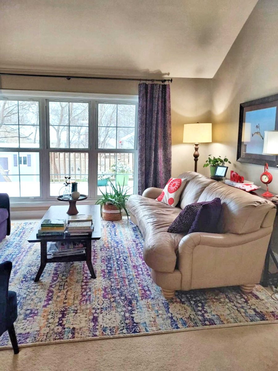
So the high walls in this area are on this wall of the living room, the opposite wall in the dining room, and the entire side with the entryway.
My Suggestions:
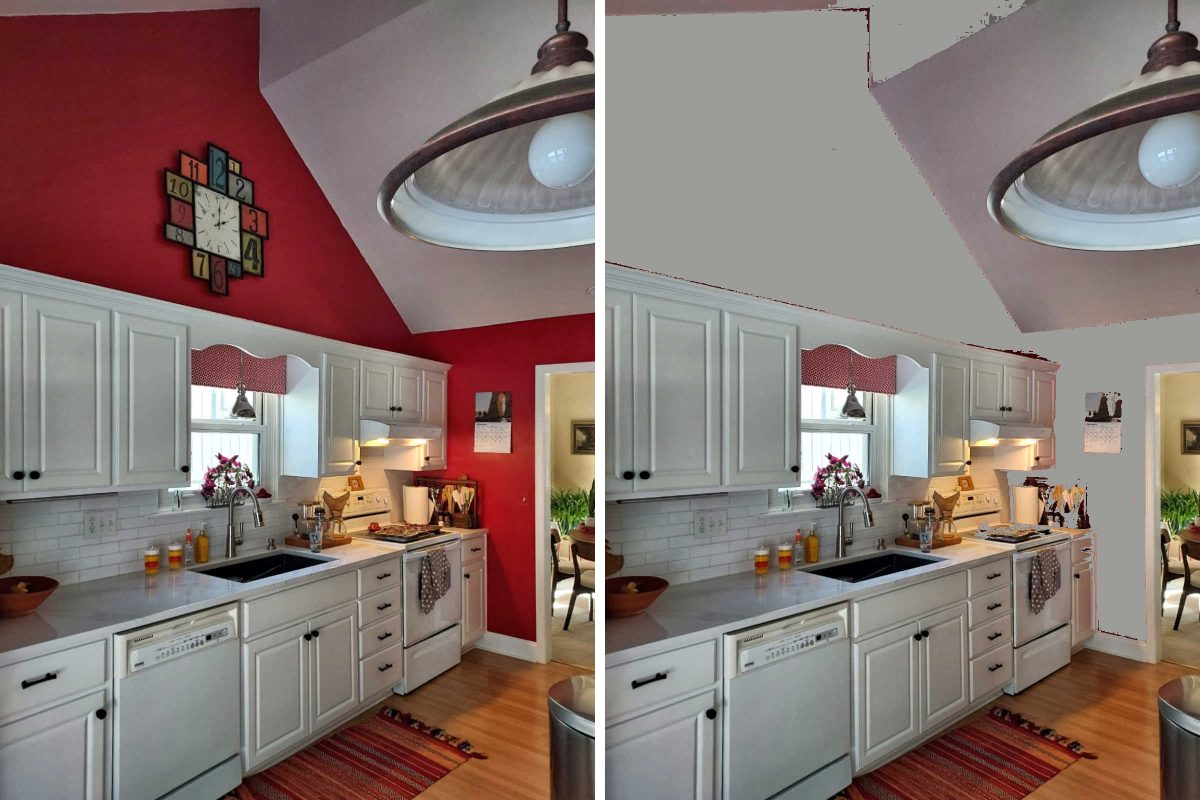
As far as the kitchen goes, I don’t think that the problem is that you need to find a way to decorate the expanse of wall above the kitchen cabinets. I think the problem is the wall color. Because that wall has such a soaring ceiling, and it has such a bold, eye-catching color on it, that wall space above the cabinets automatically becomes the focal point of the kitchen. And because that’s what your eye is immediately drawn to, and it’s a bare wall except for a clock, you feel obligated to decorate it so that when your eye is drawn up there, you’ll have something interesting and decorative to look at.
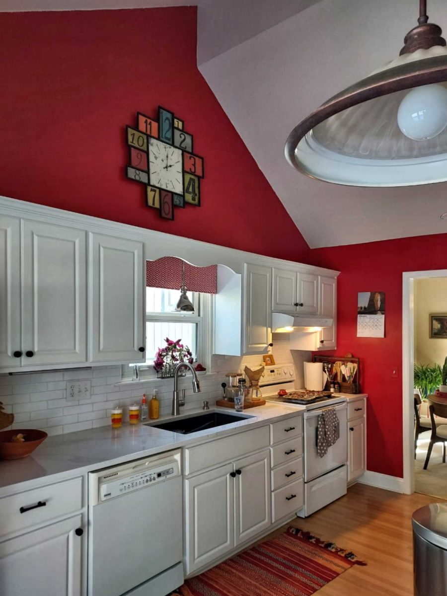
But I personally think that’s the wrong approach. If this were my project, I would paint over the red with the same neutral color that’s on the other walls, and that way your eye will be brought back down to the kitchen cabinets, which are generally the focal point of a kitchen.
You can see how vastly different this red wall with the cabinets looks from this opposite neutral wall with the cabinets.
On that wall, because there’s no red that goes all the way up to the ceiling, your eye isn’t drawn up to the ceiling to highlight the expanse of wall. Instead, the eye is focused on the cabinets and the artwork above. I don’t really think it’s necessary to fill up space on top of kitchen cabinets, but I realize that some people do like to decorate up there. So after the wall is neutral, and if you still want stuff up there, keep your decorating more in relation to the cabinets (i.e., keep things on top of and close to the top of the cabinets) rather than feeling the need to fill up as much space as possible.
Just as an example, if you want to keep the decor that you have on top of the cabinets in the picture above, I think that the horizontal artwork needs to be brought down a little bit so that all of the items up there look like a composition, rather than the framed artwork floating on its own, looking like you’re trying to take up space.
Anyway, this is a really bad photo editing job, but you can see how the red draws your eye up, while a neutral would allow you to focus on the cabinets.
And if you want to take it even further to make the kitchen cabinets the draw the eye, you could do two things. And if this were my home, I would do both of them, but I realize they’re both projects that many people would find overwhelming, so it’s certainly not required. 😀
First, I would extend the tops of the cabinets so that they terminate with the top of the lowest parts of the wall.

That project would require (1) removing the existing top crown molding, (2) adding a board horizontally across the top up to that point on the side wall, (3) add a small trim to cover the joint where the original top of the cabinet face meets the new board, and (4) reattach the crown molding. That was one of the first projects I remember seeing Layla and Kevin at The Lettered Cottage do in their first home. This was many years ago, and I’ll never forget the difference it made. I can’t find the tutorial they did, but you can see the before and after here.
And secondly, you could paint your kitchen cabinets a color other than white. And you know if this were my kitchen, I’d do that in a heartbeat. 🙂 It’s a big job, but done right, it only needs to be done once. And it would certainly make the cabinets the focal point of that kitchen, and no one would give a thought to that expanse of wall above. But of course, it’s certainly not necessary.
Now on to the entryway. If this were mine, I’d make that entryway wall a massive gallery wall. I mean, “go big or go home” kind of mindset. And I suggest that simply because I can see in the photo of the doorway that leads from your dining room to your kitchen that you obviously like gallery walls, so this entryway seems like the natural place for it, in my opinion.
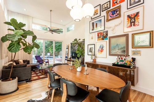
This isn’t exactly your situation since it’s not on a wall with a door, but it is an example of a gallery wall that takes up most of the vertical space. And it’s awesome. 😀
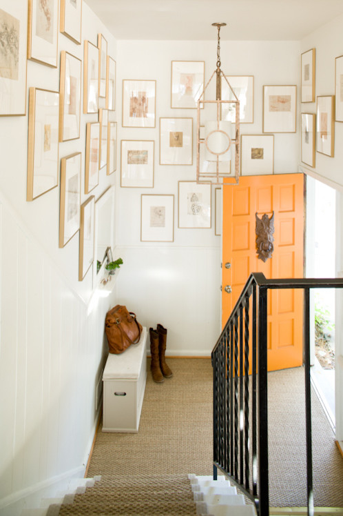
And this one is definitely not your particular situation either, but it’s definitely a “go big or go home” mindset with a gallery wall near a front door. And I think it looks amazing.
Now I know right now you’re probably thinking, “But I told you I couldn’t do artwork on that wall! It’ll fall off!” But I assure you that you can. You just need the correct picture hanging tools. And in this case, hanging artwork on a wall where it needs to stay put requires 3M Picture Hanging Strips. It’s a two-piece system that’s almost like works kind of like Velcro, but these strips are covered in tiny plastic grabby things that “snap” together more securely than Velcro does. You place one part on the back of the picture, and one part on the wall, and after waiting the requisite amount of time (check the directions), you “snap” them together, and the artwork won’t budge.
These are what I used to hang the artwork on my entry wall, and those things stay put. And while they’re not on the same wall as my front door, I do live in a house with a pier and beam foundation, so someone just walking through the house makes the floor shake. But I’m not a gentle person, and I’ve slammed that door more times that I could count, and my pictures stay put. I could intentionally stand there and open and close my front door 30 times, slamming it as hard as I could each time, and those pictures won’t even budge a hair, much less fall off of the wall.
But I do agree that the wall stencil probably isn’t the best choice for that wall. Actual artwork would be preferable. And I hope you’ll give those 3M strips a try because they’re amazing! I use them on literally every piece of artwork I hang on my walls, and nothing ever moves, regardless of how many times I bump into them or slam my front door. I never have to go through my house straightening frames on my walls because everything on my walls stays perfectly in place.
So that is my input on the specific two areas you asked about.
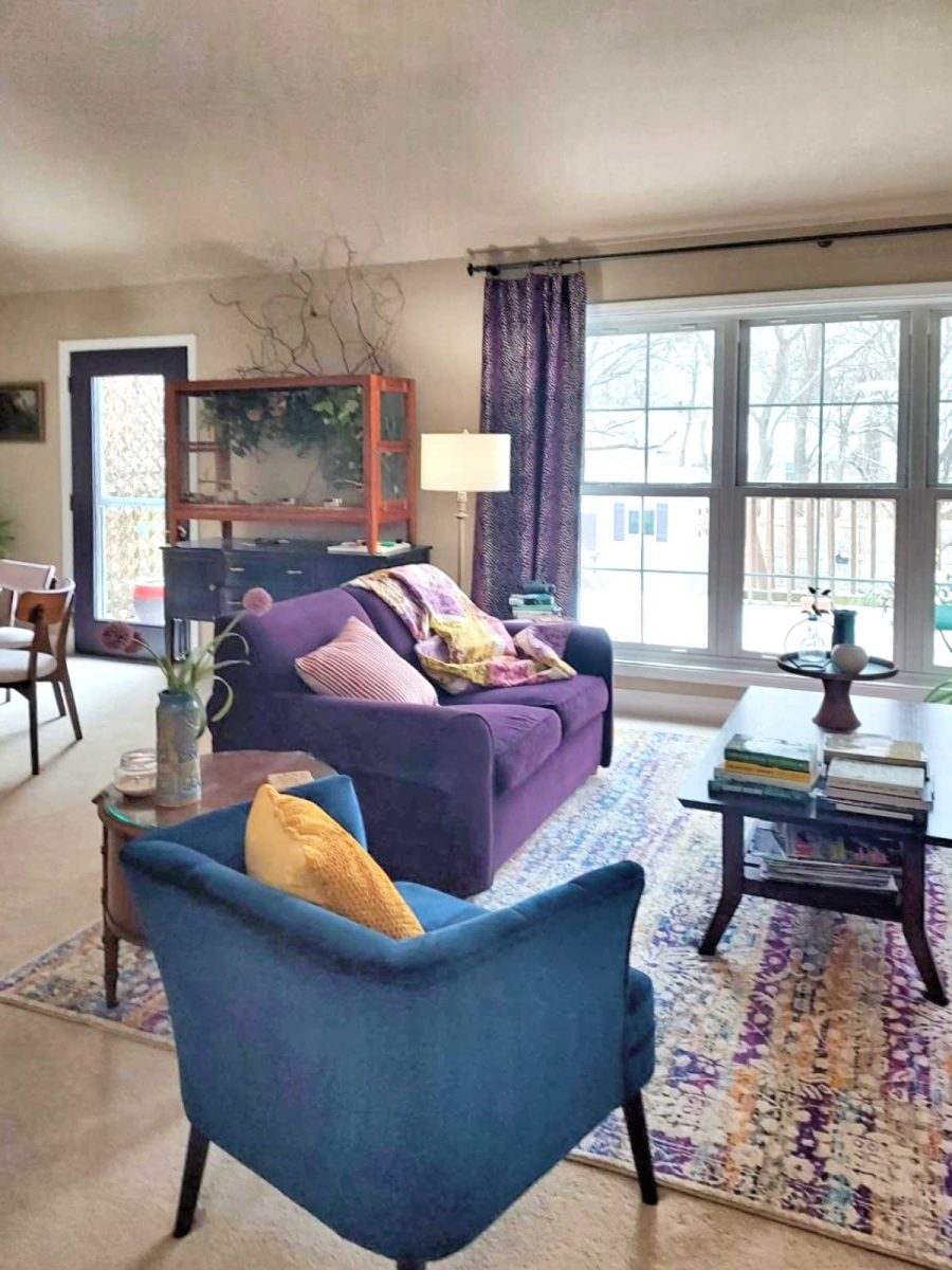
As far as the rest, I think that you’ve done well in handling the high ceilings. On the back wall (i.e., the lowest wall) with the curtains, you did a great job at hanging those high. So those looks great.
And as far as the rest of the area, I don’t think there’s any need to focus on the ceiling height or do anything specifically for the purpose of filling up space. Just because you have high ceilings, that doesn’t mean that you’re required to fill up wall space. In fact, outside of one very particularly chosen feature wall to make a real splash (like the entryway wall), my own personal preference is to keep everything down at a standard height, as if you were decorating in a room with 8- or 9-foot ceilings, and just kind of forget the rest of the expanse of wall above that.
One last thing…
If you do decide to create a feature gallery wall on the entryway wall to make a big splash, it might not work to keep this gallery wall also. I think that might create a very busy look, and take away from the one feature wall.
Of course, another idea is to forgo the “big splash” feature gallery wall on the entryway wall, and just stick with some simple artwork/wall decor there flanking the door. And then make your dining room walls your “big splash” feature wall(s).
The one thing that would keep me from going with that option is simply my obsessive need for symmetry, and the fact that the obvious feature wall in the dining room isn’t square at the top because it’s slanted. The side wall in the dining room is the one that has the squared top where it meets the ceiling, but that’s not the natural “focal point” wall of the dining room. But my obsessive need for symmetry is my stupid problem, and it may not be yours. 😀 If not, then that main wall of the dining room would be a very good spot for that “big splash” feature gallery wall, while keeping the rest of the walls in this area pretty tame (not necessarily boring, just not busy) and decorated more like a wall in a room with 8- or 9-foot ceilings, ignoring the big expanses of wall above.
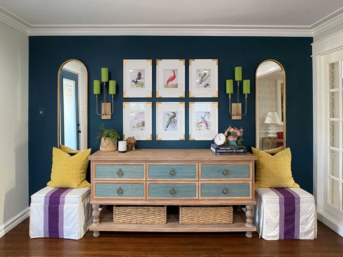
This is a good example of what I’m talking about. Even though this ceiling is very high, they kept the artwork down lower in relation to the height of the doors and windows. And really, there’s no need for the artwork to even be this big or hung that high.

One decorating rule that I have for myself is that I don’t hang wall art or decor higher than the trim on my doors. That’s an easy rule for me to keep since I only have 8-foot ceilings, and there’s not really much room between the top of my door trim and the crown molding in my rooms. But I do like to keep my doors (and windows, actually) as a guide for where wall art and decor need to be contained.
It’s not a hard and fast rule, and I’m pretty sure I broke that rule with the picture ledge shelves in our sitting room. That would be an example of a “big splash” feature wall that could break my rule, even though I can only go up above the door trim so far since I have 8-foot ceilings. So just like any rule, there are times when it’s broken. It’s just a very general guideline that I try to follow, but naturally, a big feature wall on a wall with soaring ceilings would be one of those times to break the rule, for sure. But I personally would keep those instances of breaking that rule (i.e., keeping the artwork and wall decor in relation to your doors and windows and not to the height of the ceiling) to a minimum. Again, it’s my own personal rule, but one that has generally served me well over the years.
So applying that rule in a practical way, even in that picture that I added just above, I would have chosen a piece of artwork (or a grouping) that was just a bit smaller so that the height was just below the height of the doors in the room, rather than being hung at the same height, or even a couple of inches higher than the doors. And I would do that even though the walls are high and the ceiling is soaring.
Alright, folks! What suggestions do YOU have for Laura?
(Are you stuck with a DIY or decorating problem and want input? Click here to submit your question. I post/answer the questions in the order that they’re received, so please don’t send questions if your contractor is on the way to your house right this minute and you need immediate advice. 😀 )

Addicted 2 Decorating is where I share my DIY and decorating journey as I remodel and decorate the 1948 fixer upper that my husband, Matt, and I bought in 2013. Matt has M.S. and is unable to do physical work, so I do the majority of the work on the house by myself. You can learn more about me here.
I hope you’ll join me on my DIY and decorating journey! If you want to follow my projects and progress, you can subscribe below and have each new post delivered to your email inbox. That way you’ll never miss a thing!
[ad_2]
Source link