Do You Pay Attention To The “Color Of The Year”? (And What Color Aversions Do You Have From Trends Of The Past?)
[ad_1]
I’m not one of these people who waits with bated breath each year for Pantone and all of the various paint companies to announce their color of the year for the next year, but if I come across the information, I’m generally curious to see what they’ve chosen. So when Pantone’s Color of the Year for 2024 showed up in my email inbox, I was interested to see more.
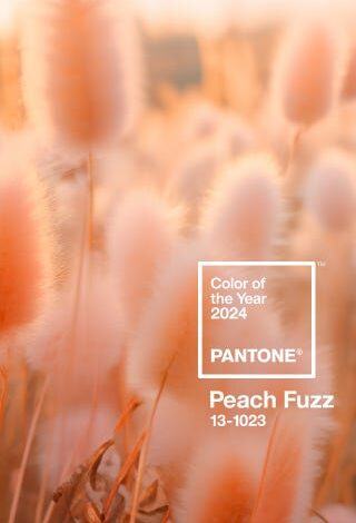
Have you seen their pick for the Color of the Year for 2024? It’s called Peach Fuzz.

What fascinated me about this color is that I didn’t recoil at the thought of peach. 😀 In fact, I opened up that email, and I was delighted to see such a happy, vibrant color. As one would expect from me, I personally think that we need more happy, vibrant colors in our homes. I think we need less of the all-white, all-neutral trend, and more color.


So with my love of color, what could possibly make me recoil at the though of peach? It’s because I’m a child of the 80s and 90s. I was born in the 70s, but I did most of my growing up in the 80s and 90s.

Who remembers decorating in the 80s and 90s? There were a few certain color schemes that dominated the entire world of decorating. There were the jewel tones — burgundy, navy blue, and hunter green. That was the popular color scheme that I gravitated to. But then there was also the country blue and mauve color scheme that was so popular, and then the peach and seafoam green color scheme.
I loved those jewel tones, but I don’t remember ever being a big fan of the other two. And yet, they were everywhere. They dominated kind of like the whole all-white, all-neutral farmhouse look has dominated for so long.
So after we started moving past those color schemes (I think that was some time around the mid- to late-nineties, but I might be a bit off on my timeline), I vowed never to go back. I mean, for 20 years after that, I couldn’t even hear the words “mauve” or “peach” or “country blue” or “seafoam green” in relation to decorating without my face involuntarily scrunching up with a look of disgust and disapproval.
I think most of us can relate to some extent, right? I’ve had people who grew up in the 60s and 70s tell me that they still can’t stand anything that reminds them of the harvest gold and avocado green trend that was so popular back then. Even beyond decorating, we can all relate to those trends that we vowed we’d never take part in again once they were gone.
There are some past trends that I’d welcome back with open arms. I was talking with a friend the other day about my newfound love for making beaded necklaces, and she said, “This reminds me of the twist-a-bead necklaces of the 80s and 90s.” Oh my gosh, I LOVED my twist-a-beads in the late 80s and 90s, and I’d love for those to come back!! 😀 I have to admit, I think 80s and 90s fashion was the best. And we can bring back big hair and AquaNet any day now! 😀
But when it came to decorating, I swore off of those colors (even the jewel tones that I loved), and I was convinced that I’d never want to see them again, and I’d certainly never decorate with them. So when I opened that email and saw that the Pantone Color of the Year Peach Fuzz, and my very first thought was, “Oh good! That’s very pretty,” I realized I am completely over my aversion, and it only took 30 years! 😀 Heck, I might even like a peach and seafoam green combination again, just as long as we don’t have to call it “seafoam green” anymore. Surely there’s a better name for that color.
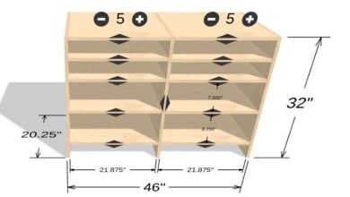
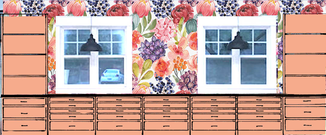
In fact, I actually considered a peach color for my studio cabinets.
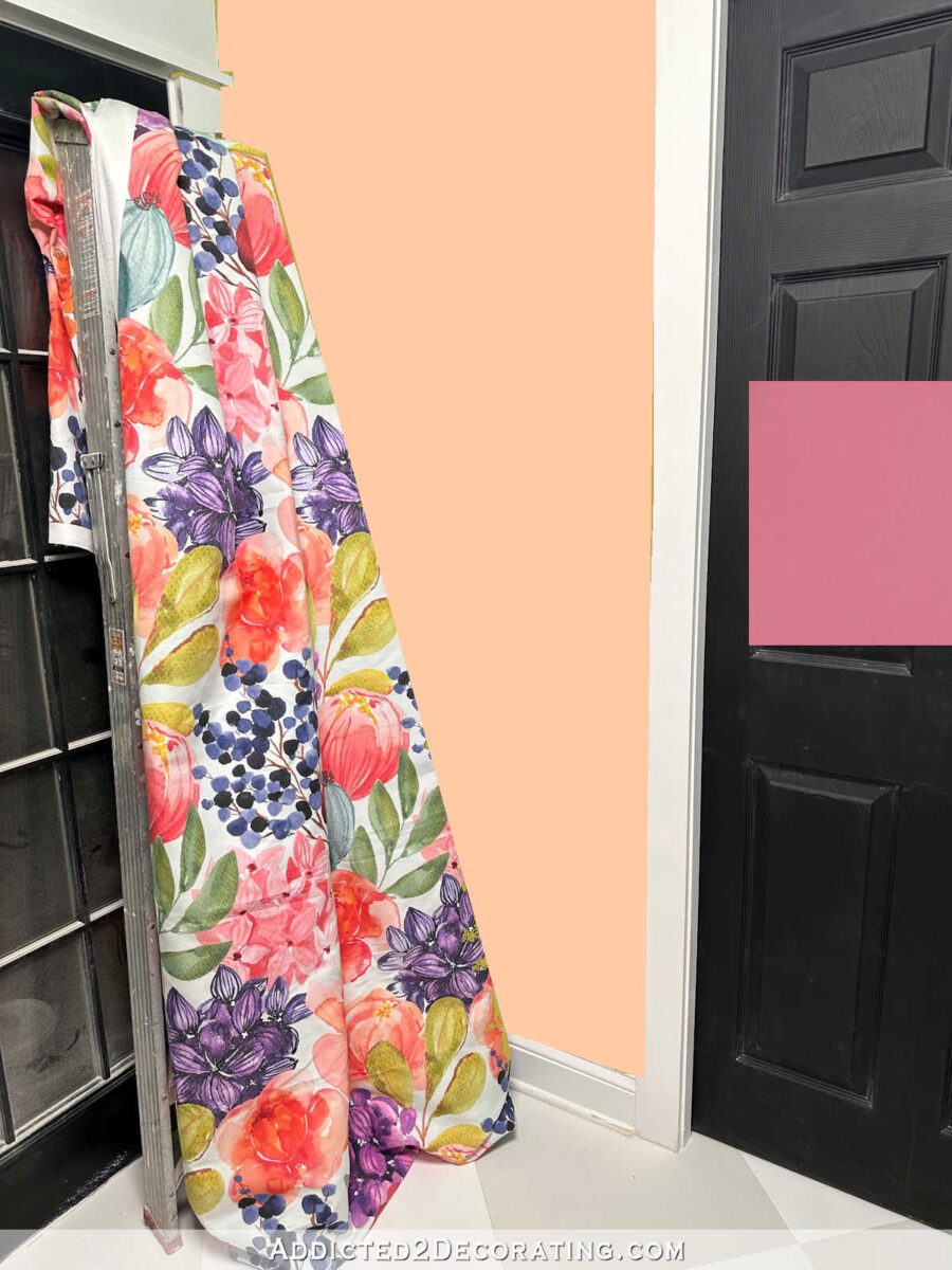
And then I considered a peach color for the walls in the back entry of the studio.
I also tried peach for the door color, and while it did give a real Golden Girls vibe, I was actually open to trying peach with the green walls!

And when I was staring at my paint swatch cabinet the other day (which I do pretty regularly), it struck me just how many colors I included in the peach family, while the pinks look pretty scarce.
So it looks like I’m completely over my aversion to peach. I’m glad that it’s Pantone’s Color of the Year for 2024, and I look forwards to seeing more of it in decorating over the next year. I’d love to find a way to bring some of it into our home. I think it would fit in nicely with all of my other colors.
I’m curious to know what color aversions you have. Do you remember those color schemes from the 80s and 90s? And after we moved past those, did you have an aversion to those colors like I did? Or maybe you’re one of those who swore you could never use harvest gold or avocado green again. Did you ever get past your aversion?

Addicted 2 Decorating is where I share my DIY and decorating journey as I remodel and decorate the 1948 fixer upper that my husband, Matt, and I bought in 2013. Matt has M.S. and is unable to do physical work, so I do the majority of the work on the house by myself. You can learn more about me here.
[ad_2]
Source link