Inside the Small Virginia Condo Designed By Carrie Miller

[ad_1]
Robert Radifera Photography for Stylish Productions; Styling by Charlotte Safavi
Peaceful. That’s the sole request interior designer Carrie Miller received when she was enlisted to help transform a single client’s condo in Arlington, Virginia, just before the COVID-19 pandemic.
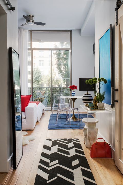
The one-room open layout presented a host of design dilemmas that are typical for small spaces. Every square inch had to be utilized for storage purposes; distinct areas for sleeping, eating and lounging required a cohesive feel; and showcasing the client’s personal artwork collection in an effort to inject personality into the room was non-negotiable. Of course, Miller rose to the challenge with gusto. “Most importantly, my client needed a space that worked for her,” says Miller, principal designer of Lapis Ray Interior Design. “Everything had to have a place. She just wanted to come home and feel like her space was complete.”
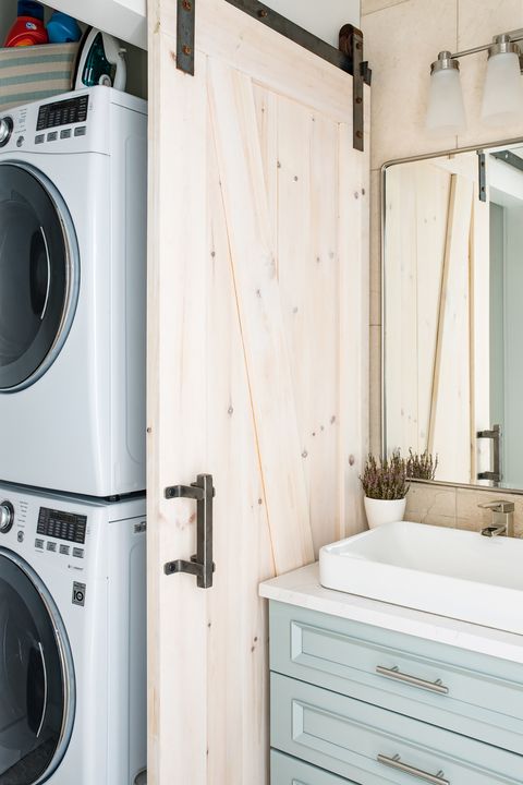
The first order of business was to “be strategic about what she needed” while adhering to a patriotic color palette that gave the layout some much-needed pizzazz. In other words, editing belongings to make room for necessities was paramount. From there, Miller reconfigured the layout a bit, which included moving the laundry area to a nook just off of the bathroom for a cleaner look and pushing the foyer’s closet space to its limit with a smart organizer. “That’s just how that space needs to be used; we tried to be as smart about each area as we could,” she says.
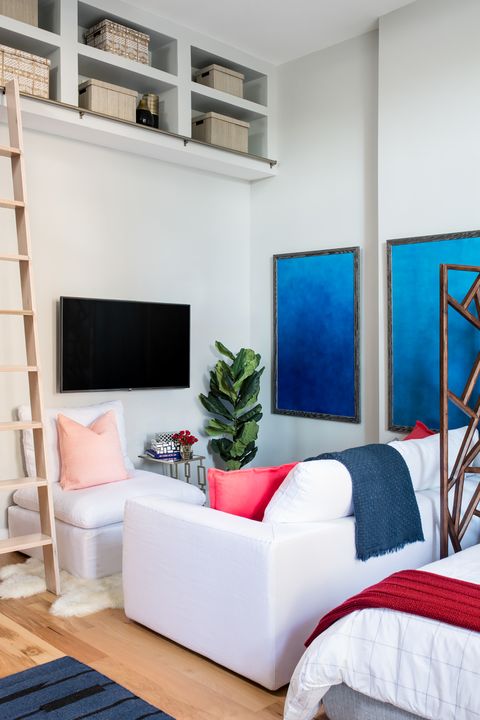
In the compact lounge area, Miller was tasked with designing around the client’s beloved Restoration Hardware modular sofa, which serves as the perfect spot to enjoy television, read a book or cozy up with her dog. She also installed a rolling ladder with access to upper shelving to “give her more of a footprint to work with.” A sheepskin rug from CB2 and a World Market decorative screen, which creates a sense of separation from the bedroom, add warmth to the interior.
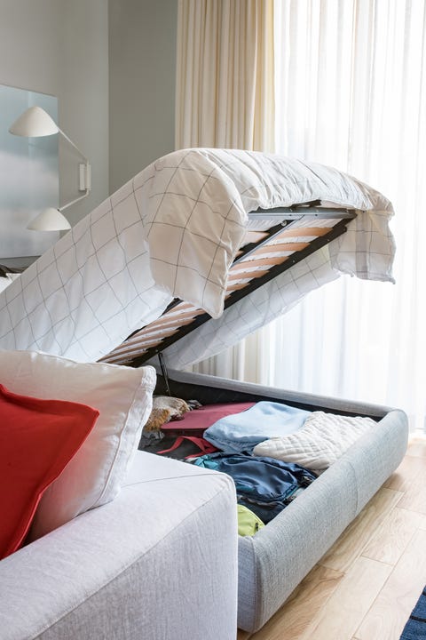
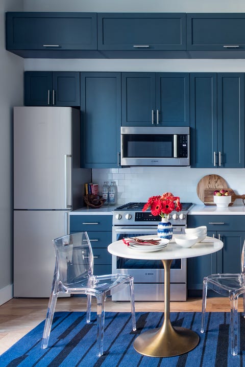
Other highlights of the condo include a storage bed — a Design Within Reach find that helps to maximize square footage. “Otherwise, it (under the bed) could just be wasted space,” Miller says. For the kitchen, Miller opted for navy blue cabinets, paired with a tulip table and lucite chairs that allow the eye to rest.
She even introduced a second tier of upper kitchen cabinetry to boost visual appeal and create yet another storage opportunity for the client. A nifty 24-inch refrigerator completes the look, adding a modern touch. “You do not need a huge refrigerator,” Miller says. “This fridge is unexpected, simple, clean and does the job it needs to do.”
Overall, this condo is a lesson in navigating small-space living with a focus on style, functionality and efficiency. “It’s a great example of drawing the eye up,” Miller says.
This content is created and maintained by a third party, and imported onto this page to help users provide their email addresses. You may be able to find more information about this and similar content at piano.io
[ad_2]
Source link


