Less than the sum of its parts

[ad_1]
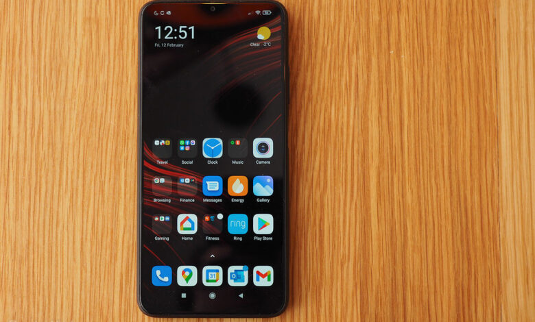
(Pocket-lint) – The Poco M3 is all about affordability. By dangling that low-price carrot, along with surprisingly well-specified features, a read-through of its spec rundown certainly sounds appealing.
But is it truly appealing in practice? With stiff competition from established players, such as the Moto G series, there’s plenty more to consider if you’re looking for an outright purchase on a budget. Here’s our verdict after living with the Poco M3 as our main device.
Design & Display
- Display: 6.53-inch LCD, Full HD+ resolution (1080 x 2340), 19.5:9 aspect ratio
- Dimensions: 162.3 x 77.3 x 9.6mm / Weight: 198g
- Finishes: Cool Blue, Poco Yellow, Power Black
- Side-mounted fingerprint scanner
Poco (or Pocophone as it once was) is an off-shoot of Xiaomi, targeting affordability as its primary focus. As such you’re not going to get ultra-luxe, well, anything. But the balance of build to price found here is fair – ignoring the vibration motor, which is the poorest implementation (complete with accompanying irksome noise) that we’ve seen/heard for some time.
The M3 certainly wants you to know its a Poco, too. The massive logo emblazoned across the rear camera unit tells you that. We’re not a fan of that look, but each to their own. The rest of the rear is coated in a textured plastic, which looks rather more like a case than it belonging to the phone – sometimes just because of the way lint gets stuck between the camera unit and the main body.
As for the phone itself, it’s fairly large, in part down to the huge battery (it’s a 6,000mAh capacity) tucked away within, in part down to the large-scale display choice. A 6.53-inch panel might not read that massive these days, but it’s actually a smidge wider than you’ll find on many a flagship (the Samsung Galaxy Note 20 Ultra being one such example).
But it’s the screen specification where things get rather interesting. For it offers a Full HD+ resolution. And this is a phone that’s on sale for sub-£/€150. That’s rather unusual, because the Moto G9 Power, as one obvious competitive example, has nothing like that degree of resolution.
Which sets the M3’s screen in pretty good stead. If the software wasn’t so keen to keep it dimmed so frequently then it’d be a solid panel on which to do your day-to-day tasks. The notch isn’t too distracting. Available brightness is more than good enough, once manually adjusted. And the degree of colour from an LCD panel does a fair job too.
Sadly, however, the touch-response of this panel is really poor. Especially towards the edges. It’s often failed to recognise very purposeful touches, which makes interacting and typing frequently just irritating.
Performance & Battery
- Qualcomm Snapdragon 662 processor, 4GB RAM
- 64/128GB storage, microSD expansion, dual SIM
- MIUI 12.0.5 software (over Google Android 10)
- 6,000mAh battery capacity, 18W charging
Even the specification, in context of this price point, reads pretty well. But, somehow, despite 4GB RAM and a Qualcomm Snapdragon 662 processor, there’s just a certain lack of cohesion in use.
Which, we suspect, is down to the MIUI software. We’ve already pointed out the excessive auto-dimming. The user interface is also sluggish to respond, hesitating sometimes to the point that we’ve tried hitting the same close button three times over. The poor screen touch-response could compound that, too, of course.
At this price point you really need to have a bar of expectation in what you’d like a phone to do. Because while the Poco M3 can certainly run games and apps without too much a bother, it can’t necessarily run them that well. Take our go-to favourtie, South Park: Phone Destroyer, and while it’ll load up fine, there are often stutters in animation and everything feels laggy and slow to the point that it’s taxing to play.
Sure, this is a budget phone, so it’s not going to be a gaming mecca. But with this kind of processor on board – which we’ve seen elsewhere, such as, again, in the Moto G9 Power – we’d actually expect better. Something just isn’t quite communicating quite correctly between hardware and software, delivering a user experience that’s below par.
But without an ultra-powerful processor, the power drain is rather efficient – again, in part, down to software – and as there’s a massive 6,000mAh cell inside the M3 lasts and lasts. And then some.
If you’re looking for longevity then there’s no fear of this phone powering through a couple of days – we’d achieved over 24 hours with over 50 per cent battery remaining (partly due to being averse to wanting to game or use the device as much we might a more capable device).
As an “office in your pocket”, for calls and emails, then, the Poco M3 will last out for an age and is worthy of consideration on that front alone. So long as you can tinker with the software sufficiently – because there are various irks from the MIUI (v12.0.5) software that you’ll need to dig into various menus to tweak to your liking.
It’s the software that’s holding things back in our view. There are battery saver per-app limitations, permissions limitations arranged in various parts of the settings that need attention, and so forth. It’s a maze to find and open things up, and even when you think you’ve got everything sussed there might be a delay in notifications from certain apps.
Just as we’ve said of so many MIUI devices in recent months, it’s the biggest hurdle that’s often holding back potential (especially in Xiaomi’s Mi 11 flagship). And with Poco Launcher here, there are additional bothers, such as the system-wide dark mode often making fields illegible by hiding them away.
Cameras
- Triple rear cameras:
- Main: 48-megapixel, 0.8µm pixel size, f/1.8 aperture
Macro: 2MP, f/2.4 / Depth: 2MP, f/2.4
- Main: 48-megapixel, 0.8µm pixel size, f/1.8 aperture
- Front-facing selfie camera:
- 8-megapixel, 1.12µm pixel size, f/2.1 aperture
Ignore the massive Poco emblazoned on the rear and your eyes will no doubt be drawn to the trio of lenses available. “Ohh, a triple camera,” we hear you say. Not so much, however, as the depth sensor and macro sensor are effectively pointless – the macro doesn’t have any way to activate it that we can see, while the depth sensor (utilised in Portrait mode) just isn’t necessary at all. It’s a classic case of overselling the cameras because “more equals better”.
With that said, however, the main camera unit isn’t too shabby. So think of it as a budget phone with one simple camera – no ultra-wide, no optical zoom – and it does the job well enough.
That main sensor is 48-megapixels, but using a four-in-one processing methodology means the M3 produces 12-megapixel results by default. Such images are still large in scale, and as so much data has been drawn in to process there’s ample detail.
However, the camera app is a little slow, navigating the features is over-complex, and the focus in shots wasn’t always on point in our testing – there’s no optical image stabilisation or other such fancy features here to help out.
In terms of specification the Poco M3 seems unrivalled for a phone at this price point. Impressive features such as a Full HD+ screen and massive 6,000mAh battery lead its charge.
But somewhere along the line there’s a breakdown in communication. For the decent spec may read well, but it doesn’t function quite well enough. Software irks, poor touch-response from the screen, stutters in both interface and apps, mean it doesn’t add up to be the dream budget experience.
If all you want is an outright affordable purchase for calls and emails then the Poco M3 will last an age and could serve you well. But the quality of even lesser-specified devices out there for a similar price – which run even better – simply means it’s not one to recommend.
Also consider
Moto G9 Power
squirrel_widget_3795551
There’s less resolution, but a far more fluid user experience is what makes this Moto the obvious choice. It’s a little bit pricier as a result, but worth pulling together that little bit of extra cash for the sake of usability.
Writing by Mike Lowe.
[ad_2]
Source link


