Moto G200 review: A genuine OnePlus rival?

[ad_1]
(Pocket-lint) – For many years Motorola’s Moto G series was all about being the best of a budget bunch. But times have changed. Since the G series went triple-figure in its naming convention – which started with the G100 – it’s now a series that ranges from entry-level through to the mid-level and sub-flagship, where at the upper echelons it delivers high-end spec for a not-so-high price.
It’s at this top-end where the second triple-figure G series release fits in: the Moto G200’s spec sheet reads like a flagship, thanks to its (admittedly now one generation older) Qualcomm Snapdragon 888+ platform powering everything, yet costs in a similar ballpark to the OnePlus Nord series, making it an ideal out-right purchase without a contract.
But what’s the compromise at this level? Well, the G200 delivers strong in its power and software, but can’t proclaim to offer the same kind of build quality or camera array as its higher-priced peers. So does it all balance out?
Design & Display
- 6.8-inch LCD panel, 1080 x 2460 resolution, 144Hz refresh
- Dimensions: 168.1 x 75.5 x 8.9mm / Weight: 202g
- Colours: Stellar Blue, Glacier Green
- Side-mounted fingerprint scanner
- Plastic frame & rear build
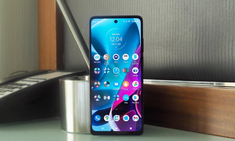
There are some tell-tale signs that the G200 isn’t at the uppermost premium end of the market. It’s built with a plastic frame and plastic rear, for starters, which doesn’t look or even feel bad in this particular arrangement – the way the Moto ‘batwing’ logo is embellished in holographic style to the centre rear is a nice touch – but won’t convince those looking for an all metal and glass physique.

It’s also a large scale handset, all considered, on account of a large battery capacity and the screen’s 6.8-inch diagonal measure, which makes it a pretty chunky device to handle compared to some slimmer, more deft handsets that we’ve seen at the upper ends of the market.
The bezel around the G200’s screen isn’t unreasonable, but it’s not the most trim either, which is further pronounced by the use of a flat screen. We think that flat display is the correct choice, though, as while a curved one might look more edge-to-edge overall in the way it would hide bezel, it would introduce additional potential issues. Here there’s no drop-off in colour or contrast to the edges, nor any issues with edge-to-edge touch response.
And it’s in the screen department where the G200 holds a lot of appeal. This display is certainly large, yet still just about manageable for one-handed use, with that large diagonal measure ensuring a physically grand area for watching content and interacting with apps. It’s also capable of 144Hz refresh rate, which is of gaming phone standard, adding to potential smoothness in playback.

Sure, it’s an LCD panel rather than AMOLED – the latter would mean richer colours and deeper blacks – but as natural-looking LCD goes this one does the job just fine. It’s bright enough, too, although not eye-wateringly so like some of the higher-priced flagships of today (not that you’d notice without comparing them side by side).
There’s no distinctive complaint about this panel, really, except the auto-brightness can be overly keen to remain dim and we’ve often had to manually adjust it. Furthermore our handset got scratched rather quickly, which was a surprise, but the specification doesn’t state Gorilla Glass is used here – which could explain why that’s been the case in our hands.
Elsewhere the G200 offers a side-mounted fingerprint scanner, which we’ve found responsive, and that’s about as far as the bells and whistles list goes with this handset. There’s no wireless charging, for example, which again is no surprise at this price point.

It’s also worth taking on board the changes that Motorola has made in the G200 over its G100 predecessor: the rear camera arrangement is now much neater, arranged as a triple-lens vertical column rather than quad-lens square, while the front-facing camera is just the single punch-hole rather than the (entirely unnecessary) double opening of its predecessor.
Sadly, however, that camera design still causes the device to ‘wobble’ when lain flat on a surface – not the end of the world but a bit irksome nonetheless, unless you put its included case on (which makes the device even larger overall).
Performance & Battery
- Qualcomm Snapdragon 888+ platform, 8GB RAM
- 5,000mAh battery capacity, 33W fast-charging
- 5G connectivity
- Android 11
Despite a few corners being cut in the design department to make ends meet, when it comes to overall power the G200 isn’t holding back. Well, it depends how you look at it: the Snapdragon 888+ platform in use here isn’t Qualcomm’s current highest end offering, because since this handset arrived the chip-maker has revealed its Snapdragon 8 Gen 1 platform. But, fret not, you’re not missing out on too much.

Having used a number of 888+ devices over recent months, we did have some fear that the G200 would overheat as we’ve seen elsewhere. Thankfully that’s not the case at all. So this device’s plastic frame and rear makes very good sense in combination, ensuring heat dissipation works well.
We’ve been playing all manner of games, streaming YouTube, even doubling up messaging apps while playing in game – the GameTime feature enables window-in-window to make this possible – and there’s never been a hiccup in terms of playback. The 144Hz panel is a nicety, too, although we’ve opted for the ‘Auto’ option within the settings to allow the device to select what’s best suited to task (manual options are 60Hz or 144Hz only, there’s no 90Hz or 120Hz in-between options here).
The one thing the 888+ platform does affect is battery life – and the same can be said of the fast-refresh display, too, really. That said we’ve never had the threat of the G200 conking out earlier than a full day of use – but after about 14 hours of use it will be in its final 15 per cent (which is Battery Saver territory, to avoid it depleting completely).

Clearly this is why Motorola opted for a large battery and the big physical scale of this device, to ensure it’ll scrape through a day – which is a lot more than we can say of, say, the Vivo X70 Pro+ (which has the same processor and terrible battery life by compare). Such is the trade-off for having such power.
The G200’s lack of wireless charging isn’t a deal-breaker for us, much as it’ll disappoint many. In terms of wired charging, the 33W maximum option available here is certainly fast, just not super-fast like some of the flagship handsets can now offer. No biggie, though, as battery health options for sensible charging over time whilst you’re in bed and asleep, for example, will ensure overall longevity and, realistically, even quick top-ups are more than good enough if it’s running low.
A big part of Motorola’s play is in adopting near stock Google Android software, without blighting its devices with layers of additional app overlays or pre-installs. Indeed, the Moto app is the one and only clear shift between the G200 handset and, say, a Google Pixel device, offering various personalisation, gesture controls, display adaptations, and the aforementioned GameTime. Many of those minor software additions are genuinely useful too.
Above all, however, it’s this software experience where the G200 excels streets ahead of many of its Chinese competitors – Xiaomi in particular – in delivering software that doesn’t add barriers to notifications or hide features in places where you’ll have to dig to look. This ‘clean’ approach is a clear benefit.
Cameras
- Triple rear camera system:
- Main: 108-megapixel, f/1.9 aperture, 0.7um pixel size
- Wide: 8MP, f/2.2, 1.12um
- Depth: 2MP, f/2.4
- Front-facing camera: 16MP, f/2.2
We called the earlier G100 an oversell in the camera department, as it had four lenses and two of those – the depth and ToF sensors – weren’t exactly ‘proper cameras’. The G200 steps things up by scaling down, if you like, by opting for a triple camera array which instead ups the main sensor’s resolution but, strangely, drops the wide-angle camera’s pixel count; the third ‘camera’ is sadly still just a depth sensor.
As such you can see where we’re going with this: the G200’s camera arrangement is still an oversell. Just call it what it is: a dual camera system, one main and one wide-angle. Which is fine, yet simultaneously a shame – as we miss any option of zoom featuring here, which would really help Motorola’s highest-ranked G series to stand out in among a busying crowd of competitors. But, hey, it is what it is.
And it is not all bad by any means. Positives where they’re due: the main camera, with its 108-megapixel resolution – it pares this down nine pixels into one, at 12-megapixels output overall – can deliver pretty smart results in good light, with lots of detail and colour.
LOW LIGHT EXAMPLE
Things get trickier as the light drops, however, as there’s no optical stabilisation (OIS) which can make shooting much more problematic – and we’ve had plenty of blurred shots as a result. Using Night Mode in much darker conditions and there’s a lot of grain visible and even some internal lens reflection issues, which isn’t great.
The wide-angle is below par, really, given how far higher resolution and more considered examples are available on all manner of other phones. The lower resolution here is also in conflict with low light, resulting in rather detuned colours and lacking in anywhere near the same kind of detail of the main lens.
Given the power available there’s no shortage of processing speed, while artificial intelligence will prompt you to adjust modes depending on conditions. It’s delicate in this touch, rather than forcing changes upon you, and makes for an easy-to-use camera experience. Albeit one that’s lacking a zoom or real flagship kudos. It’s passable overall, but no more than that.
Considered as an evolution in the series the Moto G200 is a refinement of its G100 predecessor: it has a better yet screen, does away with the unnecessary dual punch-hole in the display, and pares down the rear cameras into an altogether neater triple design. All without compromising on its high-end power prospects.
That said, however, the plasticky build isn’t all that, the rear cameras remain an oversell (no zoom, no stabilisation), and such powerful innards don’t eke the very best out of the battery (although it’s perfectly passable and the device doesn’t overheat).
But where the Moto G200 really wins is in context to its competition. It delivers a faster refresh-rate screen than many a rival, has software that’s particularly easy to use – and without the bugs of its Xiaomi MIUI and Oppo ColorOS competitors – and with this degree of power on board it weighs up to be a more measured option at this appealing price point.
Also consider

OnePlus Nord 2
When it comes to the affordable mid-level wars, OnePlus is well established, powerful, and costs a bit less too. Sure, it’s quite plasticky, but so is the Moto.
squirrel_widget_4264200
Writing by Mike Lowe. Originally published on .
[ad_2]
Source link


