The BlackBerry Storm showed why you should never turn a touchscreen into a button
[ad_1]
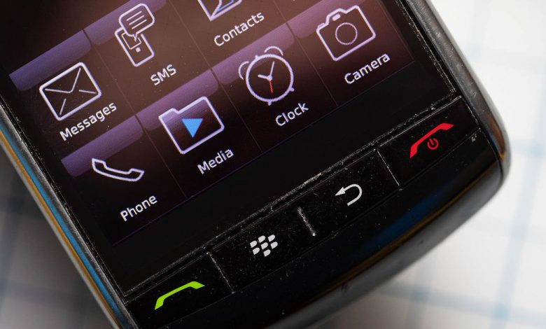
In 2007, the iPhone ushered in an era of touchscreen gadgets that caused most buttons to vanish from our phones forever. But there was one brief moment in the gray, transitory haze between buttons and touchscreens that an unlikely company tried to fuse the two together. BlackBerry split the difference by boldly asking, “What if a touchscreen was also a hardware button?”
Thus was born the BlackBerry Storm, a device whose entire touchscreen doubled as a pressable button. The Storm was one of the first (and last) attempts to bridge the legacy world of physical keyboards and the modern world of touchscreens. But to understand the existence of the BlackBerry Storm and its bizarre clicking screen, we first need to go back and understand BlackBerry at the height of its power — and why it wanted to keep buttons alive.
To BlackBerry, buttons were the entire point of its products. When you picture a BlackBerry phone in your head, you’re not seeing an interchangeable slab. You’re seeing a full QWERTY keyboard that spans the lower third of a phone, with impossibly small keys that are somehow perfect to type on. A BlackBerry without the ubiquitous, clicky keyboard for firing off BBM messages and emails was hardly a BlackBerry at all. Even the company’s logo evokes the chiclet keys that built its brand.
:no_upscale()/cdn.vox-cdn.com/uploads/chorus_asset/file/23351840/akrales_220328_5025_0045.jpg)
Photo by Amelia Holowaty Krales / The Verge
But even the most beloved buttons can’t beat back the inexorable waves of progress: touchscreens were the future, and BlackBerry had to jump on board. As Steve Jobs commented in his now-famous 2007 iPhone introduction, phones like the BlackBerry or Palm Treo “all have these keyboards that are there whether you need them or not to be there, and they all have these control buttons that are fixed in plastic.” And as such, they’re unable to adapt to specific applications or user interfaces. It was an observation that would precede the announcement of the touchscreen-only iPhone and the beginning of the end for hardware buttons on phones.
BlackBerry got the message. And so, in 2008, the company made the Storm, its first touchscreen phone. At the time, the device had a 3.25-inch screen, much larger than its then-typical 2.5-inch screens. And it didn’t have a physical keyboard.
Instead, the Storm had a unique “SurePress” display: rather than keyboard buttons, the entire display was a gigantic button that could be clicked down like a trackpad. On an iPhone, you simply tapped away at a virtual keyboard with no real indication that you were pressing anything. On the BlackBerry Storm, you physically had to “press” each key to type, complete with an ultra-satisfying “click” sound, thanks to the mechanical switch underneath.
:no_upscale()/cdn.vox-cdn.com/uploads/chorus_asset/file/23351841/akrales_220328_5025_0053.jpg)
Photo by Amelia Holowaty Krales / The Verge
It was a great idea, in theory. In practice, the Storm was terrible to type on. (There’s a reason we use lots of little keys to type rather than one giant button.) The huge screen on the Storm was slow and had to fully lower and raise before you could press another key. The lightning-fast typing that BlackBerry power users had grown used to slowed to a glacial pace — typing out one letter at a time.
The company would try to tweak the formula on the Storm2 a year later, replacing the single mechanical switch with four piezoelectric switches at the corners of the display (making it possible to “press” multiple keys at once). It also added a full-size QWERTY keyboard in vertical orientation (where the original only offered a strange two-letter-per-key option). But even then, the SurePress technology wasn’t good enough to replicate the feeling of typing on one of BlackBerry’s normal keyboards.
BlackBerry tried to offer customers the best of both worlds when it made the Storm; instead, it managed to harness the worst qualities of both physical hardware and touchscreen typing. It resulted in a laggy, slow experience that wasn’t particularly enjoyable or easy to type on. The physical elements were louder and more fatiguing for users than a traditional QWERTY keyboard, without any of the tactile benefits of multiple hardware keys. The added friction from the physical switch detracted from any major benefits of a touchscreen for typing, too.
:no_upscale()/cdn.vox-cdn.com/uploads/chorus_asset/file/23351838/akrales_220328_5025_0036.jpg)
Photo by Amelia Holowaty Krales / The Verge
It’s no wonder that BlackBerry would abandon its SurePress technology shortly afterward: in 2010, its subsequent flagship, the BlackBerry Torch, would offer a display that was the same size as the Storm but with a traditional BlackBerry QWERTY keyboard.
BlackBerry would bounce between full touchscreen devices and its familiar hardware keyboard for years after the Storm (even offering both in many cases). But the company never tried to build a tactile touchscreen again.
Because while buttons can be a good way to use a phone — and touchscreens can be a good way to use a phone — a massive touchscreen-button hybrid turned out to be a terrible idea.
[ad_2]
Source link
