To Her Surprise, A Designer Renovated Her Childhood Home
[ad_1]
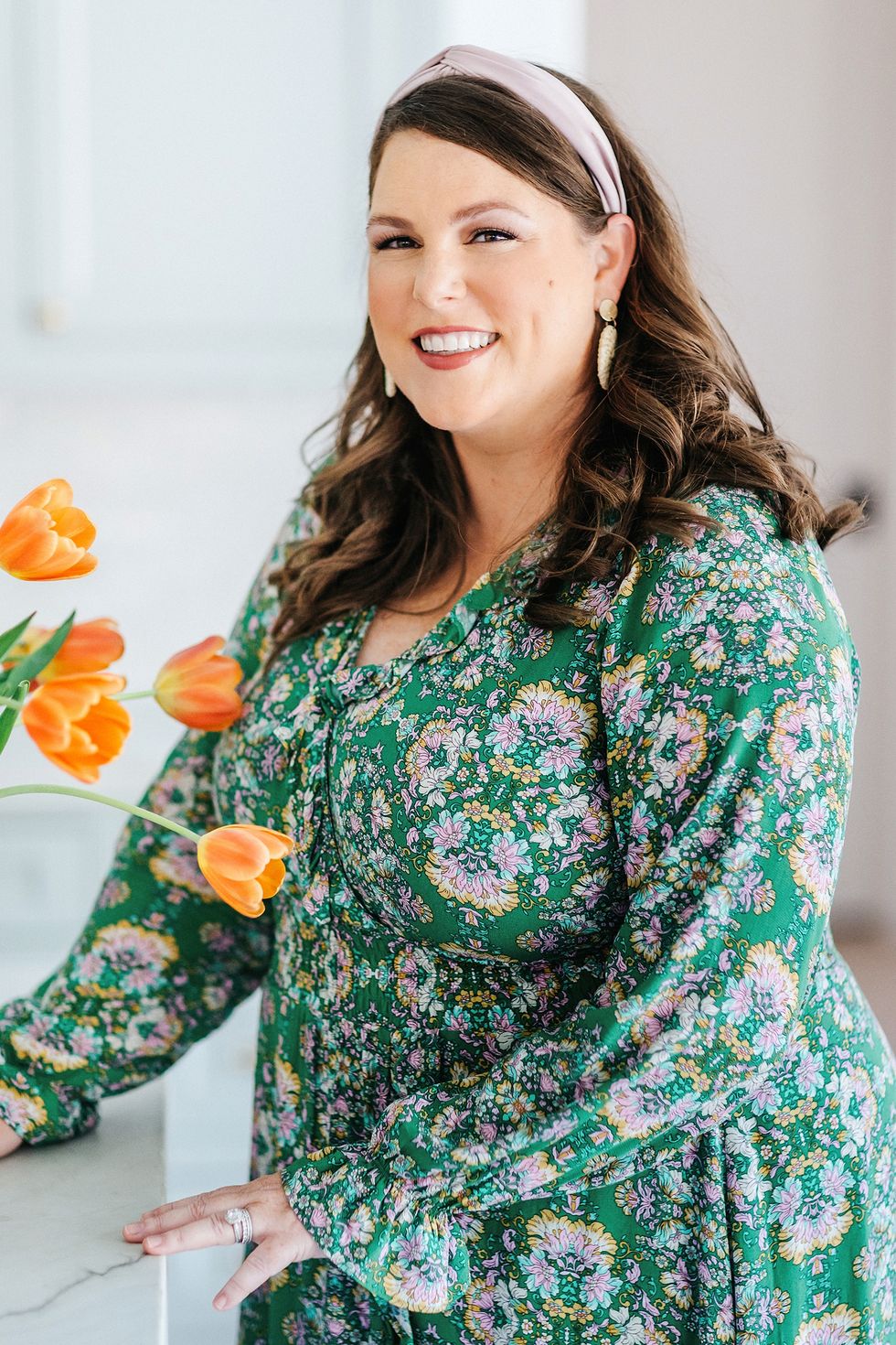
A client request to revamp a 1950s ranch-style Houston property yielded an immediate “yes” from designer Katie Davis. As the couple with three young children began to describe the home’s layout and location in the city’s Memorial neighborhood, it started to sound very familiar to Davis.
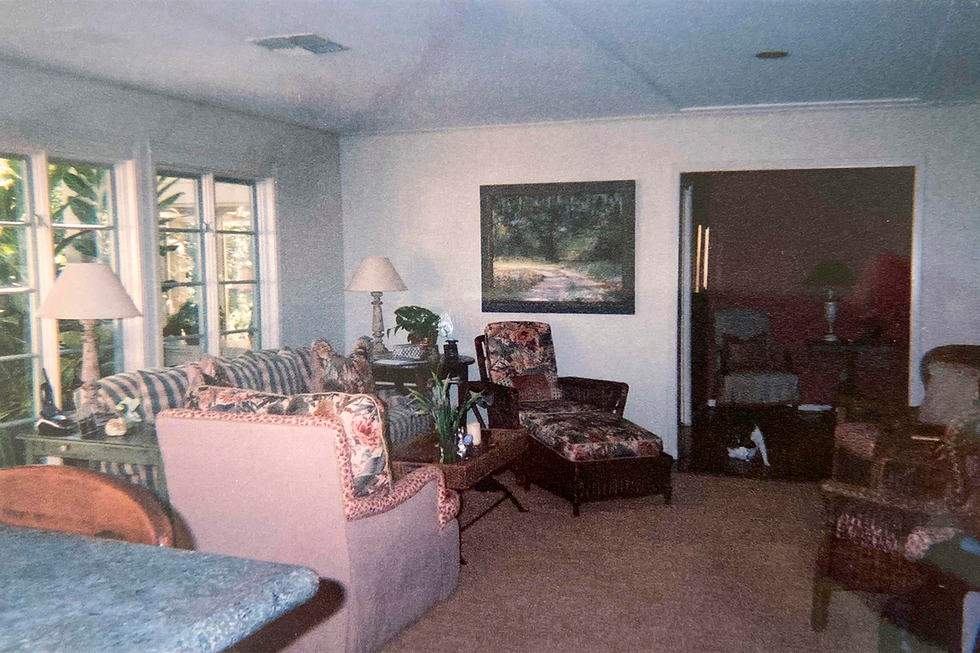
As kismet would have it, it was Davis’ childhood home. “This house shaped everything for me. My parents worked with a designer to renovate it when I was in sixth grade, and I watched the whole process unfold. I credit my mom for introducing me to a world I didn’t know about,” she says.
For the clients, she converted the dining room to a music room, made the sunroom more suitable for entertaining and refreshed several other spaces. But it was her instant familiarity with the home that made the design process so special: “I had a comforting feeling when I walked through the door,” she says. “Even though it wasn’t my parents furniture and there had been tweaks to the layout, at its core, the house has special spaces that feel so unique and interesting.” Talk about a full-circle moment!
We spoke with Davis, who talks details behind designing the property she once shared with her parents and brother. Whether it’s crafting versatile spaces for the current family of five or finding unique ways to pay homage to the original design, here’s her top six pieces of advice:
1. Let wallpaper inspire your paint color.
In the powder room, the cabinetry’s green hue (Benjamin Moore’s Saybrook Sage) was pulled from the leaves on the floral wallpaper. The rectangular mirror with ruffled edges from Ballard Designs adds to the whimsical charm.
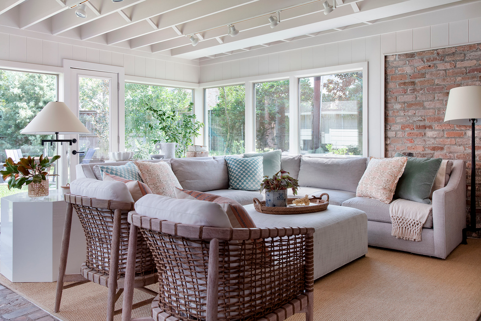
2. Create an “outdoor” living room.
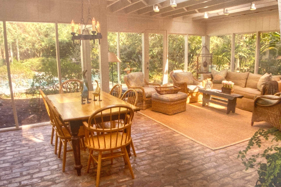
With nature as its backdrop and a ton of seating, the sunroom is the perfect place to gather. The sectional and the Palecek chairs create a cozy vibe. “It’s a special spot,” Davis says of the room, which was her go-to play area as a child.
3. Try tone-on-tone with a twist.
Monochromatic spaces don’t have to feel one-note. In the entry nook (which was a cedar closet long before Davis’s parents reconfigured the area), varied shades of blue, paired with the mix of Schumacher textiles for the custom sofa and walls, keep the look fresh and appealing. The butterfly print is by Paule Marrot.
4. Feature art you love.
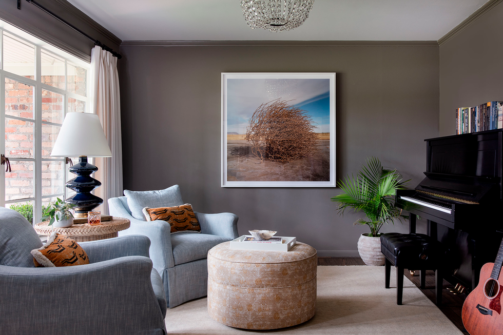
“The only requirement for art is that it makes you happy,” Davis says. For the music room, which had been her family’s dining room, the clients chose a tumble weed photograph by Dallas artist Allison V. Smith. “This room was special — we had so many holidays with family and friends there,” Davis recalls.
5. Reinvent classic colors.
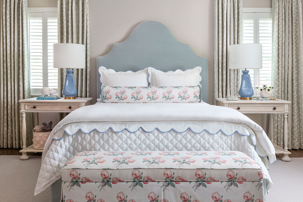
As a nod to her childhood home — which had bright blue tiles, paint colors and patterned fabrics — Davis wove in classic blue elements. For the daughter’s bedroom, Davis found versatile pieces that felt modern and could grow with the home. She went with a blue headboard and floral fabric bench that reminds her of a “cute cottage” — but also acts as storage for dolls and barbies.
6. Play with pattern.
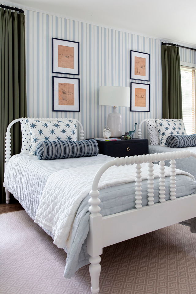
The surge of pattern and color continue into the boys’ bedroom, which Davis wanted to feel young yet subtly masculine and mature. “I love the stripe wallpaper,” she says. “It helps add interest to an otherwise simple room.” Next, she layered in patterned throw pillows and hung antique artwork above the beds.
A version of this feature appeared in the May 2023 issue of Good Housekeeping.
Senior Home Editor
Monique Valeris is the senior home editor for Good Housekeeping, where she oversees the brand’s home decorating coverage across print and digital. Prior to joining GH in 2020, she was the digital editor at Elle Decor. In her current role, she explores everything from design trends and home tours to lifestyle product recommendations, including writing her monthly column, “What’s in My Cart.”
[ad_2]
Source link


