See How Designer Maureen Stevens Gave a 1920s Home a Modern Makeover
[ad_1]
Designer Maureen Stevens set out to give this 1920s home a modern makeover, and by incorporating cool colors, gold hardware and geometric details, she was able to give the Victorian-style home new life. Still, she held onto its unique history, making the century-old crown molding, stain glass windows and original bathroom fixtures the home’s focal point.
Fill your inspiration board with decor ideas from this sun-drenched home. Along the way, steal Good Housekeeping Cleaning and Home Care Lab Director Carolyn Forte‘s top tips on how to keep every room in your home sparkling.
Living Room
The living room’s relaxing hue (Benjamin Moore’s Gray Owl) recedes to allow the century-old bright white trim to pop. Architectural accents like a coffered ceiling draw the eye up to the ceiling.
Kitchen
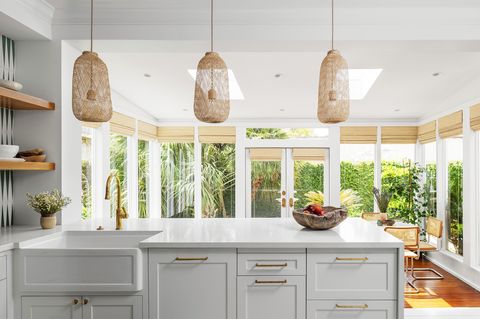
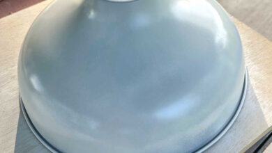
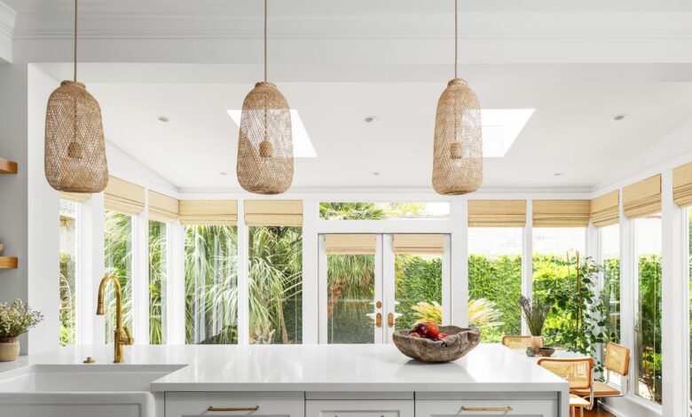
Textured pendants, crafted in Thailand in the style of traditional bamboo fishing baskets, unite the kitchen’s and sunroom’s natural elements.
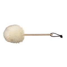
Cleaning Tip: Intricate moldings serve as stylish focal points, but these fancy details can harbor spiderwebs. To remove them, you’ll need an extendable duster. Look for one that expands to six feet, giving you over 11 feet of reach.
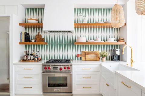
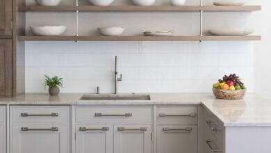
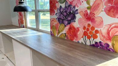
The retro pattern acts as a counterpoint to the warm wood shelves and the elegant brass hardware.
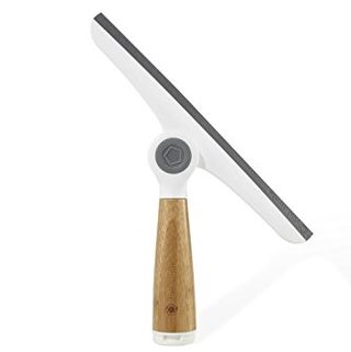
Cleaning Tip: Polished fixtures can be a bit of a challenge to keep spot-free. To prevent hard-water minerals from marring the shine, dry water drops with a glass-cleaning microfiber cloth. It will buff without streaking.
Bathroom
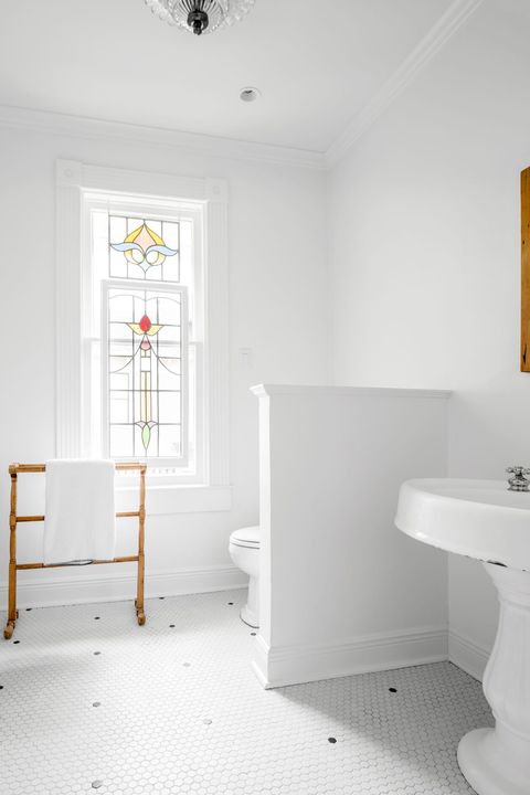
Keeping vintage fixtures like stained glass, a claw-foot tub and the original sink and tile was priority one for the homeowners. The result is a bright room that highlights period details.
Cleaning Tip: Soaking a shower head in vinegar to remove hard-water clogs can mar its finish. Dip a soft brush in vinegar to scrub, then rinse.
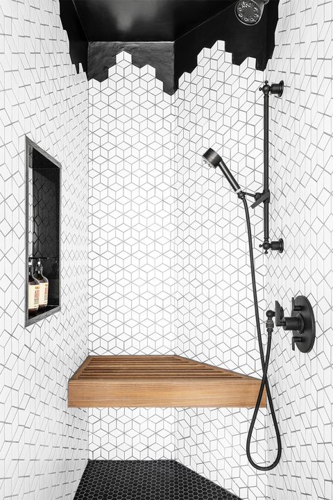
Mixed tiles in black and white — and a wooden bench for a dose of comfort — complete the small shower in the primary bathroom. “The hard edges of the wall tiles and the round edges of the penny tiles work well together,” Stevens says. “It’s a good balance between simple and drastic.”
A version of this feature appeared in the June 2021 issue of Good Housekeeping.
This content is created and maintained by a third party, and imported onto this page to help users provide their email addresses. You may be able to find more information about this and similar content at piano.io
[ad_2]
Source link


