This Traditional Greenwich Home Blends Playful and Formal Elements for a Timeless Look
[ad_1]
Spacecrafting Photography
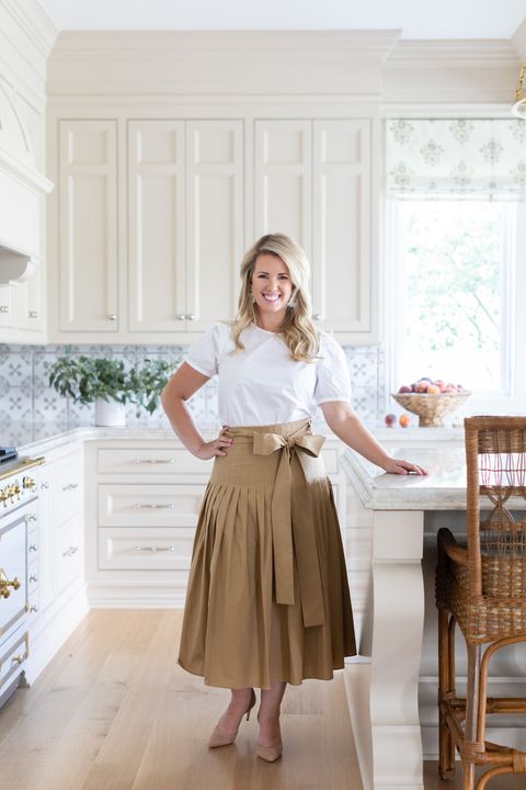
According to interior designer Bria Hammel, there’s personality that comes along with embracing the architecture of a home. “To have a really great end result, let the architecture create the beginning of the story,” Hammel says. “Instead of trying to go overly modern, let the bones of the home set the pace.” So it’s no surprise that when it came to revamping her client’s traditional Greenwich, Connecticut, residence for her family of six, this is exactly what Hammel kept in mind during the design process.
Hammel’s client moved to Greenwich from San Francisco and was eager to make her space comfortable for every member of the family. This included filling the home with an array of neutrals, upgrading the light fixtures and hardware as well as incorporating stylish furnishings throughout the home — all while respecting the history that lies within the city. “Whether it’s a modern, traditional or coastal home, in every project we do, it’s important to us that the client can live in every room of the home,” she says.
Primary Bedroom
Add style with a crystal chandelier.
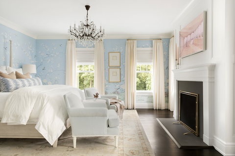
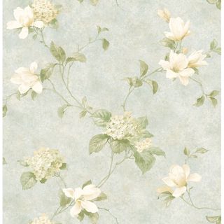
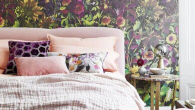
The chandelier, which was from the client’s previous home in California, served as the starting point of the room. “A lot of crystal chandeliers feel very formal, but this feels a bit more casual and vintage because it has a bronze finish,” Hammel says. The rest of the room is designed with an elegant poster bed, a nightstand with a stain finish for softness and an eye-catching mural that brings a peaceful and garden-like aesthetic to the overall space.
Install a Frame TV.
The fireplace, paired with a Frame TV, acts as a focal point in the bedroom and plays up its formal feel. “It looks like a piece of artwork, but it’s actually a television,” Hammel says. “You really get both function and form in the space.”
Living Room
Choose furniture with a subtle traditional profile.
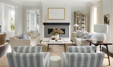
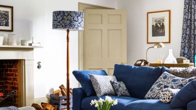
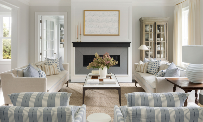
Since the modern fireplace is the main architectural detail in the room, this urged Hammel to find other ways to pepper historic elements into the design scheme. This included the sofas, with their classic legs and modest arms, and striped upholstered chairs with clean-line frames. “We wanted to not ignore the fireplace but still embrace our client’s more traditional style,” Hammel explains. “We picked furniture that had a traditional profile, but in a simple and refined way.”
Hammel’s Tip: If you’re afraid of using color but want to add some, blue can act as a neutral because it feels like the sky and colors of nature. It’s not as jarring as other hues.
Mix modern and vintage decor.
“Playing with antiques to catch your eye and adding a little more of that texture and age to the space helps make everything not feel so fresh and brand new,” Hammel says. From the contemporary coffee table and line artwork above the fireplace (a Kayce Hughes creation) to the china cabinet and satin flange detail on the pale blue sofas, these accents enhanced the room’s warmth. “One or two antique pieces can add a rustic and vintage flair without being overwhelming in the space.”
Design Tip: Hammel suggests starting with a neutral color palette before incorporating vintage or rustic elements, such as wicker chairs, art or galvanized floor vases.
Dining Room
Make a statement with wallpaper.
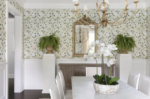
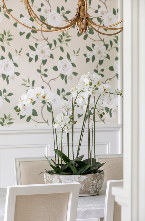
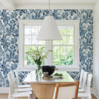
Hammel believed this dining space was the perfect spot to use wallpaper —and she was right. “We decided wallpaper was going to be the showstopper and the rest was going to support it,” she says. They went with a graphic pattern to complement the neutral colors in the room. From the soft warm ivory fabric of the dining chairs and the beauty of the orchid centerpiece to the luxe feel of the large-scale chandelier and marble table countertop, the wallpaper plays with the monochromatic tones and colors of nature.
Add some greenery.
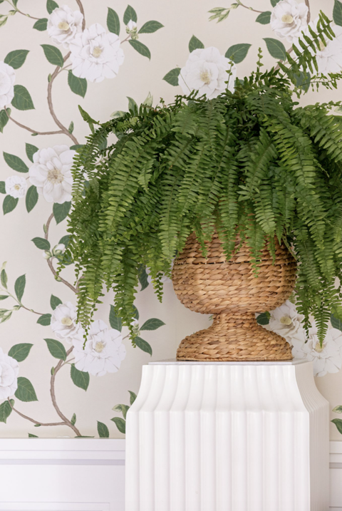
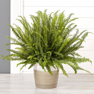
Greenery never fails to breathe life into a space, and the dining room is no exception. Hammel settled on a print that complements the wallpaper. “When you add greenery to the space, it makes it more approachable,” she says. Her team added live ferns for an East Coast, southern and formal vibe, while the orchids were simple indoor (and easy-to-care for) additions. She explains: “We love using them as a nice, large centerpiece in the dining room.”
Powder Room
Design the room with brass accents.
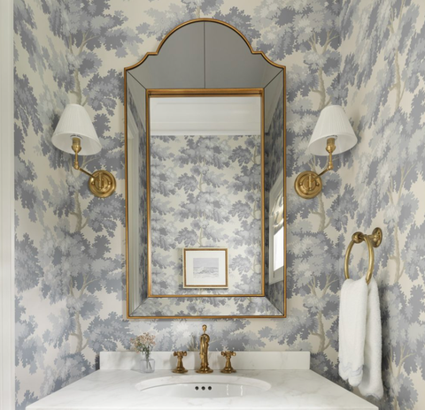
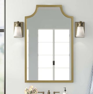
The powder room — the smallest space in the home — is positioned right across from the dining room. It proved to be the ideal location to add a touch of formality, thanks to a console sink and brass accents that pair well with the cool tones of the wallpaper. “This is the place to take a little risk and chance because it’s such a small space,” Hammel says. “People really love that hidden room when guests come over.”
Hammel’s Tip: The powder room is where you can to go all out with color. “Go darker than you normally would,” she says. “Try using a higher gloss finish.”
Casual Dining Area
Bring on a coastal feel.
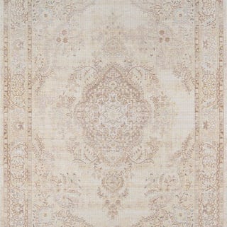
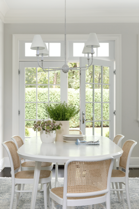
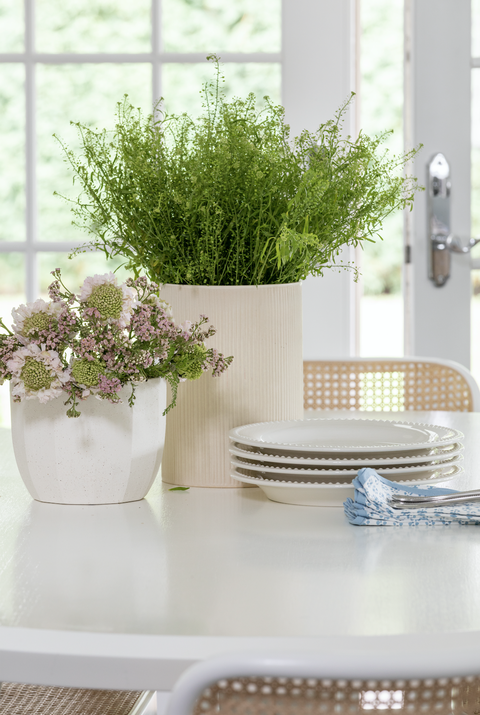
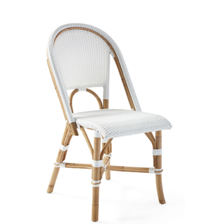
This small dining space connects to the kitchen and opens up to the backyard, only enhancing its light and airy feel. Hammel and her team changed the light fixture, opting for a more understated design with a white finish. The furniture has a fun California vibe (a tribute to the client’s previous home), while the vintage rug only accentuates the overall look.
Hammel’s Tip: “We love using textures like cane or wicker to bring warmth into a white room,” she says.
This content is created and maintained by a third party, and imported onto this page to help users provide their email addresses. You may be able to find more information about this and similar content at piano.io
[ad_2]
Source link


